fbpx

Sunscreen for Your Store: Protect your products from UV damage 

Bright sun

If you’re an outdoor retailer, the sun is essential to your shop’s existence—it allows your customers to get outside and pursue their favorite activities. But without proper precautions, the sun can damage your products. Fixture Lab consistently hears the same gripe from clients: storefront windows look great, but the products behind them crack and fade. How can we protect product from UV damage?

You put sunscreen on your skin. Turns out, you should be doing the same for your store.

The Problem
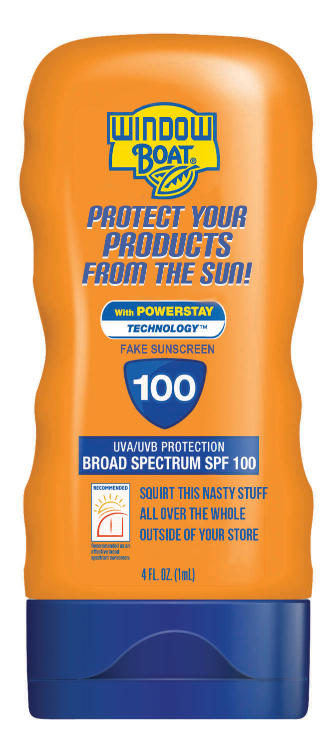
Not a real product:-)

Let’s get science-y for a second (forgive us, actual scientists). We’ll divide sunlight into three crude components: heat, visible light, and ultraviolet radiation (UV). Heat and visible light are easily observable, so we won’t spend too much time on them here. UV, on the other hand, has a shorter wavelength than visible light, so we can’t see it. UV also carries more energy than visible light, which is why you get burnt by the sun, but not the lights in your house. In oversimplified terms, UV degrades materials because its high energy gradually alters chemical bonds. As the bonds break and change, materials fade and become brittle. Some materials (like metal or ceramic) resist these effects, while others—plastics—are likely to be damaged. Just think about sunbaked patio furniture that snaps at the slightest touch. If you’d like more details on the science, we encourage you to check out this article from the magazine UV Solutions.

All three components of sunlight can negatively affect a retail environment. High heat melts fragile products and intense light makes the space uncomfortable for shoppers. UV causes products to crack and fade.

Thankfully, these three elements can be filtered and separated. An insulated window, for example, can keep out heat while letting in light. So, how do we filter for UV?

SolutionsWindow film
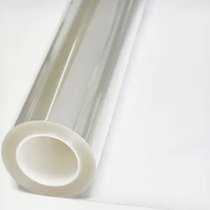
Many manufacturers produce film designed to let in light while blocking UV. The film acts sort of like sunscreen for your store. According to 3M, an industry leader in UV protection, 3M film can “reject up to 78% of solar heat” and “block up to 99% of harmful UV rays.” Plus, these films can be crystal-clear. You can find UV film with a variety of features at many different price points. Pricing per square foot often decreases the more film you buy. These films are accessible to the average consumer on sites like Amazon. They tend to be marketed to homeowners. They’re a great affordable option but may be less durable. These films can cost as little as $0.55 per square foot, depending on the size of the roll.


UV-films can also be a great way to change the look of your windows—whether for privacy or aesthetics. Frosted, tinted, corporate-office-style-mirror… the options are endless. Your local hardware store (Home Depot or Lowe’s) can be a good place to start exploring. These can be a slightly more expensive option, depending on the finish.

Security too!

Many stores—we’re looking at you, bike shops—are interested in preventing theft. Have you ever seen how a shattered car windshield keeps its shape? Films can do the same thing for your store, making it much more difficult to break in. Hardware stores likely carry these options for a slightly higher price ($0.75 and up per square foot)

The most radical option: New glass

Some modern windows have integrated UV protection, so you won’t have to mess with film. If you’re due for some new windows, you might consider factoring UV protection into the budget. Your window supplier/installer should have more information on these options.


Wait, do I really need this?

You may not need UV treatment on all your windows. When calculating your UV protection budget, we recommend that you prioritize windows with the most sun exposure and those in front of the most product. The bathroom window that leads to an alley? Probably not a priority.

There are also handy tools to help you decide which windows to treat first. You might consider purchasing a UV detector to get a better idea of how much UV is going through a particular window. With some luck, your windows might already be treated! The detector is also a good way to periodically check how your window treatment is holding up, since treatments degrade over time.


Installation

So, you’ve determined which windows to treat, and you’ve bought the perfect film. If you’re up for it, you can install the film yourself with minimal tools: you’ll need a tape measure, a marker, a sharp blade and/or scissors, tape, window cleaning product, paper towels, and rubber/plastic scrapers. There’s a wealth of YouTube videos by homeowners and professionals that walk you through the installation process. With some focus and patience, you can treat your windows over the weekend—and save quite a bit of money!

If you’d rather not mess with installing films, professional services would be happy to install the films for you. The cost will depend on the surface are of the window(s) you want protected, among other factors. An online quote calculator can help you get a better idea of the price tag. To give you a rough idea, one window film installer estimates that 3M film installation will cost between $5 to $12 dollars per square foot, depending on the film quality and quantity.


If you’re worried about all the stuff that’s cooking in your store, reach out to us. Fixture Lab is happy to help!

Free Tour! What has Fixture Lab been up to in Denver, Colorado?

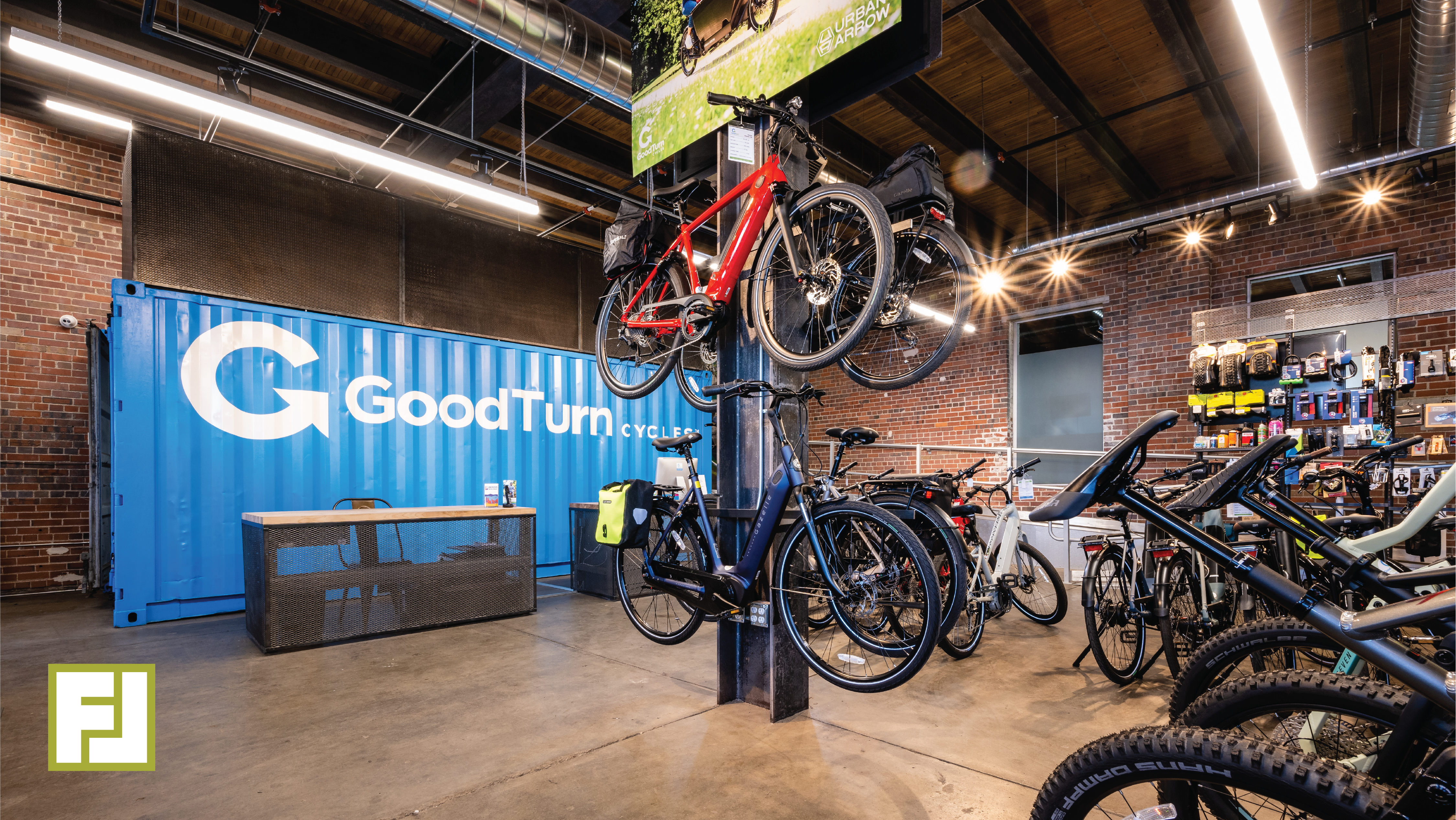
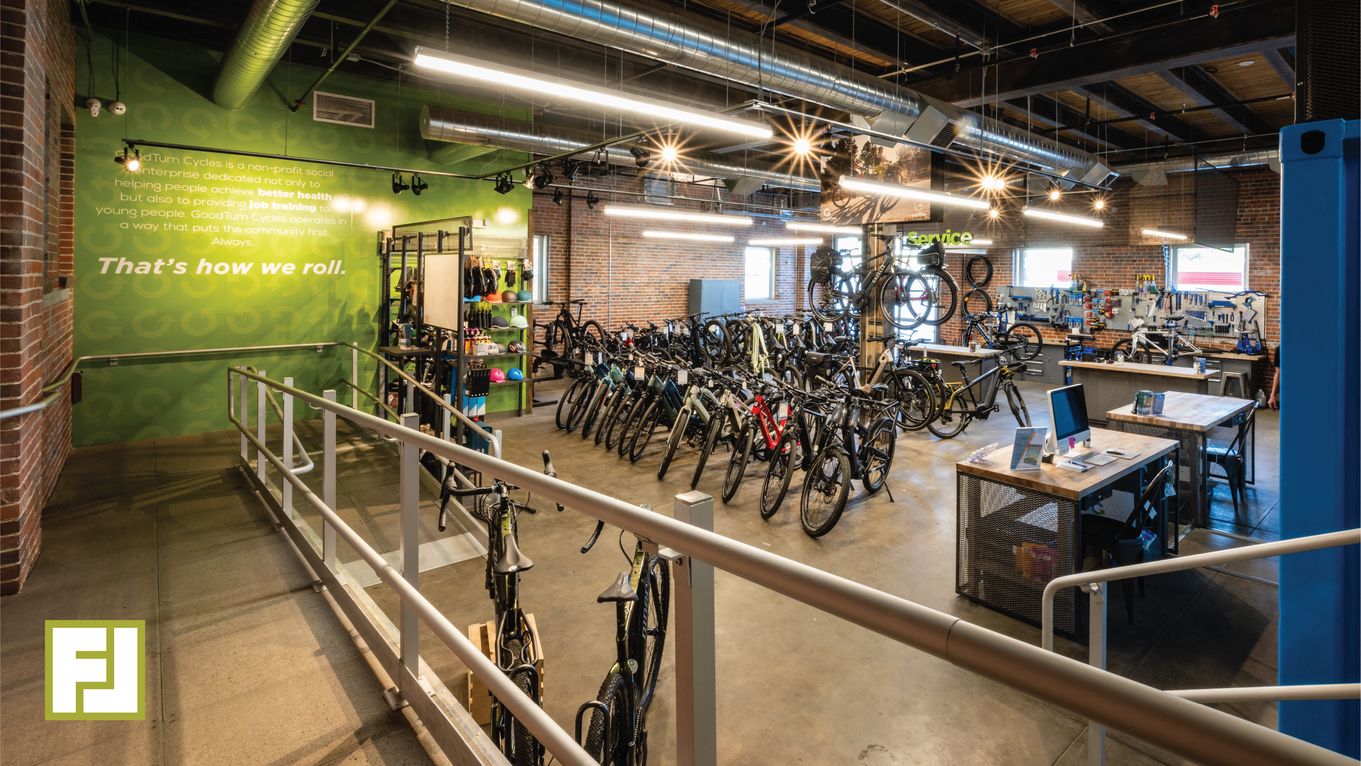
At Fixture Lab, we value versatility. We love being your go-to for a variety of needs, from lighting to heavy lifting. The downside, however, is that people sometimes ask us: “what is it that you do, exactly?” Since “anything” isn’t a satisfying answer, and “everything” would be an exaggeration, we thought of a creative way to show you what Fixture Lab does. Join us on a walk-through of Good Turn Cycles, a recently-completed bike shop in Denver, Colorado. You’ll learn about our process, expertise, and how Fixture Lab can help you create an amazing store!
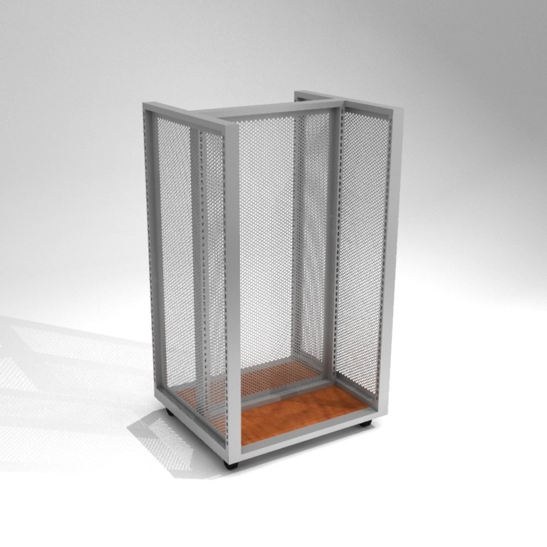
 

Here is just a sneak peek at what you will find once you press play below:


Side note: in case you missed it, our first walk-through video was of The Hub, a bike shop in Jackson, Wyoming. Go check it out once you’re done here!


As you’re watching and chomping on some popcorn, take special note of how Fixture Lab can help with:
  • Space planning. Turning your space into a thriving retail store is where we shine!
  • Lighting. Everything about it. Where, which lights, and why.
  • Fabrication. We know the people who can get any job done.
  • Fixtures (duh!). It’s in the name. We provide versatile, effective display solutions.
  • Installation. We’re happy to put in the legwork.
  • Moving shipping containers with forklifts
  • Hanging big, weird metal structures

You tell us! We’d love to help make your vision a reality.
 

When you’re done, reach out to Good Turn to let them know how their store inspired you to remodel yours. Hungry for more? Check out the walk-through of The Hub we mentioned earlier.

THE HUB 

Add graphics AND decrease echo in your retail store!

Pretty much everyone agrees that strong graphics contribute to a great sales atmosphere. And most people also agree that noisy retail environments can ruin the shopping experience.

Effective retail stores invite customers in and keep them shopping. We’ve all visited stores with sound so deafening and annoying that we can’t wait to leave. Well, we have a super genius trick for you! Here’s how to add visual excitement to your store while subtracting acoustic distractions. The video below walks you through how we applied this technique to a bike shop.

Start by using the right kind of graphics: Silicone Edge Graphics (SEG).

SEG fram on wall

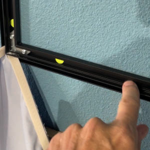
SEG frame mounted to the wall

SEGs have about a million advantages over old-fashioned rigid graphics or vinyl graphics. They are great looking, inexpensive, easy to ship, easy to change, and you can make them in just about any size. However, there’s another advantage hidden in the little gap between the fabric graphic and the wall. If you’re really smart (like us, of course), you can use that sliver of space to tackle the sound problem in your store!

Install the sound-sucking material

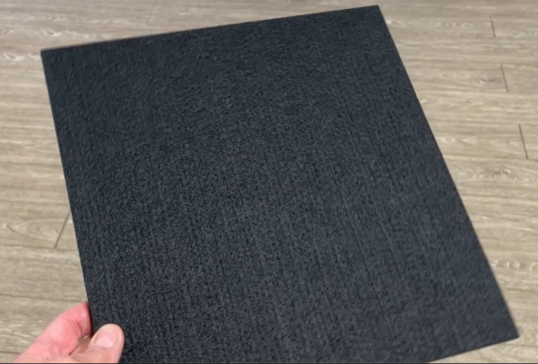
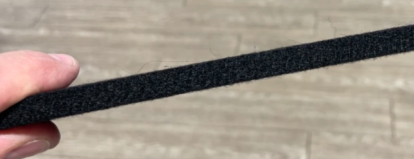
There are a number of products on the market that do a great job of absorbing sound. Sound-absorption materials are really popular these days because of their usefulness for eliminating echo in online meetings and podcasts. Every sound recording studio in the world uses some sort of sound baffle system, and we think more retail stores should too. The product shown here is a ½” thick, semi-rigid, felt-like material. The tiles come in 12×12” squares, so installing them is easier than losing your car keys.

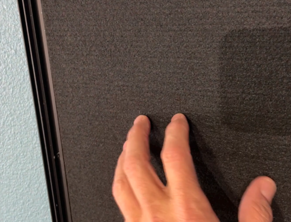
Once you have the SEG frame up on the wall, just fill it with as many sound tiles as possible. In the example above, we used silicone glue to stick the tiles to the wall and made sure they wouldn’t move by tacking them in place with a couple of tiny nails (from a handy nail gun). This process goes extremely fast. Remember that the sound tiles won’t be visible, so they don’t have to be flawlessly cut or perfectly positioned inside the frame. The more tiles you fit, the more echoes you’ll eliminate.


Install the graphic over the tiles

After the acoustic tiles are in place, you can simply install the fabric graphics as you normally would. Just like that, you’ve accomplished two major improvements at once: amplifying your visuals and dampening your sound. Right about the time you finish this project, your customers will be clamoring to buy stuff from the store – so be ready. They’ll probably say things like, “wow, that’s such a nice image. And darn it, I don’t know what it is, but I feel completely comfortable in your store. Here’s my credit card.”
If you are interested in tackling this project, let us know. Fixture Lab can help you with all the nitty-gritty details.


Take this virtual tour, and see what Fixture Lab does!

The Hub Bicycles

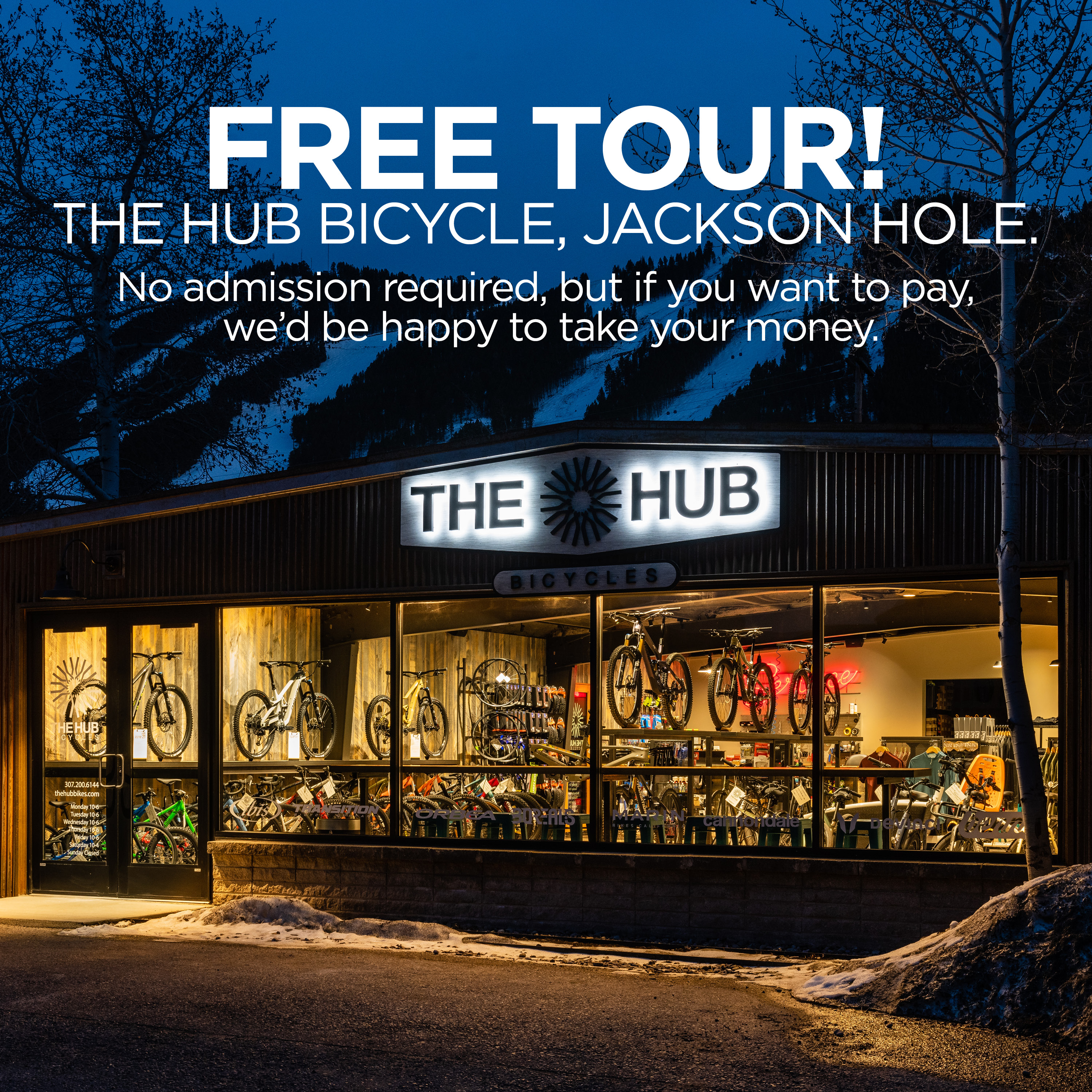
At Fixture Lab, we get this question all the time: “We are remodeling our store and we could use some help, but I don’t really know what you guys actually do in the process. What do you do?” So, as we were looking at our photos of The Hub, we got to thinking that this would be an ideal opportunity to show off the new store AND help everyone understand the things we typically do in the store design/remodeling process.

Check out the video. Inside you’ll see nicely handled examples of these common things we address:

  • Creating great storytelling opportunities in your store
  • Great store flow design
  • Specifying and using standard and custom Fixture Lab fixtures
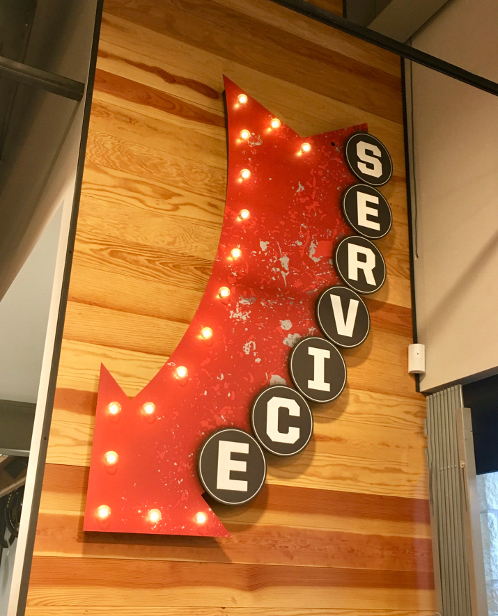
  • Service, cash wrap and bar counter design and fabrication
  • Choosing paint and other finishes, including tasty wood wall textures
  • Custom bike displays
  • Adding local flavor to the space
  • Custom graphics and signage (interior and exterior) including fun items like neon signs
  • New concept for a “cash wrap” transaction counter
  • Designing and utilizing sexy, effective lighting

You will love this tour, so pop some popcorn and your beverage of choice, and have fun!

When you’re done, reach out to The Hub and tell them what a good job they did!


Make bikes magically float on a wall

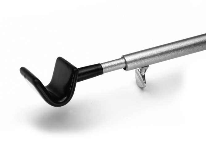
Adjustable V-hook
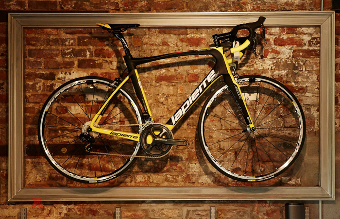
Want your bike to float?

There are about a zillion ways to hang a bike on wall, but if you look for a solution that does ALL of these things at the same time, the list quickly dwindles down to one…

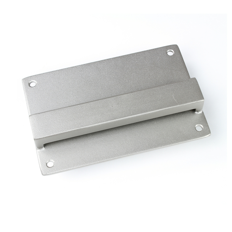
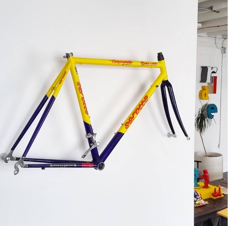
The Fixture Lab adjustable V-Hook and wall bracket for bike book:

  • Holds every style bike absolutely level, with the wheels straight 100% of the time – even if the frame has goofy geometry
  • Adjustable for mountain or road or any style bike
  • The fixture hides behind the bike so the bike appears to float
  • The fixture never touches the delicate paint on the bike

The fixture hides nicely behind the bike and doesn’t scream at you on the wall. It helps the customer focus on the product rather than a fixture on the wall. The V-hook is also great because if you have our wall fixture system with crossbars, you can put a bike pretty much wherever you like on a wall!

Follow the link below for more product details! 

Adjustable Bike Hook (V-Hook) 

Call today and let us share the exciting possibilities for your own store display. 303-777-2014

An easy and sexy way to brand a store.

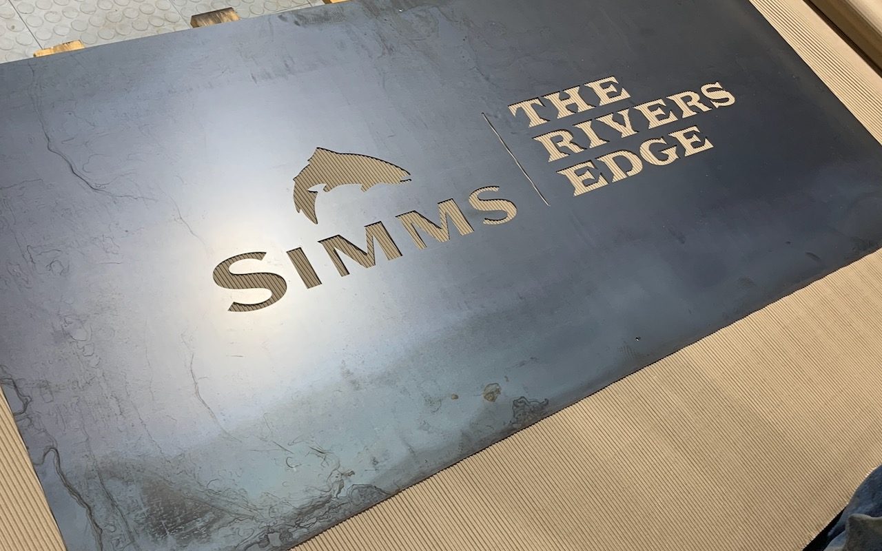
Customized Steel Logo Sign

Laser-cut steel can be just the ticket to make your logo sing when you brand a store.

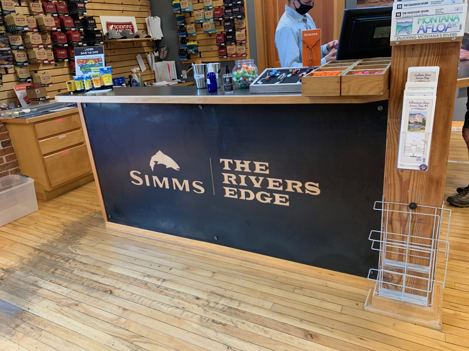
Main counter picture
The cash wrap counter at The Rivers Edge in Bozeman

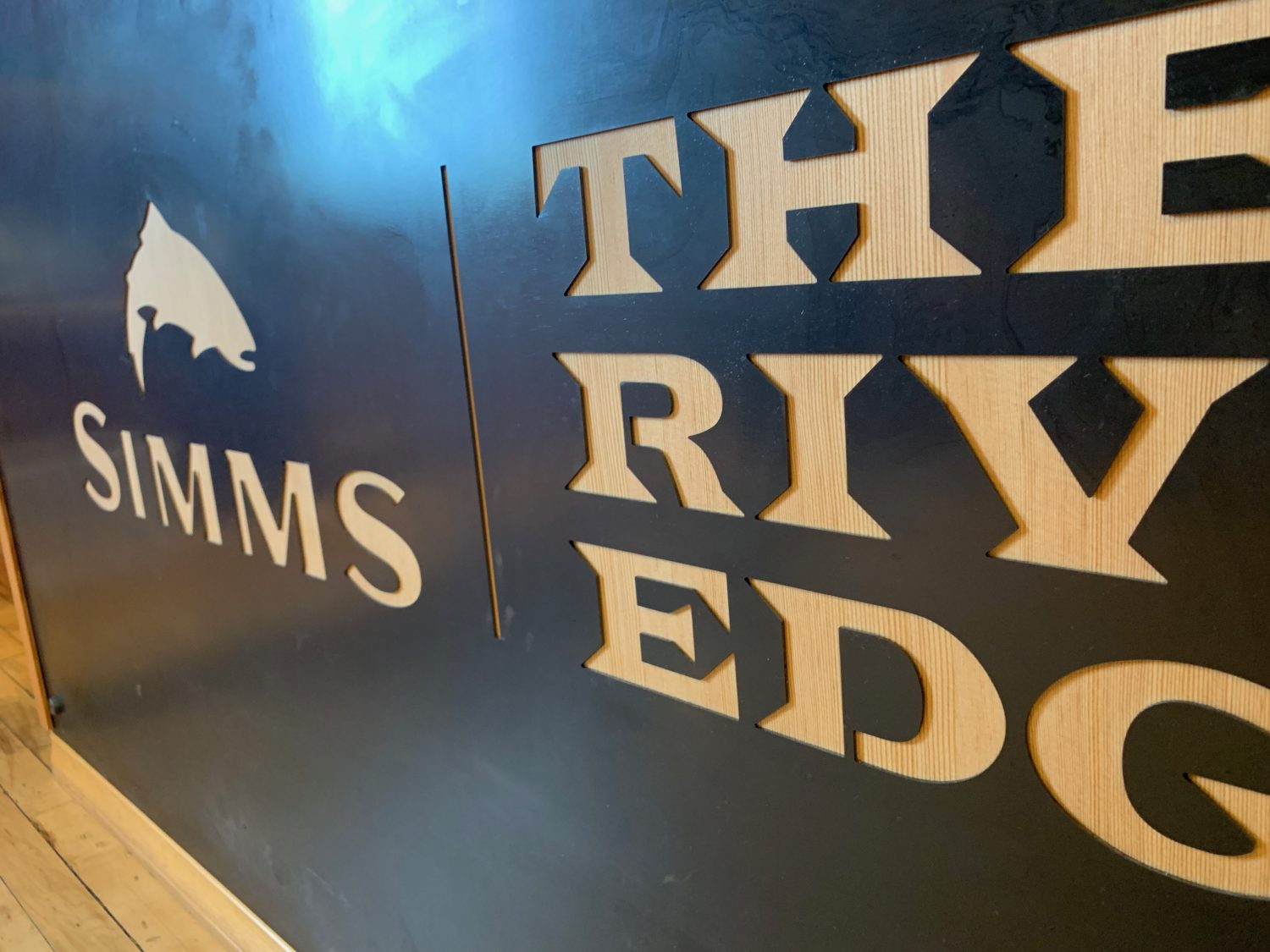
16 gauge steel sheets with the store’s logo laser cut through to reveal the wood from the cabinet behind it. It’s a classy, durable, and as signs go…pretty darn inexpensive.

Mounted Custom Sign

If you’re curious about this type of thing for your own store, let us know! Contact us here or give us a call 303-777-2014.

Looking for more inexpensive ideas to brand your store? Check out this blog post: Fixture Lab reveals retail store design secrets that will give your store an unfair advantage! …a value-packed webinar with all the ways to “take a gun to knife fight” when it comes to store design. Super valuable stuff, you’ll definitely want to take notes.

Bike retailers. This is your chance to get free stuff from Fixture Lab!

If you are a bicycle retailer, you’re definitely familiar with the National Bicycle Dealers Association (NBDA). And you might also know that Fixture Lab has been a proud member for a few years now. If you haven’t checked out the long list of benefits that NBDA offers, you should check them out right now: https://nbda.com/membership-benefits

Fixture Lab and NBDA logos

We just wanted to bring our own great benefits to your attention, because, well, who doesn’t like discounts and free stuff! 

NBDA Preferred Partner discount:

Store fixture special: $100 off any fixture order over $1000, or $500 off any order over $5000!

Store design special: FREE in-depth, custom store remodel budget creation and consultation…a $500 value. Tap our decades of store design, brand development, and remodeling expertise with a detailed analysis of your situation. This step alone could save you thousands of dollars!

How do you get started? Just give us a call: (303) 777-2014

For extra credit: Want to learn some great stuff about bike shop store design? Check out the Fixture Lab webinar: https://nbda.com/bike-shop-of-the-future

Want the customer’s eyes on your product? Try removing the ceiling.

How painting the ceiling can help to upgrade the store and focus the shopper’s attention on the product below.

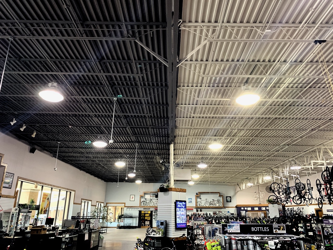
Over the years, we have recommended painting the ceiling to a lot of stores. Sometimes the ceiling in a store is messy, dirty or distracting because there are so many colors going on up there.

A lot of the time the ceiling is just painted white (or some other light color) and the net effect is unoffensive…but uninspired.

If the ceiling was painted a light color it’s usually because the store was afraid that a darker color would feel heavy, or subtract from the light in the space.

What we have found is almost exactly the opposite impact.

Richardson Bike Mart
Before: Richardson Bike Mart

Three things a darker ceiling does for your store:

  1. Gives your eye less to look at overhead, thus drawing your eye down below to the product on display
  2. Improves the contrast in the product’s reflective surfaces, making it prettier looking
  3. Creates visual definition between the ceiling and the space below which helps to define the shape and depth of the space

Case study: Richardson Bike Mart, Richardson Texas

Richardson Bike Mart is a big store. A real big store. Making the decision to paint 18,000 square feet of ceiling that’s 21 to 25 feet high was no small decision.

Our strategy for the whole store remodel has been to turn from the feel of an overwhelmingly large warehouse, to a more modern, more inspired, more approachable space.

Certainly painting the ceiling alone isn’t going to change everything, but it is a big and very impactful move. We are also relighting the space, creating much better storytelling opportunities throughout, and reducing clutter and visual distraction overall. All these things together are going to really make for a remarkable update to this venerable store!

Even half-done, the darker ceiling already gives the eye a much-needed rest.

“We have a 22-year-old building with 25 ft ceilings that haven’t been renovated since we moved in it. The goal was to get bikes off our tall ceilings and for the store to look more like modern-day retail stores and less of a warehouse look. I was listening to an NBDA Podcast with Brian Hawkins and invited him to Dallas to show him our challenges and he gave us a dynamic plan that we are starting now. Part of that plan was painting our white ceiling a dark grey color. I was reluctant to do it because of the price. It was north of $30,000+. Painting the ceiling just didn’t seem like a good return on our money. Long story short, I went to REI, lululemon, and others and they all had a dark or black ceiling. I was shocked that the darker color didn’t draw my eyes to the ceiling at all. It was like there was no ceiling.  All I saw was the product. I have no regrets we did it and it works!”

Woody Smith, Owner, Richardson Bike Mart
Richardson Bike Mart
The updated, modernized ceiling at Richardson Bike Mart

If you’re curious about learning simple, yet profoundly impactful tactics to improve your store’s design and in turn, your sales, you need to listen to the exact webinar by Brian Hawkins here…the webinar that inspired Woody Smith to modernize his humungous, outdated bike shop through the help and planning of Fixture Lab.

Looking for help with re-designing your store? Contact us here or give us a call 303-777-2014. We’d love to help create your dream store.

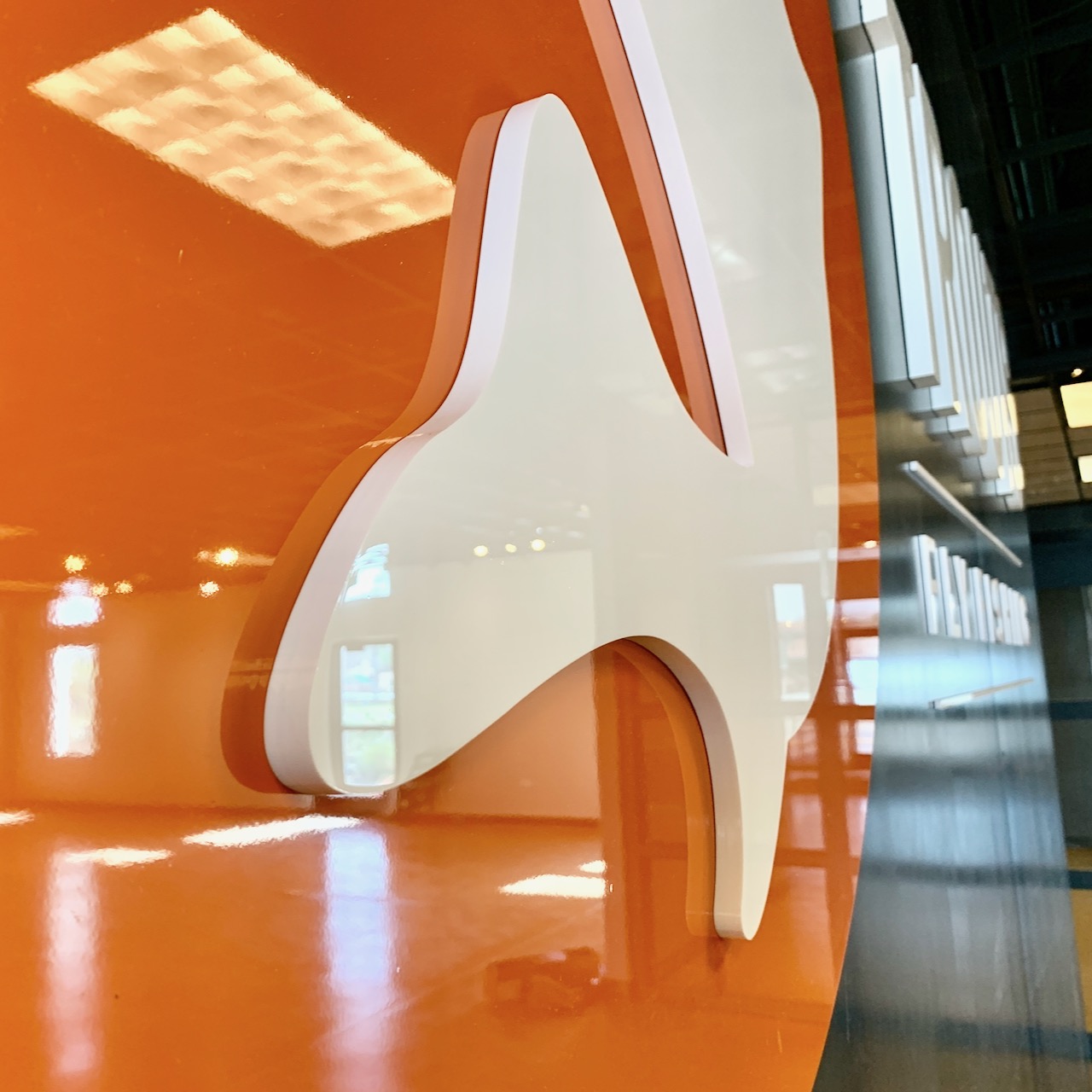
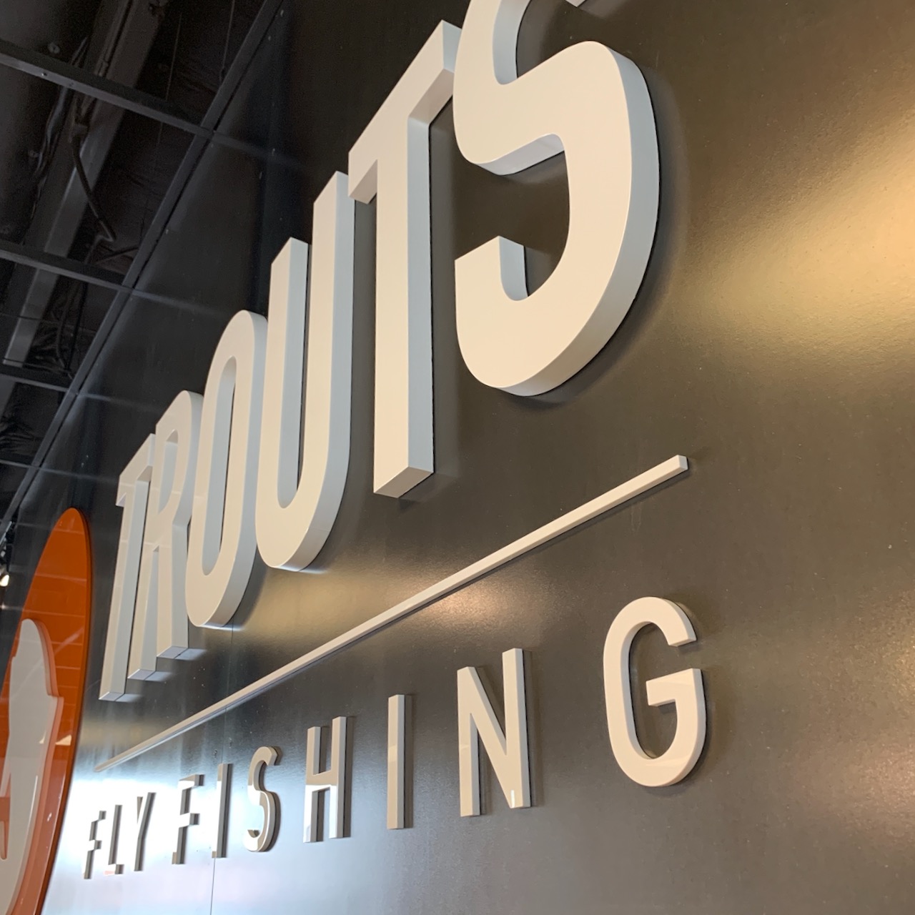
Putting up the logo sign…One of the most satisfying things to do in a new store!

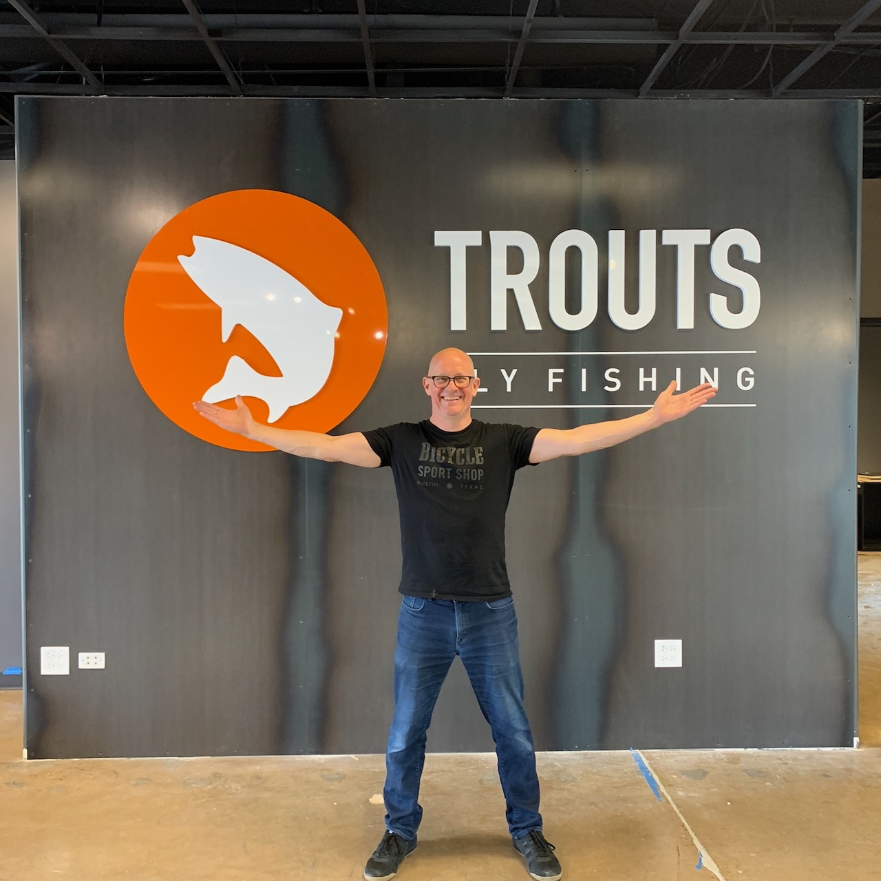
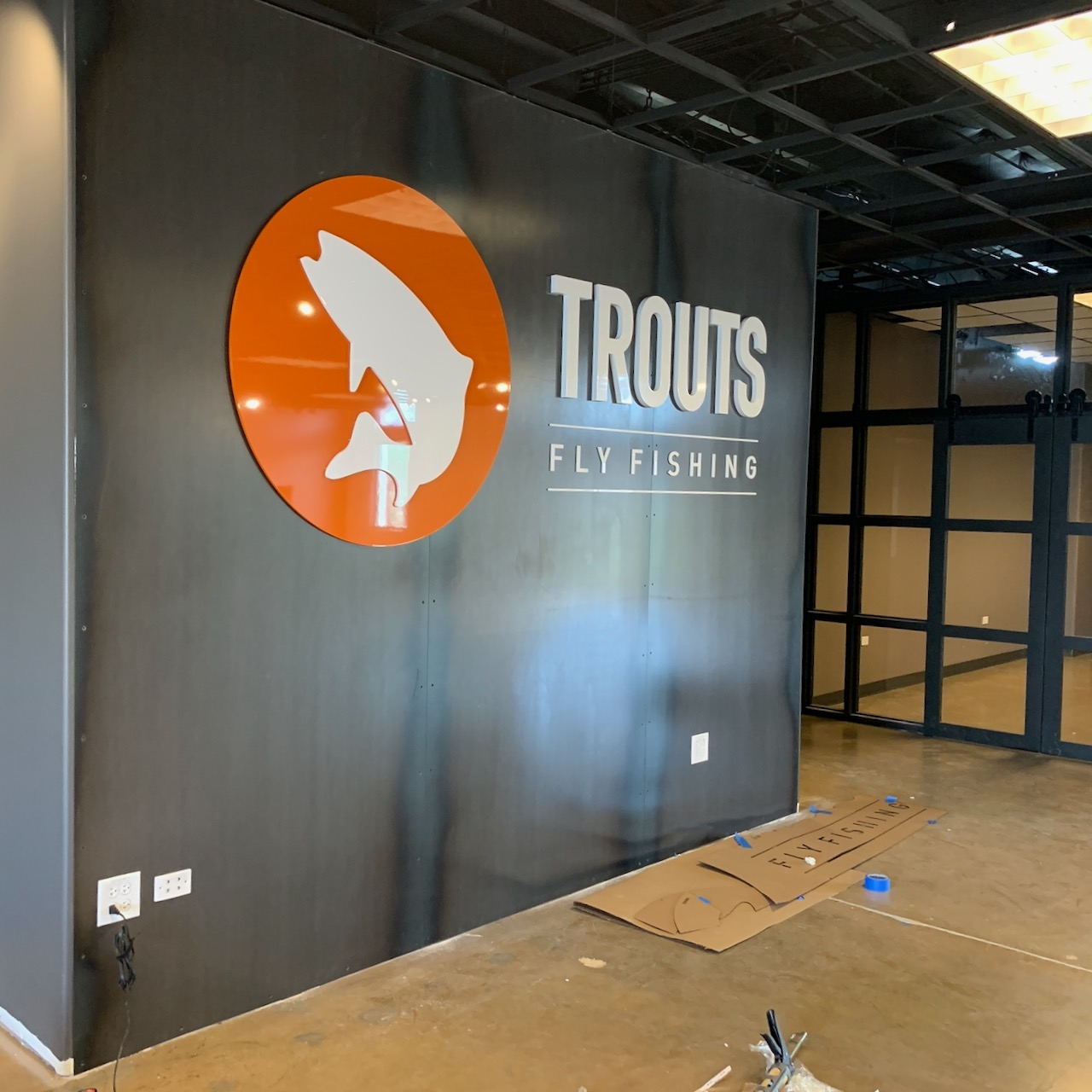
Watching a store come to life is so exciting, and yesterday I got to tackle one of the most satisfying parts…putting up the logo sign for the brand new Trouts Fly Fishing store in Denver. When that logo goes up, you can suddenly feel how cool the whole space is going to be.

Logo Sign

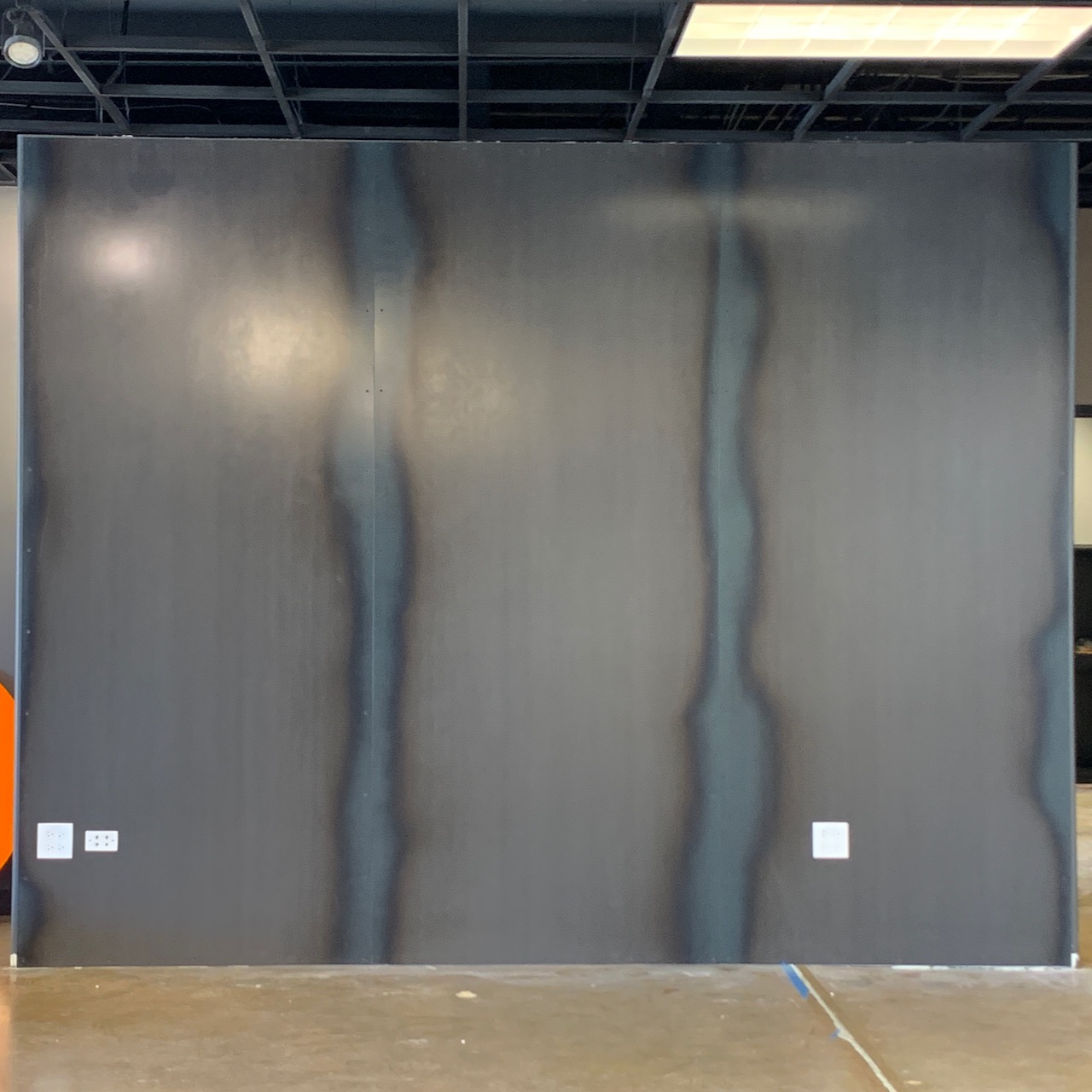
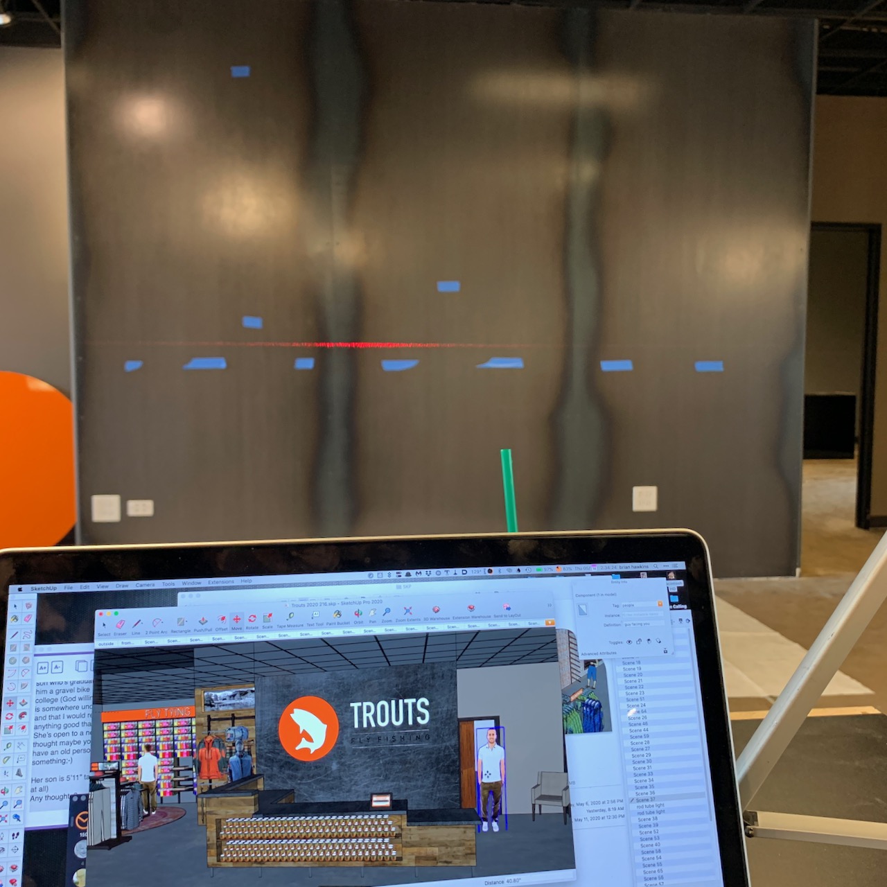
This particular installation had a high penalty for failure. We designed the wall (which will be behind the cash wrap counter) with hot-rolled steel on it…ooh la la. Installing the sign meant drilling holes through the new wall to hang the letters/logo. Nobody wants extra holes in their brand new steel wall.

Retail Store Design
Logo Sign Installation

Check out the time-lapse below of me installing the sleek new sign. I make it look so easy, right? Good thing you can’t see me pitting out while I do it!

The logo was built by Artcraft Sign Co. here in Denver and it looks fantastic.

Logo Sign
Logo Sign
Logo Sign

And, voila! The finished sign for Trout’s Fly Fishing. Be sure to check out this post about all of Brian’s retail store design secrets that will give your store an unfair advantage.

Defy gravity, and your customer’s ability to ignore your bike display

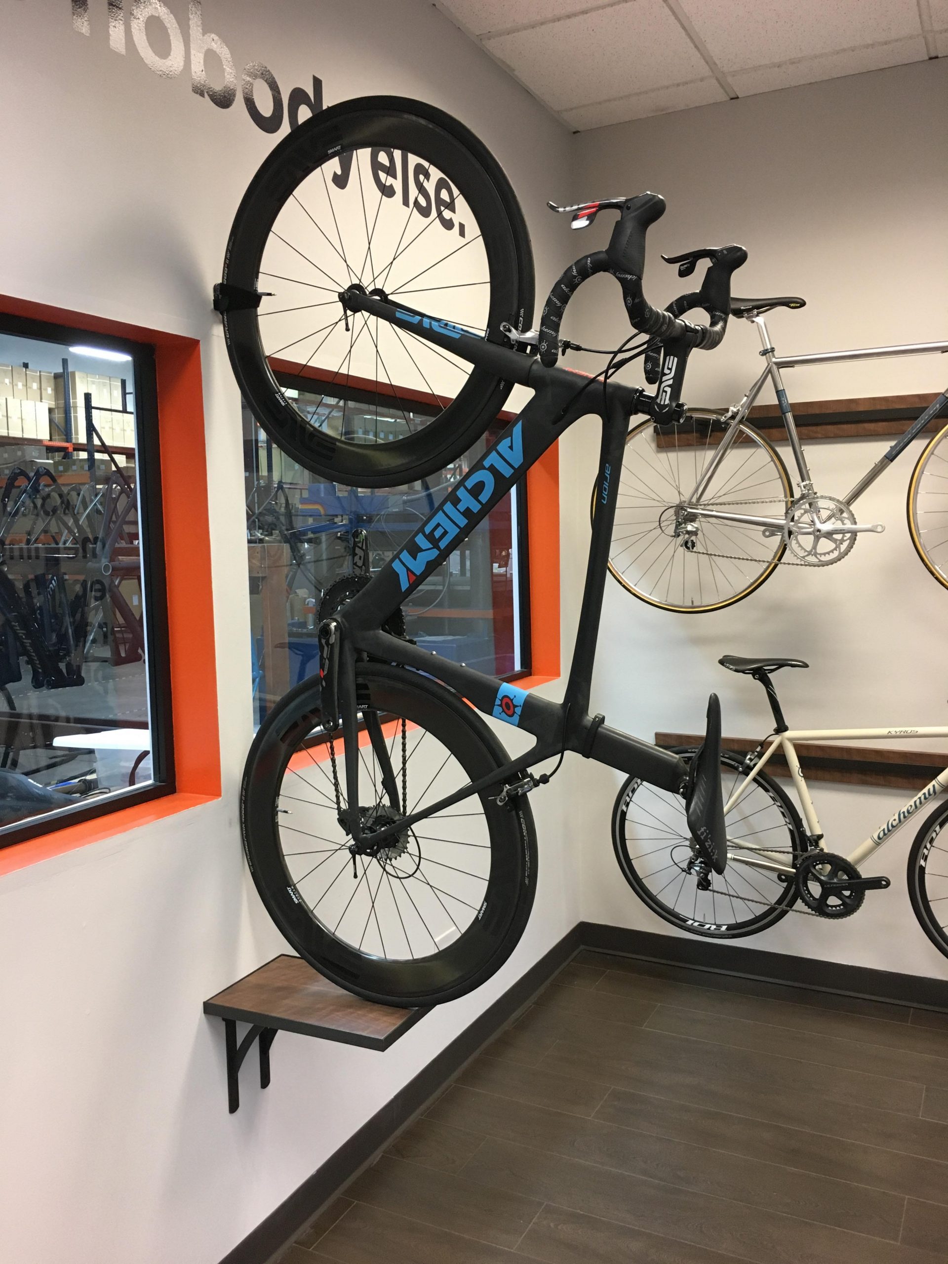
Have a unique spot for a product?  Need a creative way to display a bike – or anything for that matter?

We have to develop new ideas all the time so we are a great resource for ideas, and all the ways to produce them. This example is from the Alchemy store that we designed a while back. We have always loved this particular display. Need something unique for your own store? You know who to call!

Fixture Lab reveals retail store design secrets that will give your store an unfair advantage!

If you are an NBDA member you need to know about this fun Webinar

How’s an independent retail store supposed to compete with the big guys these days? How can I make my own store as engaging as the national brands/stores? And how the heck can I make my store’s brand stand out without spending zillions of dollars? If you’re asking questions like these, this webinar is just what the doctor ordered for you! In this fun presentation Brian Hawkins (the leader of Fixture Lab), will take us through a treasure trove of retail store design tips and best practices that the leaders in retail use every day. It’ll be like getting the keys to unlock the store you’ve been dreaming about.

Watch it here!

https://www.youtube.com/watch?v=yj_HnilE2vU

Put your customers right in the middle of a great day of riding!

You’ve heard it a thousand times.

Show your customers experiences, not just products. This display that we built for Bicycle Sport Shop in Austin does a great job of taking the customer’s mind right to a great day of riding their mountain bikes with friends. It never fails to get a comment from people walking in the front door. It also gives the team at BSS a chance to display other types of merchandise right along side the bikes. If you need help coming up with ideas like this, give us a shout. This stuff is super fun.

The best F%#ing Podcast About Retail Store Music

Manndatory Listening Podcast features our very own Brian Hawkins in a great discussion about music in your retail store.

This podcast should absolutely be in your weekly roundup. Packed with 16 years of business expertise, The Mann Group created The Manndatory Listening Podcast because they’ve got a lot to talk about…like, a lot of juicy content that you’ll want to soak up ASAP and apply to your business right now.

We were delighted but not surprised to learn that Brian of Fixture Lab’s interview on Podcast Episode #18, “Music In Retail” is one of their greatest hits! The episode is packed with valuable tips about the correct and best ways to create the perfect musical atmosphere in your store (there’s a lot more to it than you think). You’ll be able to apply most of his tips right away.

These are a few things you’ll learn about in the podcast:

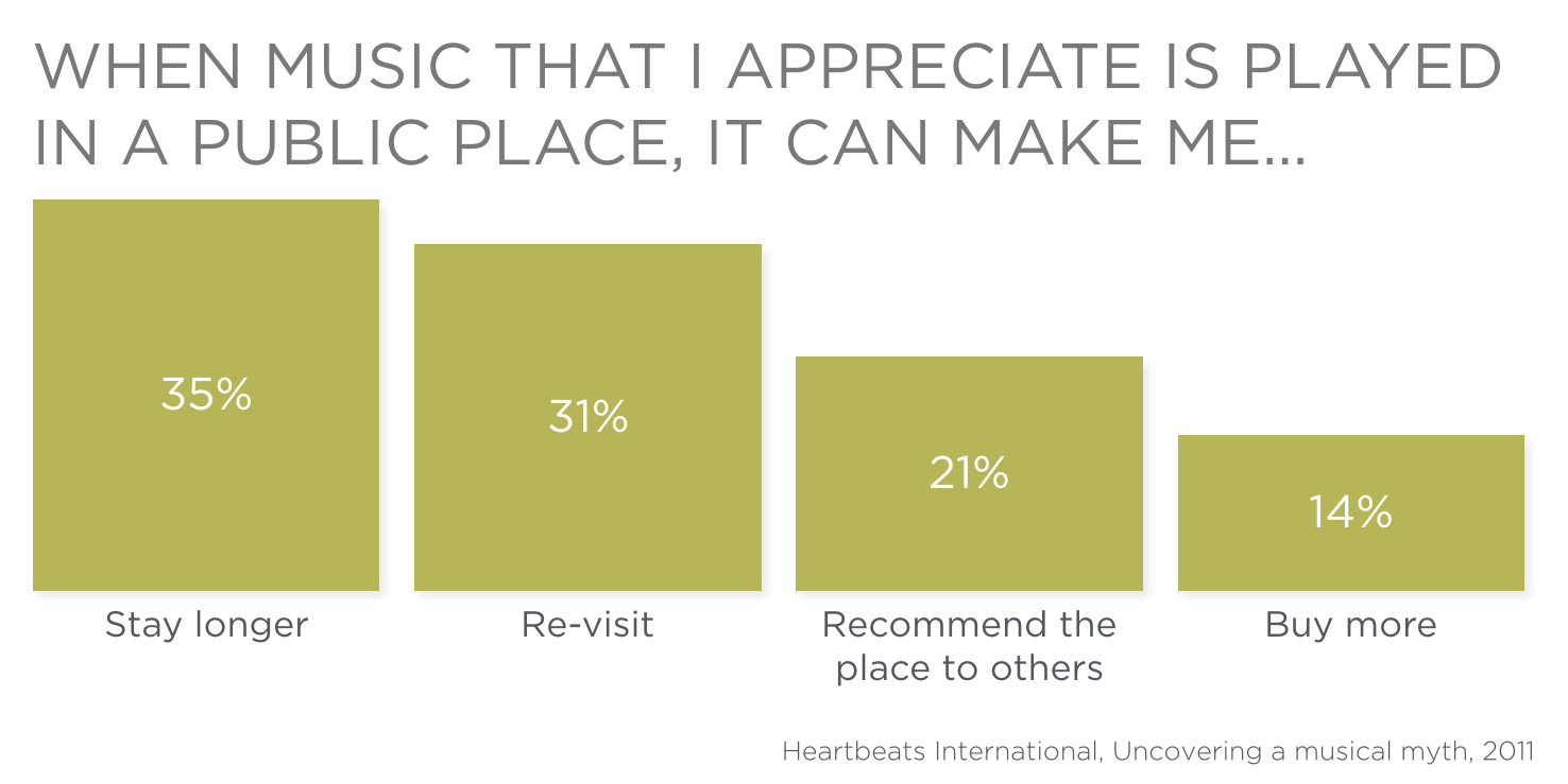
  • Help customers hang out in your store longer by selecting the right music
  • How your music actually drives sales
  • How music emotionally connects with your customers, your brand, and your space
  • The best sound system to use
  • The legalities of playing music Spotify, Pandora, and Apple Music
  • Music resources that can provide you with great, clean, non-offensive music

Do yourself a huge favor and click here to listen to the episode.

For a more in-depth look at how exactly you can elevate your store with music that keeps your customers coming back, check out our two-part blog post series, “Making your retail store sing by adding the perfect music” here:

Part 1, The Importance of the right music in a retail store and the equipment to use

Part 2, Selecting the right music source and songs


The Most Customizable Retail Display, Ever

The Fixture Lab Gondola

If you don’t know about this completely customizable fixture, it’s about time you learn!

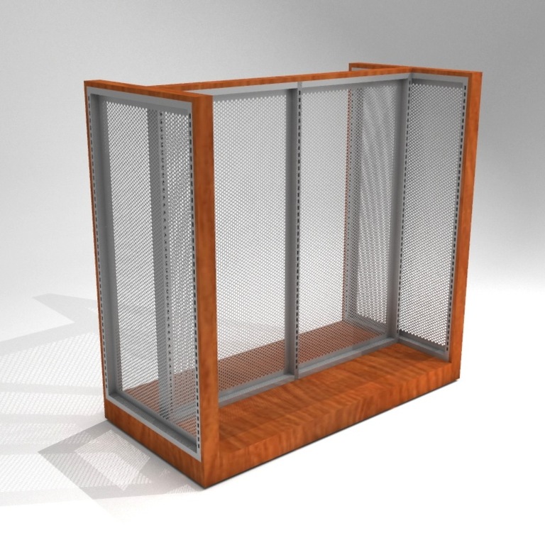
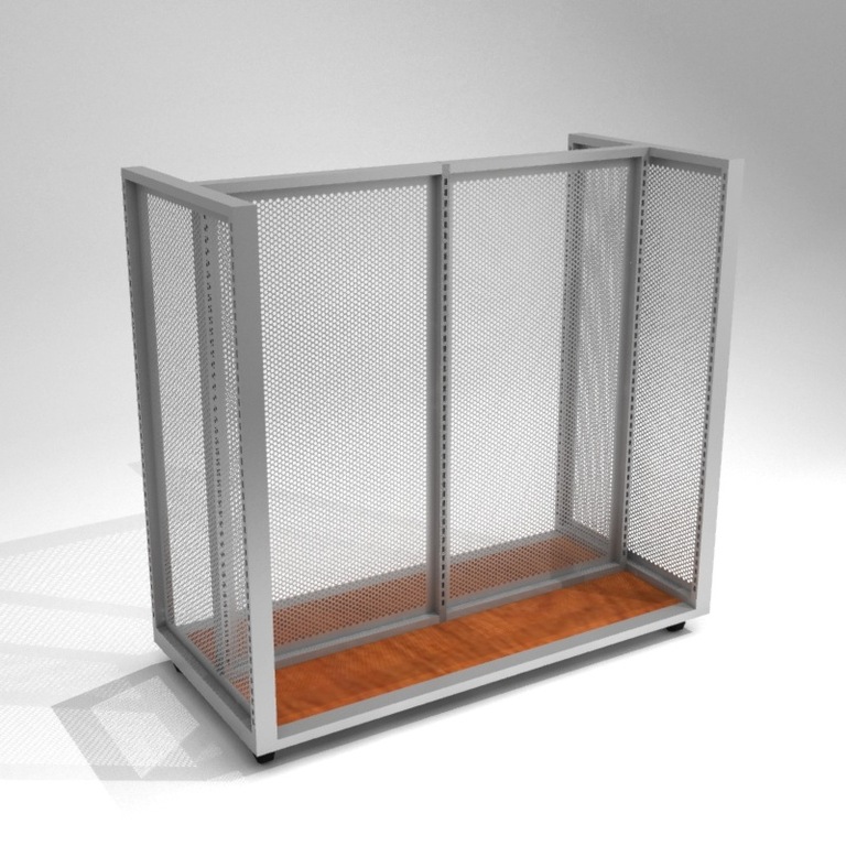
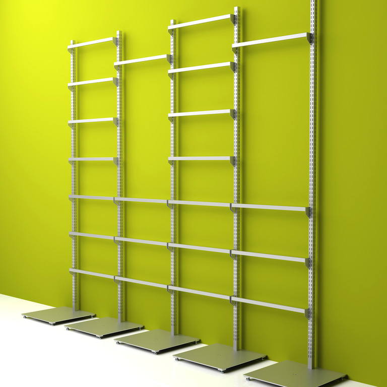
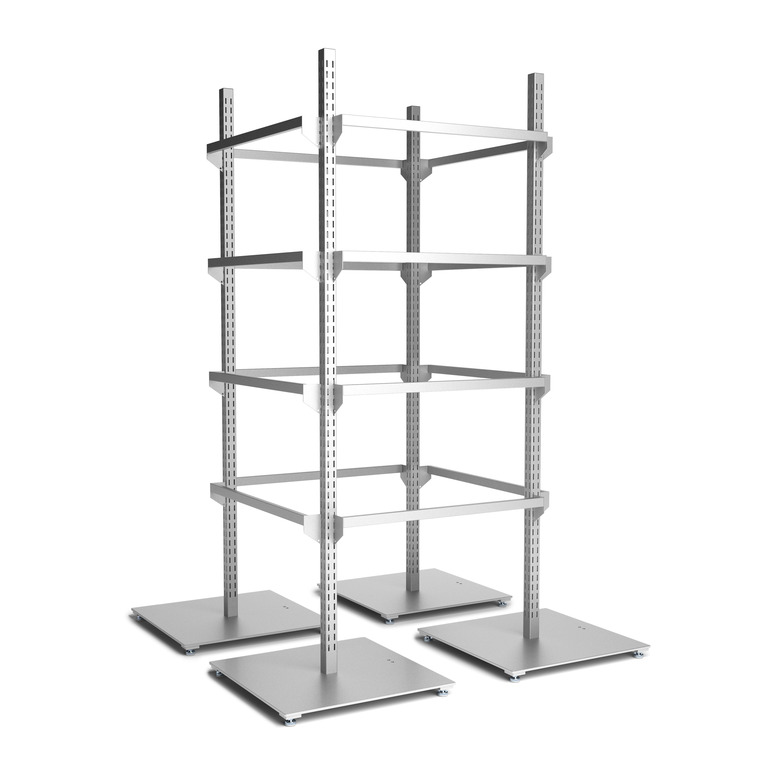
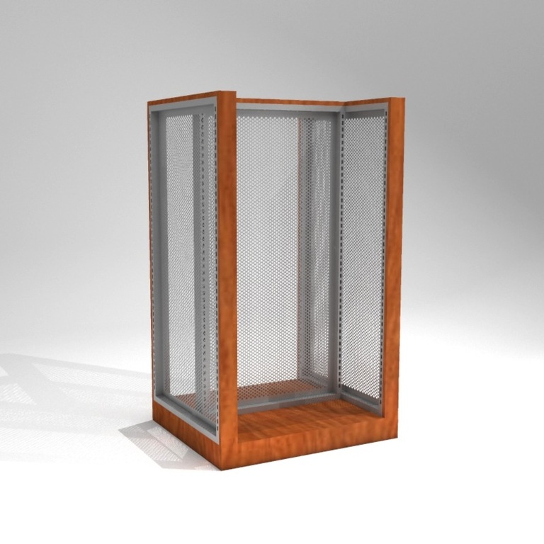
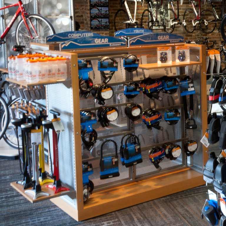
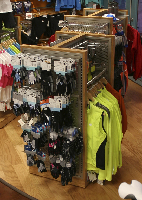
A common fixture in most retail stores, as you probably already know, is the Gondola. Gondolas are great for displaying a plethora of items in one cohesive, beautiful fixture. And when you have wall fixtures and gondolas that are the same system, your merchandising world becomes A WHOLE LOT BETTER because you can put just about any fixture that goes on the wall, on the gondola….and back again. That means that moving product around is EASY and you are about 999% more likely to update displays more frequently. When you move stuff around more frequently your customers are kept more engaged. When your customers are more engaged you SELL MORE! Not to mention, when you have a nicely fixtured store, it’s great looking. Who can argue with being great looking?!

We can build you just about any size, configuration, and finish, that blends seamlessly into your store’s style…so give us a call and let’s get started.

Increase Sales Today With This Wheel Display Hack For Your Bike Shop

If you are a bike shop, you have wheels to display. If you have wheels to display, then you are absolutely challenged with the problem of how to display them in a beautiful, easy to use, way. This is the exact problem that causes thousand dollar wheelsets to be displayed on 69¢ 2x4s at bike shops all over the place 😉 Showing wheels can be a pain in the A@#$!…until now.

You need to meet the ECLIPSE WHEEL DISPLAYER!

This super simple and elegant fixture literally hides behind the wheel, so that all the customer sees is the pretty wheel you are showing! And because it doesn’t rely on the QR or the Thru-axle to hold the wheel, your wheel display life is about 300% easier! Check it out.


A Cool Bike Display Idea You Need To Use In Your Bike Shop Today

Is your bike shop needing a clean, sophisticated way to display bike frames? Tires of having to rig up goofy ways to hold expensive framesets on your walls? Well, we have the perfect solution for you.

Are you ready to hear what this cool idea is?? Okay. We’ll tell you. Here it is:

The Frame Standoff Set

Why it’s cool:

Aside from making your bike frames look clean, sophisticated, organized, and all-around beautiful in your shop, the Frame Standoff Set keeps your valuable frames safe…mounted to the wall until you take it down.

What it is:

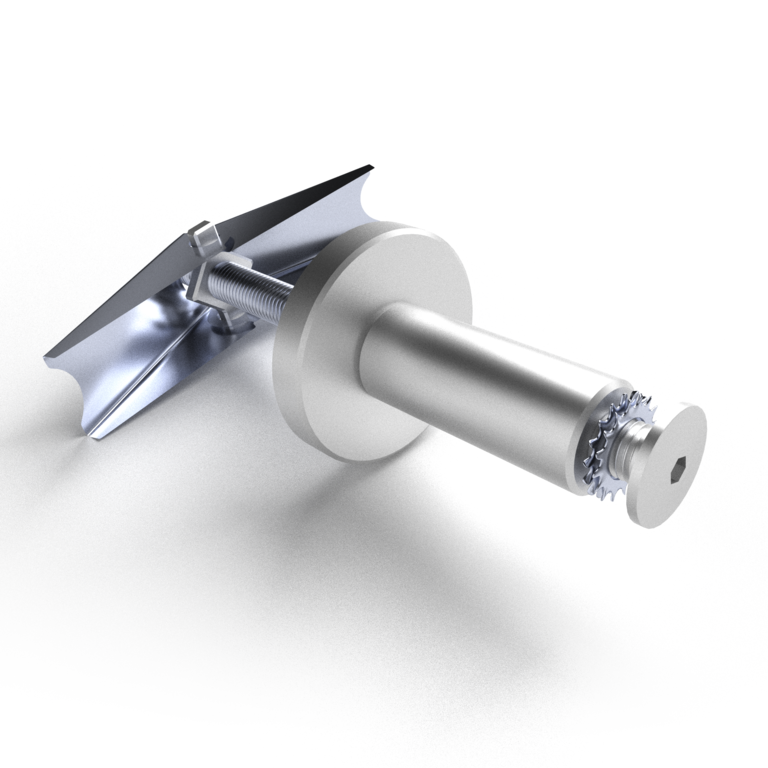
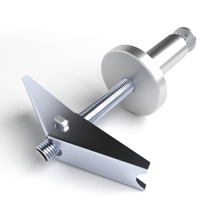
The Frame Standoff set includes these two stand-off style brackets made out of CNC aluminum for a very polished look.


Be sure to check out the set on the website here for pricing and order details.

Note: Some frames these days are really goofy, and sometimes they require different washers to display perfectly. Fear not, we’ll help you if that’s the case.

Being The Retail Store of The Future

Tips on how you can make your bicycle retail store kick butt, instead of it kicking your butt!

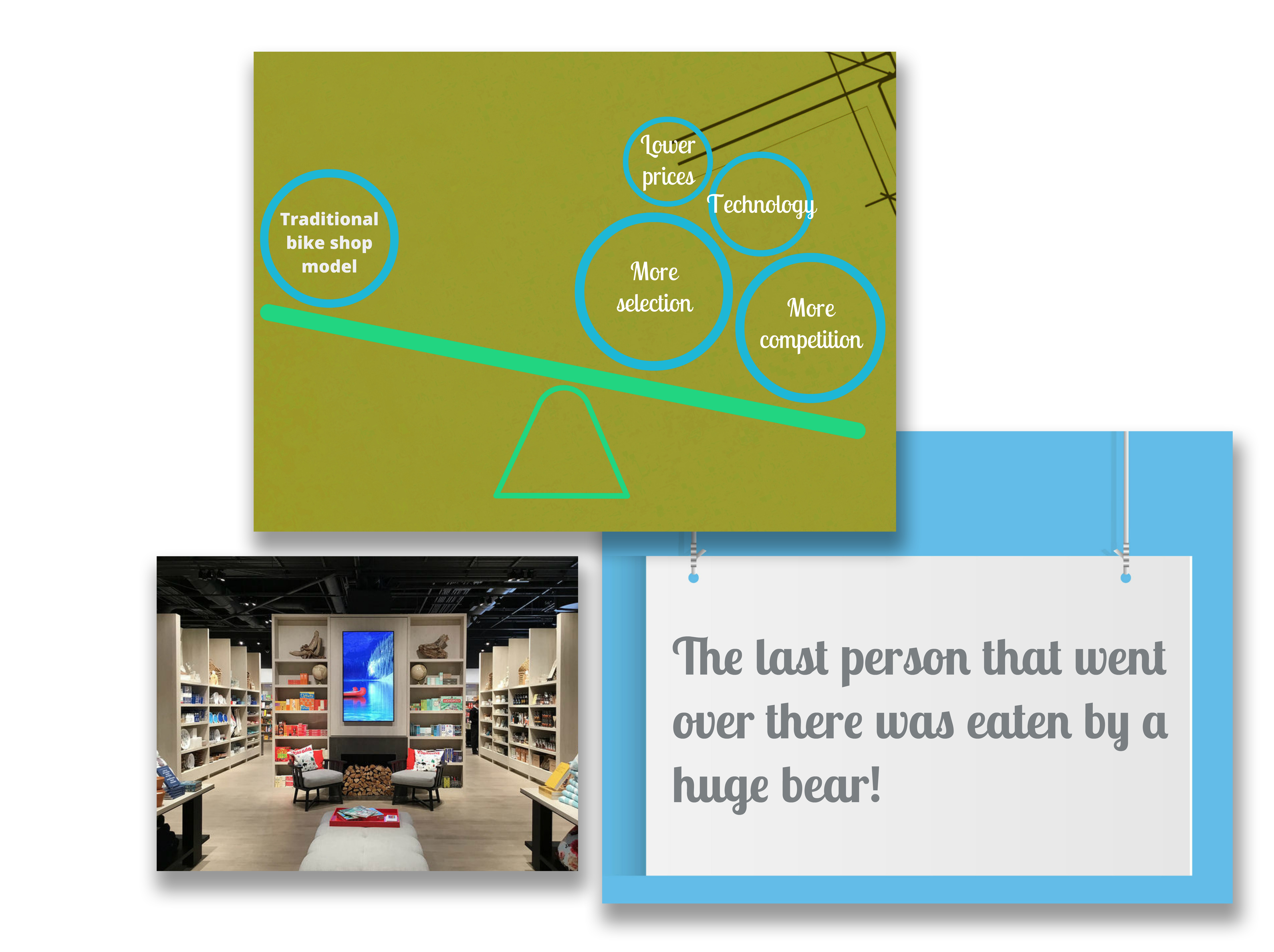
Brian of Fixture Lab explains exactly how to do that in his recent webinar with the National Bike Dealer’s Association, “Being the bike shop of the future is all about being a great retailer of today”. If you missed his webinar and you’re a member of the NBDA, login to their site where you can listen to the recording of it here and follow the topic titled “NBDA Webinar Recordings”.

The biggest takeaways from this webinar were also published in a recent post in Outspokin’s blog here. Outspokin’ summarizes the main topics & takeaways that Brian covered in the webinar, such as:

  • The importance of continually keeping your store fresh/changing things up
  • Prioritizing customer experience
  • Bespoke (making people feel special with customized products)
  • Fostering a strong community
  • Technology integration
  • Telling a story
  • Standing out and being remarkable

Be sure to check out both the NBDA webinar for the rest of his extremely valuable tips, and head over to Outspokin’s blog post for a full summary of the webinar.

Let us know what you think in the comments, and feel free to call us with any questions about how we can help you design your store. We’re here for you!


Elevate Your Visual Merchandising With This Crazy-Flexible Fixture

Introducing every store merchandiser’s best buddy: The Outty Tower!

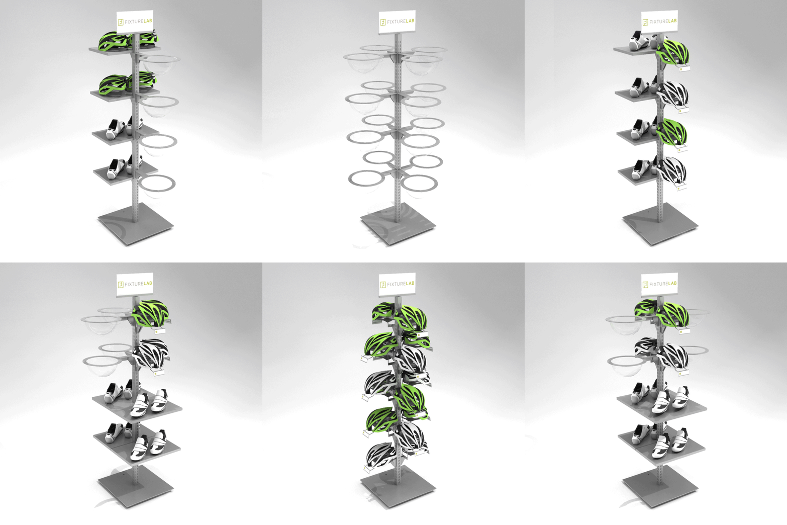
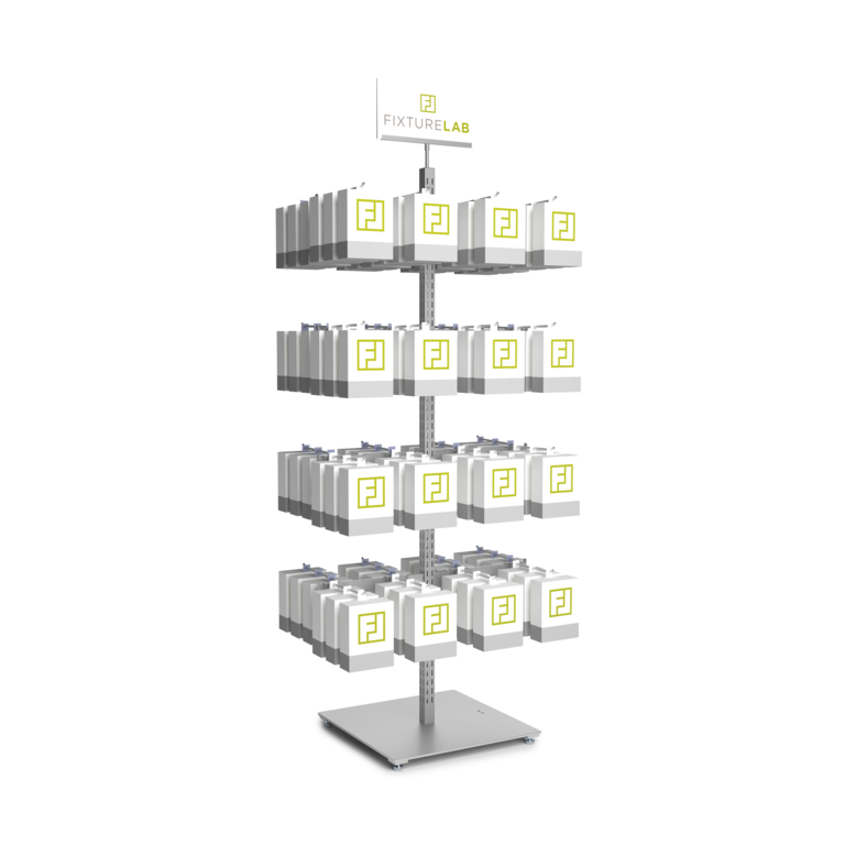
Meet The Outty Tower, the completely customizable fixture that can solve just about any of your in-store display problems. No matter what product you want to display, the Outty Tower can do it, big or small. Create any type of tower for your unique store layout, and then change it, and change it again..and again.

Why it’s cool:

Place It Anywhere

Literally, anywhere. In the middle of your sales floor, against a wall, let it stand alone, combine towers, the options are endless.

Place it on a wall

Create a wall of merchandise that’s not attached to the wall! Then, easily move the towers around when you want to refresh your visual merchandise display.

Standalone

The Outty Tower holds all sorts of products, and it takes up almost no floor space (only 2.5 sq ft). That means that it can fit just about anywhere you need it!

Combine towers

Create the ultimate tower with multiple towers, and display even more.


Configure yours today!

Just give us a call, and let us know what you want to show and we’ll help you dial-in the perfect tower. 303-777-2014


If you’re looking for something similar and super customizable, we’ve also got what you’re looking for. Check out our Gondola post, The Most Customizable Retail Display, Ever” here to learn about how this display item can be custom made to fit beautifully inside your store.

The Best Grip Display In The World

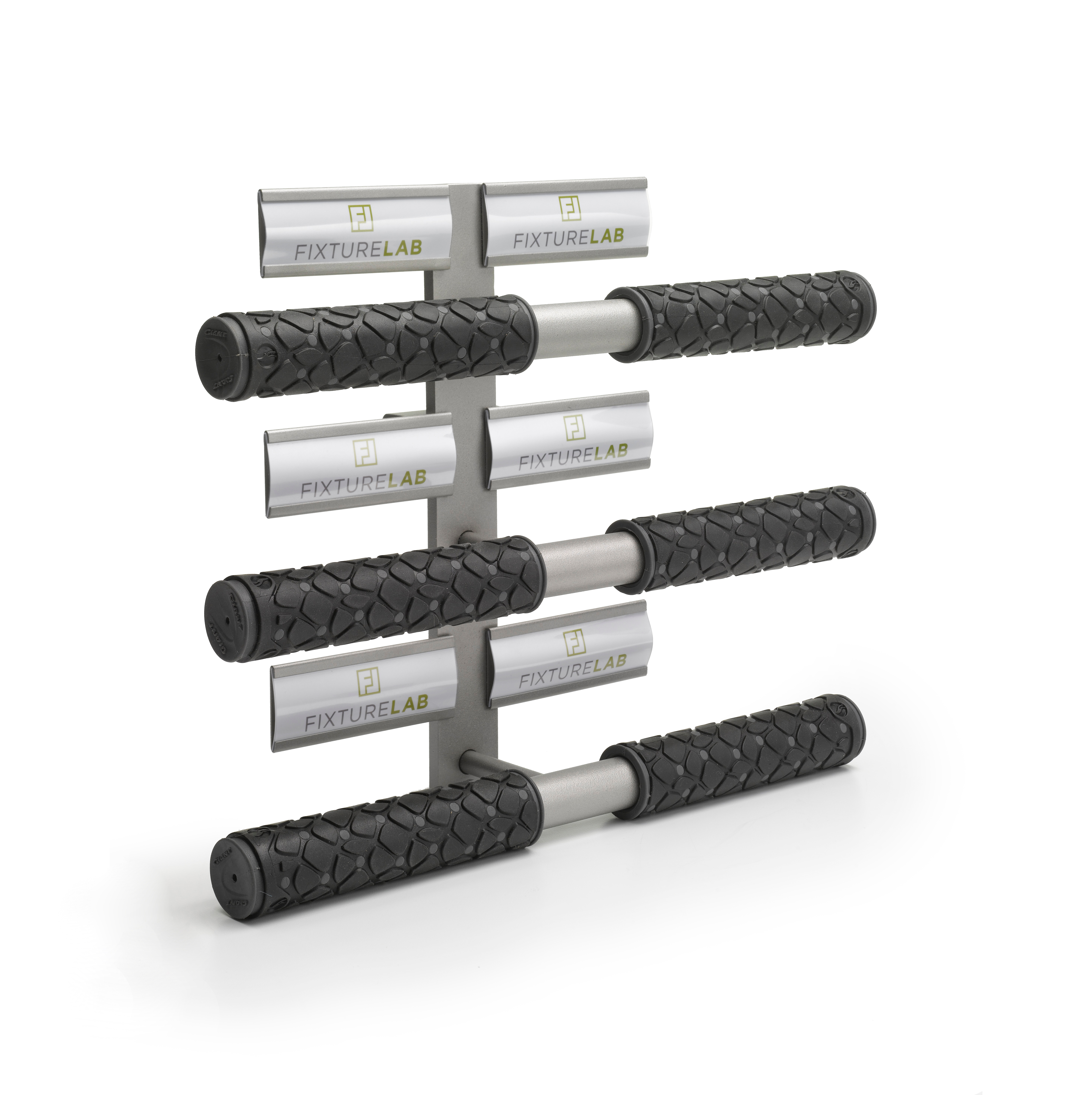
Are you the kind of person that likes to try/touch/feel something before you buy it? Same. Fixture Lab’s sweet Grip Displayer allows you to display up to 6 different grips out of their packaging for the full sensory experience. Check it out on our product page here.
People are initially attracted to how visually appealing something is…it’s science. People are even more attracted if you can also touch & experience it! Also science. This display is a great way to elevate your customer’s experience. Go ahead and place some grips on display for your customers to feel. Then watch what happens (more sales).

Secret tip: Sure this is great for displaying grips, but you can also wrap the bars of the fixture with bar tape in order to create a really nice tactile display.


The One Fixture You Need In Your Store If You Have Special Items To Display

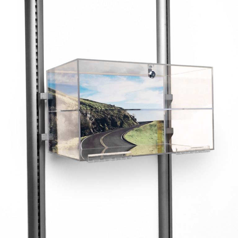
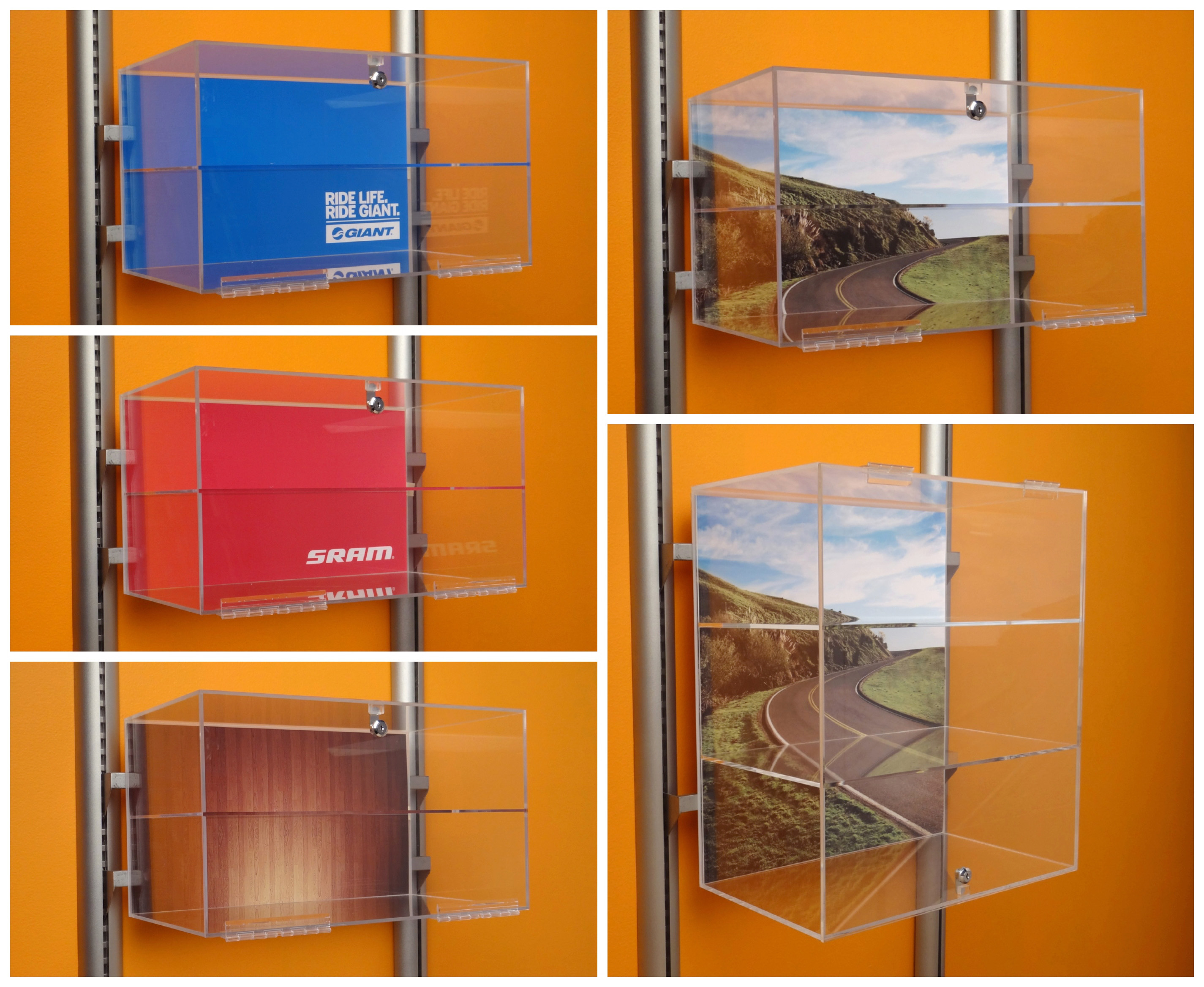
The Acrylic Display Case is the perfect solution for displaying those products that deserve extra special attention. Instead of just hanging it on a wall, place your product in the Acrylic Case to protect, secure, and feature it in your store. The case offers extra security with the key and lock option, while displaying the product beautifully.


Make your product stand out with a graphic background. The case offers the ability to slide your own unique graphic in the built-in slot, just like the options in the photo to the left.
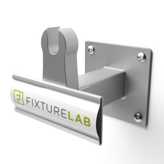


The best part is that it’s unbelievably easy to hang on a crossbar in your store. It only takes about one second to hang!


Check out the Acrylic Display Case on our product page here for details and pricing.

Level Up Your Bike Shop Wheel Display With This 1 Easy Trick

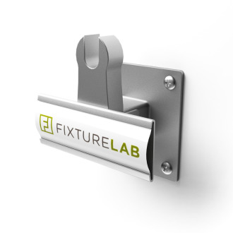
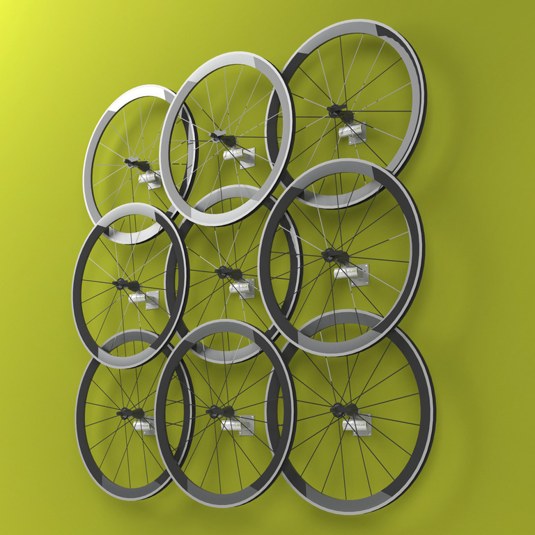
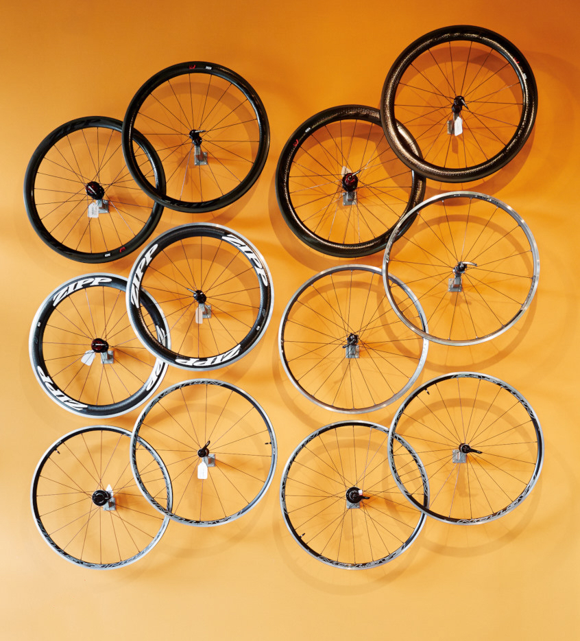
If you’re looking for a functional AND beautiful way to display wheels in your bike shop, you’re going to love our Wheel Standoffs. These little fixtures come in short and long sizing so you can overlap the wheels, just like the display below. The result is a thoughtful and visually appealing way for your customers to view all their options.

The Long Wheel StandoffThe Short Wheel Standoff

A bonus feature about these fixtures is that each has an optional magnetic price card holder. Use it to clearly communicate prices to your customer, or if you don’t want to use it, you can simply remove it.

Up-level your retail store design with these small but mighty fixtures to make your wheels stand out. Check them out on the Fixture Lab site here (for the shortys) and here (for the long ones).

Don’t just make space for service department, design it.


We know your pain! The retail bike biz is a tough one, and sometimes areas like the service department can evolve into a less-than-optimal monster. Fear not. We can help.
Whether your service area needs to be re-thought, made sexier or you’re just trying to upgrade your store’s service game, you should check out NBDA’s latest Outspokin newsletter, “Make It Sexy: Tips for Sprucing Up Service” written by our own Brian Hawkins.

In the article, Brian spills the beans about designing sexy & functional service departments – offering so much value. You can even use his tips and take action on them like, today! Hint: it’s not just about fancy displays and reclaimed wood walls.
“…national statistics show that bike service is one of the highest performing areas of the bike shop these days, so there’s no question that your service department is worthy of a good hard look.”
He’ll walk you through step-by-step the specific ways to understand if your service department is operating smoothly or not and what to do about it. By the end of the article, you’ll understand the four solutions to problems that come up when changing your service department. Then, he’ll lay out all the mistakes to avoid. Again – so much value. You can take this information through the lifespan of the business and pass it along to your team.
We can’t wait for you to soak up all the wisdom that Brian offers and learn about how it impacts your store. Check out the article now!

Brian made famous by article in Bicycle Retailer ;-)

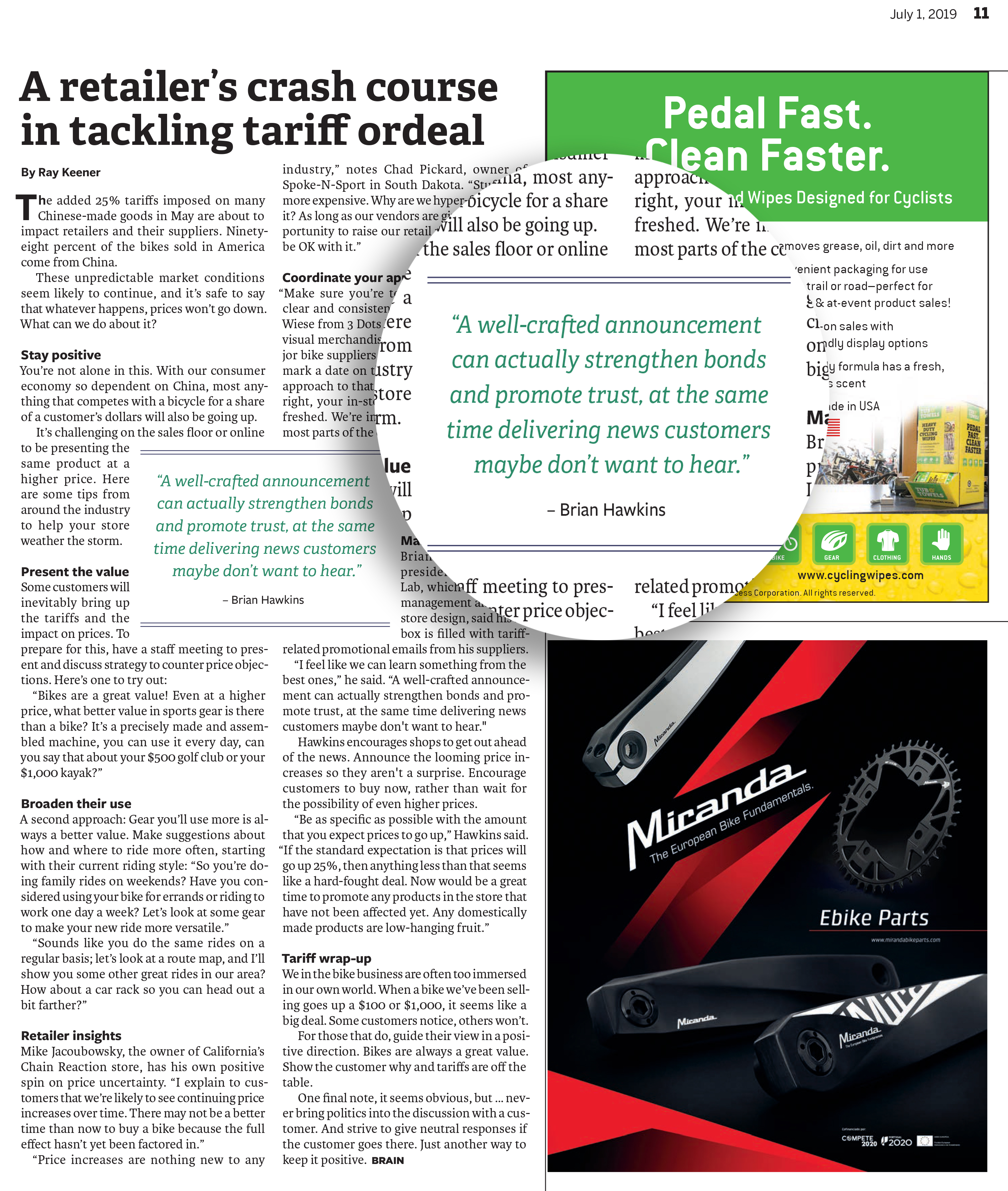
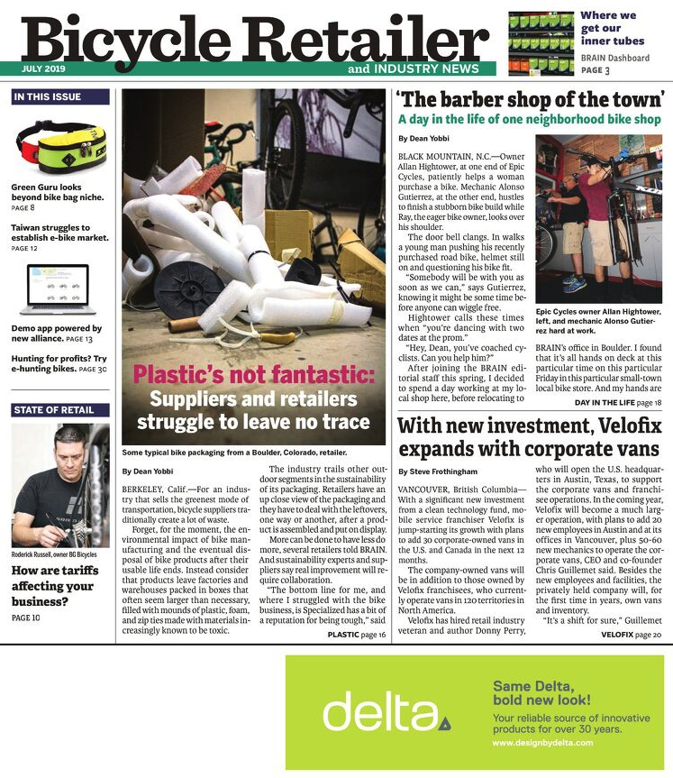
Fixture Lab is honored to be featured in the latest Bicycle Retailer and Industry News. He is basically famous now.

Well, maybe not famous, but if you own a bike shop or retail store, the issue on tariffs applies to you. In this article, you’ll learn how the China tariff ordeal will impact US bike retailers and what you can do about it as a shop owner.

Our foremost tariff expert (insert throat clearing noise here), Brian Hawkins was interviewed and in fact featured in the center of the article. Brian explains how to keep the communication positive & transparent with your customers in the face of increasing prices. Read the full article below for some key ways you can keep the value of the bicycle at the forefront of your customer’s mind and your sales steady.

P.S. Don’t miss out on reading the Bicycle Retailer’s full issue here.

Huge News: Fixture Lab Teams Up With NBDA

If you run a bike shop and you are breathing, we have huge news.
We’ve partnered up with the National Bicycle Dealers Association aka NBDA. As an NBDA Preferred Partner, Fixture Lab is super excited to help bring the NBDA members extra special discounts on our unique services, because we really like you. We want your business and store to be successful!
What this partnership means: we get to bring more value to you by helping you save money to create your dream store. Whether it includes just a few new pedal display fixtures or an entire remodel, we can absolutely make your dream store happen for you. Stand out from the fierce retail competition and let Fixture Lab help make your store sing.

What we’re offering you:

As a preferred partner, we’re discounting store fixtures and offering a FREE in-depth, custom store remodel budget creation/consultation…a $500 value.

The good news is: It’s crazy easy to take advantage of these sweet deals! All you need to do is be a member of the NBDA and hop on over to their website which you can find here! Happy Designing!

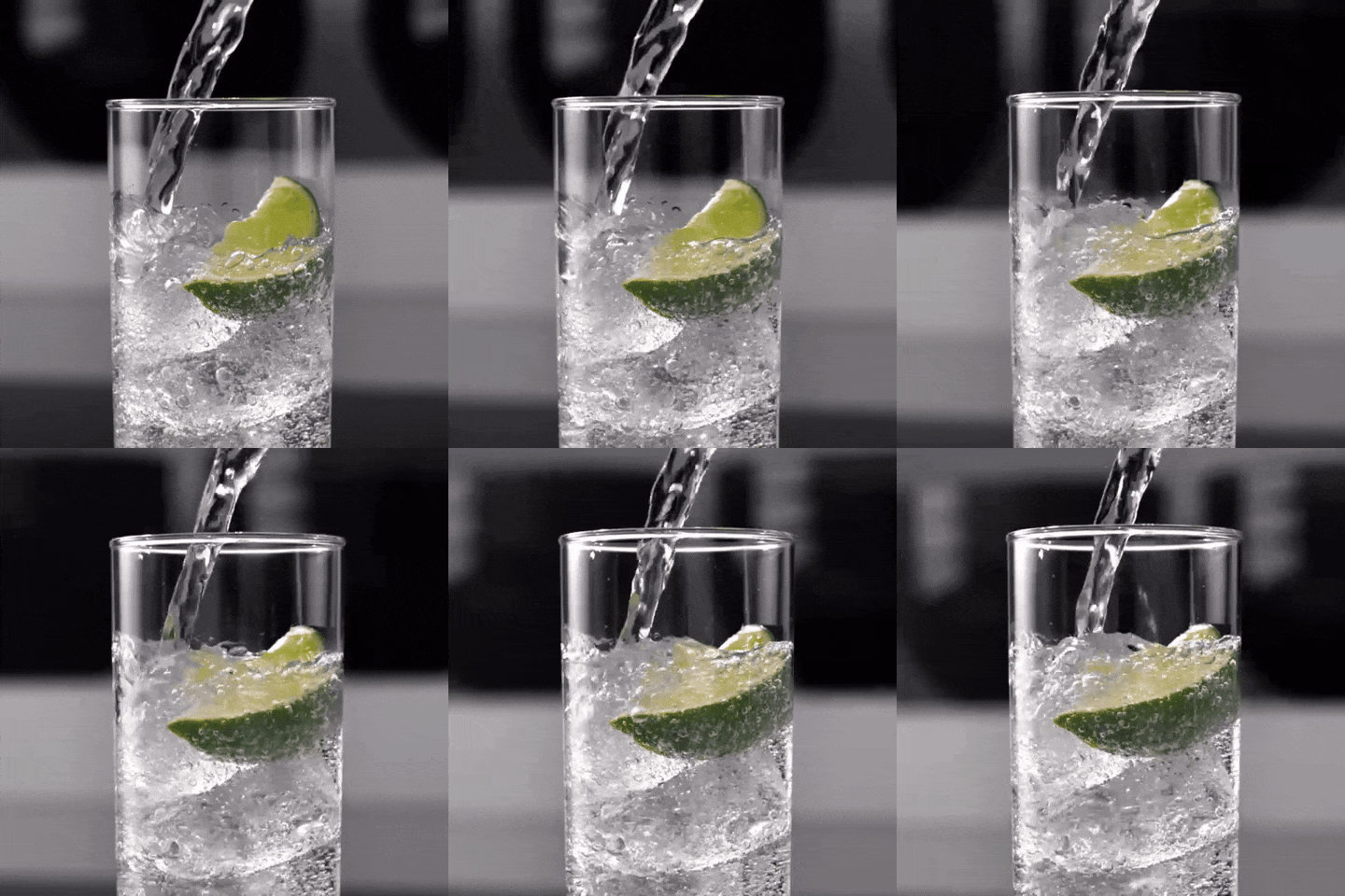
Is there any difference between canned sparkling waters?

FINALLY we are digging into some of the preeminent and pressing questions of our age: Is there any difference between canned bubbly waters? And if there is a difference, then which one is the best?
Why this topic for Fixture Lab? Why not! Carbonated water makes people happy. Happy people make good decisions and they take great care of customers. So toss out all the other advice we have given on retail stuff and just do bubbly water right;-)

I’m a big fan of a little gassy water to accompany my coffee. When I buy the water, I have always wondered…Is there any difference? Should I just be buying the cheapest one? So we decided to do a super scientific blind taste test.

The bubbly water we tested

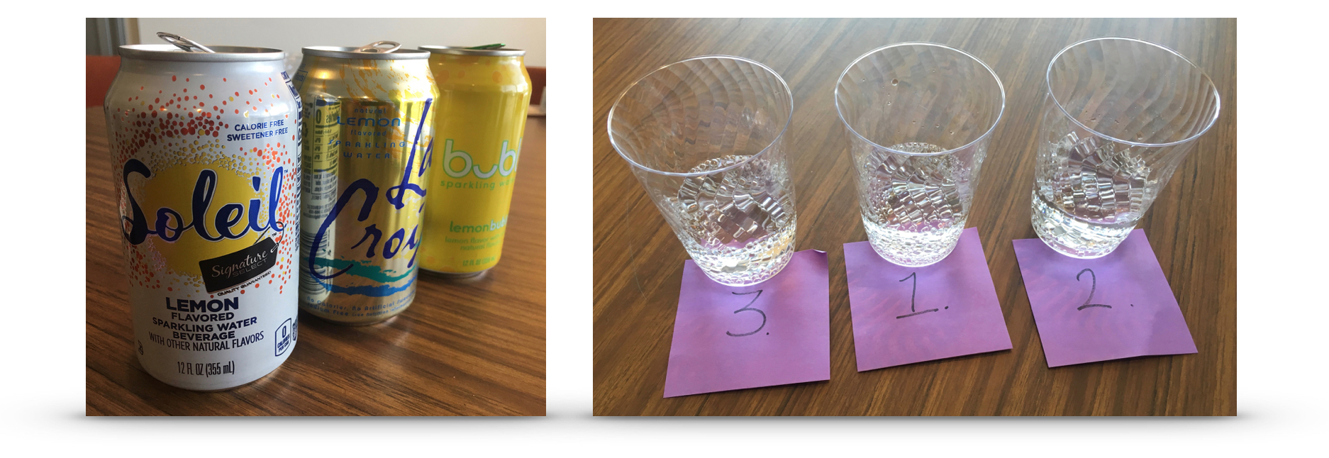
For our test, we grabbed three common brands that cost all cost a bit different: Soleil (Safeway’s store brand), LaCroix, and Bubly

How we tested

We poured equal amounts of the different products into matching cups. The sticky notes had the name of the product on the bottom, so we could keep track. Then, we had people taste test and take as much time as they wanted to determine if they tasted a difference, and which one they liked the best. We switched the order for every participant to keep it random.

The results

Bubbly water test results

To be honest, I was the most challenged to taste any difference between the three waters. Beth, Christina and kimberly all said they could taste a clear difference. I thought they were lying until I asked them to identify the product by tasting it after we finished the test.


Interestingly, Bubly didn’t do too well in our test. Soleil and LaCroix battled it out for top honors, which was also interesting because those two represent the two ends of the price spectrum.

In a completely unfair and unscientific twist, I personally am going to buy Bubly water. Even though it was most people’s 3rd favorite, and it’s more expensive than Soleil or LaCroix, I like the can a whole bunch more. Drinking out of a can that I like makes the whole experience better. Take that Soleil!

The take-aways

  1. There is actually a subtle difference in taste between these waters!
  2. We recommend Soleil or LaCroix for taste, and Bubly for can design
  3. If you have a really discerning taste, we recommend that you taste all your options before you commit to the water you want to buy. It would be horrible for your to get the wrong one.

Fun extra fact:

We have heard people say LaCroix differently. Here is the correct pronunciation: La-CROY, rhymes with enjoy (that’s from the LaCroix web site)

Blazing Saddles opens first retail bike shop in Sonoma!

We are very excited to announce our latest! Blazing Saddles called us when they decided to open a retail store alongside their new bike rental location in Sonoma, California.

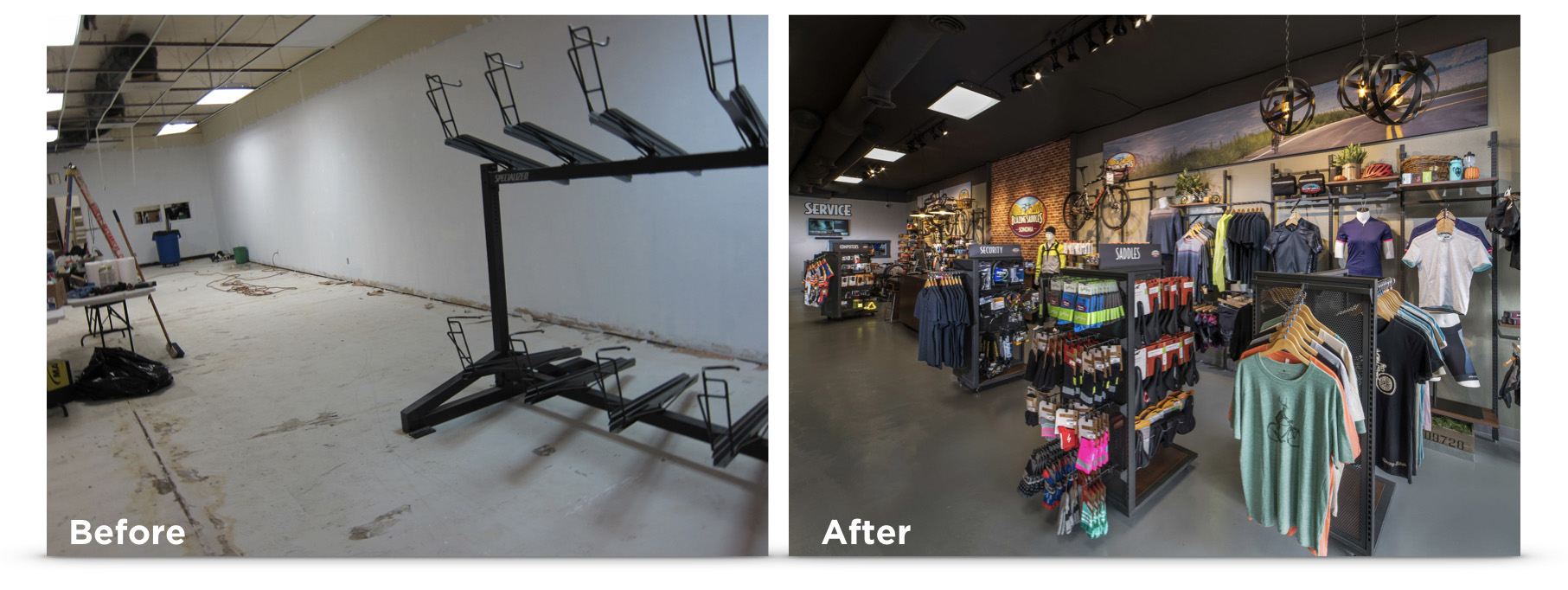
Before and after photo of Blazing Saddles, SonomaGetting a chance to help a veteran bike rental organization with a new retail store.
You might know Blazing Saddles already, because they run an amazing business in San Francisco renting bikes to about a billion people a day. When you are around San Fran, you can’t miss the droves of happy people on Blazing Saddles bikes. Their operation is seriously impressive, so when they called and said that they wanted help designing and implementing the retail & rental store in Sonoma, we were like, “Oh hell yea!”

We were able to pretty much help with every aspect of the new store…floor plan, fixtures, graphics, signage, merchandising, etc. We even installed one of those Sonos sound systems that you might have read about in our previous blog post. By the way, see those fixtures? The Blazing Saddles team wanted a look of their own, so we produced all the fixtures in their own dark grey paint color. They look really great!

We could not have had a better time working with the awesome team at Blazing Saddles! If you are in the area, make sure you stop by and say “Hi”

Flip through these pics!

Go check it out!

Blazing Saddles
20093 Broadway, Sonoma, CA 95476
https://www.blazingsaddles.com

Making your retail store sing by adding the perfect music. Part 2

Part 2 of the perfect music for retail stores:
The music itself

We’ve all had shopping experiences that were enhanced by the right music playing in the store. It seems natural when it happens, but if you are in the store of a savvy retailer who knows who they are as a brand, it’s more than natural, it’s scientific. Music is a huge part of our lives, and supporting your brand’s environment by playing the right music in the right way can have a profound influence on your customers.
music statistics

A quick note about the depth of this article: The science of the effects of music on consumers is a very deep subject with complexities that you could make a career out of understanding. Since we doubt you have time to study a new career today, we’re going to highlight some key topics and share our quick opinions on solutions. If you’d like to dig deeper please give us a call. We eat this nerdy stuff for lunch.

Setting the stage for the right retail store music, with the right equipment

If you haven’t read part 1 of this series, click here and check it out. It has some very useful info about choosing the right equipment for a great in-store musical experience. In this, part 2, we are digging into the music itself.

What is the right music for a retail store?

It’s tough to summarize all of the science that can go into making the right musical selections in your store, but at a very basic level these two factors will shed light on the right choices:

  1. Start by defining what your brand sounds like.
    Good or bad, your retail store tells the story of your own brand. Take a step back from picking songs, and do some strategizing about the story you want your brand to communicate. A store that wants to tell a story that embraces the whole family is probably not going to be the right place for hardcore rap music with n-bombs being dropped every 5 seconds. Think of our store’s brand like its a person with a deep personality. What would that person want to listen to?
  2. Don’t pick music you like. Pick music that your key customers like.
    Most of the time the person who runs the store, or picks the music isn’t a carbon copy of the core customer the store wants to embrace. Just like in step one above, take a step back and describe your most important customers. Pick music they want to hear. Don’t be persuaded by the outspoken shop guy who swears that creating a working environment for him is what really matters.

If you select the right music sources, the selections you make and the right amount of variety is way easier than it used to be. Today’s good resources for retail store music will also offer a huge selection of music without offensive language that could very quickly erode all your best intentions.

The legal issues with playing music in your retail store

Most businesses aren’t even aware that they are breaking the law when they play a radio station, Spotify or personal music playlist in the store. To be legit, your business needs to pay for licenses from BMI, the ASCAP, and SESAC for the rights to play music. Even consumer streaming services like Spotify or Pandora are not intended for commercial use. Using one of these services, even when you have the licenses from BMI, ASCAP, and SESAC, may put you at risk of breaching that streaming service’s terms of use. We haven’t seen any retailers sent to Siberia for playing iHeart Radio in their store, but to be on the up and up, you need to take some simple steps. The easiest way around the issues these days is to simply choose a music streaming service that IS build for business, and already takes care of the licensing for you.
Picking the perfect music service/source for your retail store

Thank your lucky stars that you have a retail store today and not 1970, when you might have been running to change an 8-Track tape every few minutes;-) Today you have so many options it can make your head spin. And one of the reasons why we so highly recommended the Sonos sound system in our last installment is because their system makes child’s play out of using and mixing streaming services that have perfect tools for you. Here are a few key features that we feel help define a great music service for your store:

  • The music selection is vast – so you don’t have to play the same stuff all the time
  • Licensing has already been taken care of
  • Lyrics and or the song choices have been cleaned up to avoid embarrassing, harmful, offensive interactions with your precious customers
  • Music choices and mixes are easy to navigate and don’t require much hand-holding
  • Extra features like daypart scheduling, seasonal updates, custom mixes, and even audio commercials add a lot

Here are a couple slam-dunk favorite music services for retail stores

There are a LOT of solutions out there, so experiment if you want to, but based on the criteria above, these are a couple of our favorite services. They both happen to work wonderfully with Sonos. But even if you don’t have Sonos, you can use these extremely easily. We have used both of these services with a lot of success. They both offer great tools that make creating a sophisticated music plan for your brand really easy. They are both very affordable. They both take care of the licensing for you. And they both incorporate great music that will create just the right shopping vibe!

A quick note on the music you’ll find in any business (read “clean”) music source: Its your prerogative to play whatever you like in the store, but when you start listening to playlists that are safe from obscenities you are going to hear new music that you probably haven’t heard before – which can be a great thing. You will also not hear the latest n-word, b-word, d-word, p-word laden jam from the new Drake album that just dropped. If you want to bust out the dirty stuff, you still can, but our guess is that you won’t even miss the risky stuff in your store. Just go listen to it in your car if you need to.
Custom Channels

https://vimeo.com/160796799


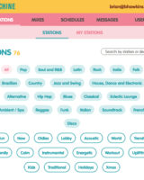
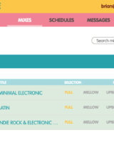
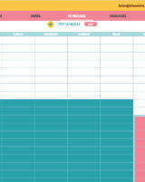
Sound Machine


A quick note on a couple services that we tried, but weren’t thrilled with:

  • Hotel Radio
    Once you get their system running, it might work great, but we had real problems just trying to get the basics installed and working. I’m not sure what country they are based in, but its clearly not the USA and the process suffers from what feels like a language barrier.
  • Soundtrack Business
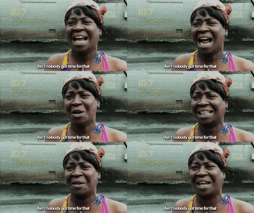
    Since Spotify doesn’t have a commercial business in the US, we thought that the partner solution they recommend would be a easy fit, but Soundtrack Business suffered – at least in our experience – from similar problems as Hotel Radio. It was tough to get going, there were hitches in the process of getting the account set up and the help offered wasn’t useful at all. “Ain’t nobody got time for that!”ain't nobody got time for that


How to go the extra mile with in-store music

Any music service you decide to listen to – legal or not – will give you the ability to select a music list and hit play. But in 2018 you have some awesome additional options that can be fun to use and super beneficial for your selling environment.

  • Try daypart scheduling.
    Build a playlist of nice calm music to start the day and a more aggressive list that amps up the energy level for the busy part of the day, and then another type of music for the end of the day. Then schedule the mixes to automatically change on schedule every day
  • Add a message to your mix
    With Sound Machine you can easily add messages (think commercial) to your music mix. Want to promote an upcoming sale or ride? Want to share useful cycling tips or facts? Build messages and make that playlist your bitch!
  • Utilize the professionals and have them build your custom playlists.
    Most business music solutions offer a higher level of service where they essentially become your DJ for the store based on the brand image and other goals. Try it!
  • Try new music
    Live it up, baby! You have musical control at your fingertips that they didn’t even imagine in the old sci-fi movies. Go for it. Explore. Change things up. Be daring. We bet you’ll see a great new energy level on the selling floor!


“Just as interior design is part of the in-store experience,
music has become an important competitive tool for business owners.”
– Heartbeats International

Now that you’re inspired to upgrade the sound experience in your store, make sure your lighting is on point too.

Check out the lighting blog post we did here, titled, “The Right Overhead Light For A Retail Store’s Dressing Room“.

Making your retail store sing by adding the perfect music. Part 1

The importance of the right music in a retail store

We all know how much the right music can add to an experience. Your favorite movie would hardly be recognizable without the right soundtrack. Your dinner party would probably end about 7:15 if you didn’t have the right tunes setting the mood. And your retail store needs the right ambiance if you are going to help your customers emotionally connect with your brand and your products. Music is one of the easiest and most effective ways to set the scene perfectly for buying.

In this two-part blog post, we are going to discuss…
1. Equipment for playing music in the store
2. Music sources and tools for creating the perfect vibe in the store

This topic is vast. One could make a career out of figuring out the right tools and the science behind everything, but if you are like I am…and I know I am… you would like us to cut to the chase and jump straight to some proven solutions. We aren’t going to cover every conceivable option, but we are going to share some simple, inexpensive, proven solutions that you could literally have up and running by tomorrow. So, in the paraphrased words of good old Zig Ziglar, the famous sales coach, “Mr. or Mrs. store owner, if I could show you a very very simple way to make your store dramatically better for your customers and for your sales, when would you say the best time to implement the solution?” Today right? Let’s get going.

Attributes of a great in-store sound system

  • Plays music from a number of locations, so that the sound isn’t loud in one spot and quiet in others
  • Is easily customizable and variable, so that the mood can very easily adapt to seasons, day parts, event, or moods
  • The speakers reproduce sound in a high-quality, wide frequency range, making the music easy to talk over in sales conversations
  • Utilizes a multitude of music and audio sources, so no matter what is happening at the store, the sound will support it
  • Easy to set up, configure, adjust and control – preferably with simple control from your smartphone or other handy remote
  • Easy to move and grow the system, so as your business takes off your sound system isn’t a tiny ball and chain.
  • While low price doesn’t have to be an attribute of a great in-store system, we have yet to meet an independent retailer who has too much money.
  • The right music mix is vital. We’ll get into that in the next part of this blog series.

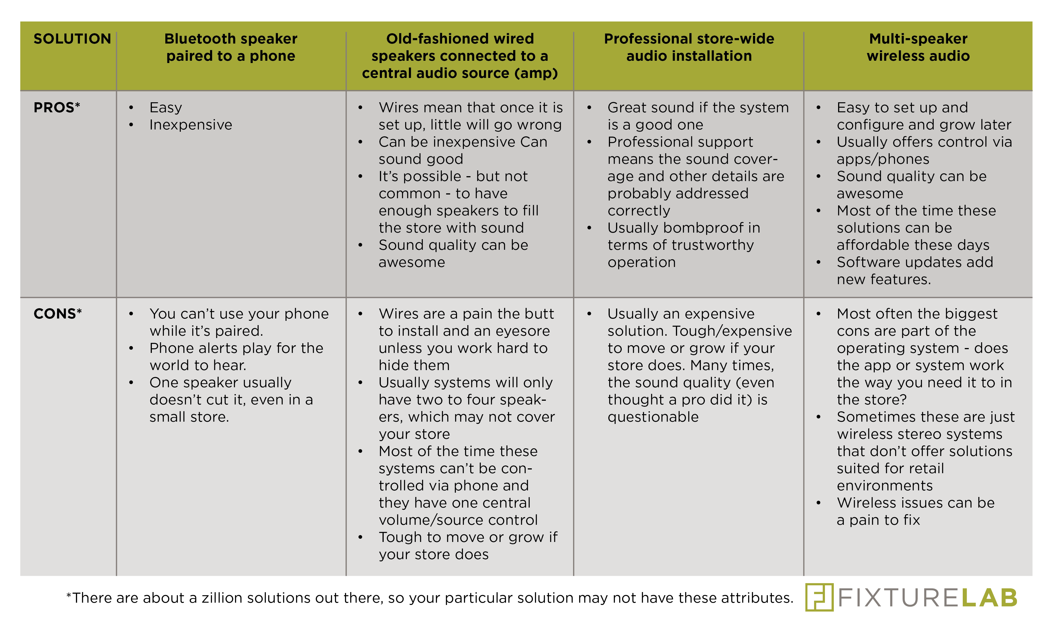
Common music equipment solutions for retail stores

Sound Solution

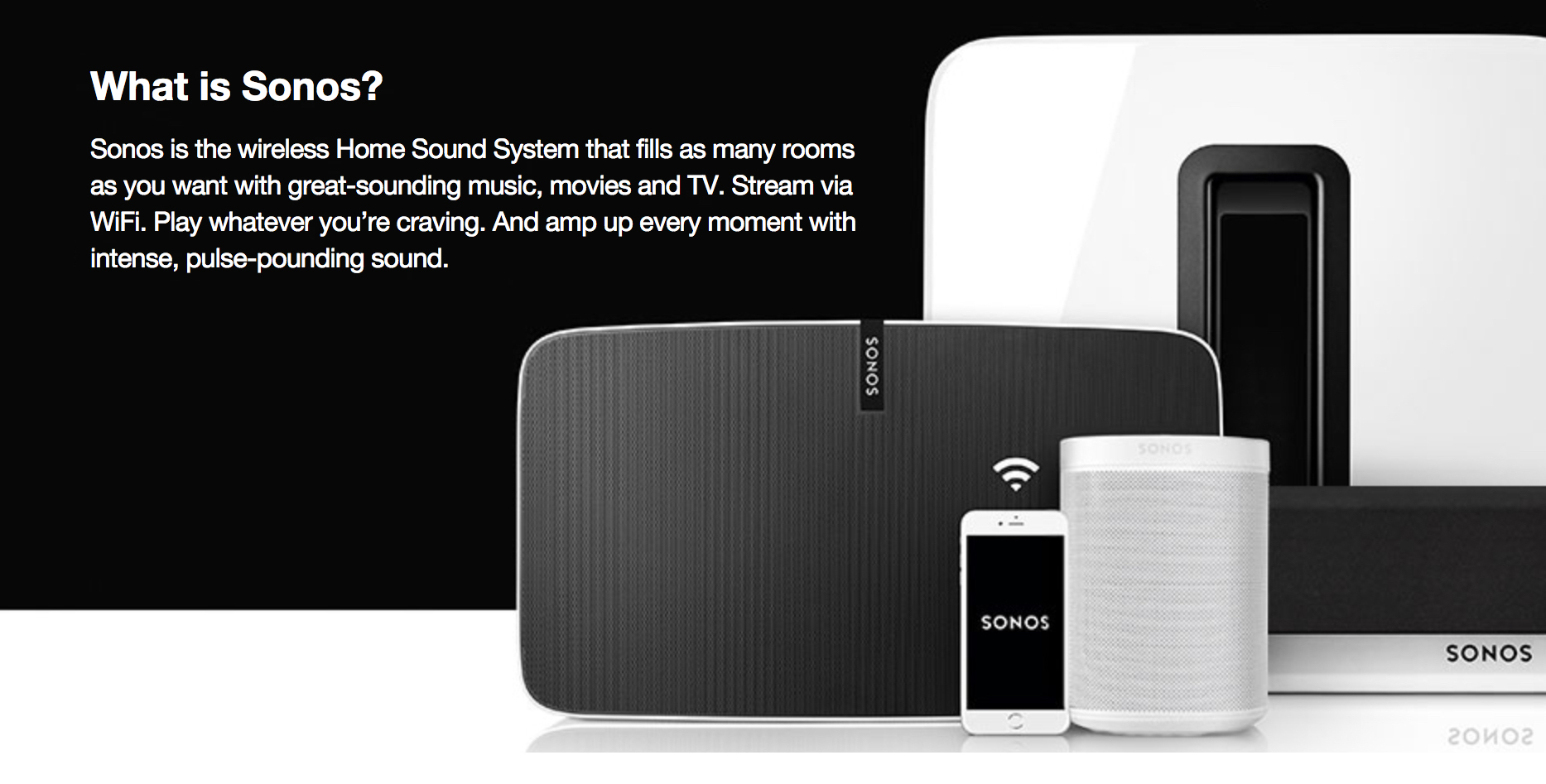
Our favorite in-store sound solution: Sonos

sonos

There are a lot of competitive wireless systems out there now, so look around and see what features suit your needs best. We can tell you though, if you want a slam dunk solution it’s Sonos. We have used their solutions at home and in a number of stores around the country, and every single time we implement it, the team at the store has loved it.

Key features that make Sonos great:

  • Extremely easy to set up. It’s about as hard as falling off a log.
  • They make a wide variety of speakers and other products that all work together seamlessly. You can even integrate your old traditional stereo equipment and music sources. The Sonos products are also very handsome and they look professional in any environment.
  • The sound is frickin awesome. The more you spend, the better the sound is going to get, but even if you just start with the basics, the sound is great for a store.
  • Expanding your system, or reconfiguring is crazy easy. It’s very open-ended, and Sonos is constantly adding services and expanding capabilities.
  • Sonos integrates about a million music sources into one slick app that you can control on your phone, tablet or computer. This is spectacular because you can change up your music strategy whenever you want and you can try different music services in seconds. Have accounts with Spotify, Pandora, Apple Music, Google, and Amazon Prime? No problem. They all play well with Sonos.
  • You can play different music from different sources to different speakers very easily. That means that you can create music zones if you want and areas like the service department can play an entirely different thing than the women’s apparel area. It’s very easy to switch back and forth too.
  • While you can control it with your phone, when you leave, the music keeps playing, because it’s not playing from the phone. Anyone with a smartphone can control the system if you want them to.
  • You can integrate external sources like your TV. So when it’s time for the Tour to play, BAM, it’s one the system!
Sonos
The cost of a Sonos system varies widely depending on the features you would like and the size of the store. A basic small system might only cost $375, and if you want a more elaborate system for a larger store the total cost might be $2000 +/-.
Configuring the perfect system for your store is really easy. There are just a few basic questions that need to be addressed. Sonos can certainly help you, or if you’d like the help of some experts that know bike shops and bike shop employees like the back of their hand, then please call us. We are affiliates, so you can order directly through us, or you can order direct after we help you select your solution.

A small disclaimer: You’ll notice when you research Sonos that they are very “home” oriented. Don’t expect to see the term “store” in their information. Their primary market is simply a home environment. However, our experience with their solutions in the typical bike, running, fly fishing store is 100% success.

In the next in this two-part series, we’ll get into these juicy issues:

  • The legal issues with playing music in your store
  • Picking the perfect music service/source
  • How to go the extra mile and really create the perfect multi-featured music environment

Read Part 2 by clicking this link!


Now that you’re inspired and ready to absolutely kill it with the sound in your store, make sure your lighting is on point too.

Check out the lighting blog post we did here, titled, “The Right Overhead Light For A Retail Store’s Dressing Room“.

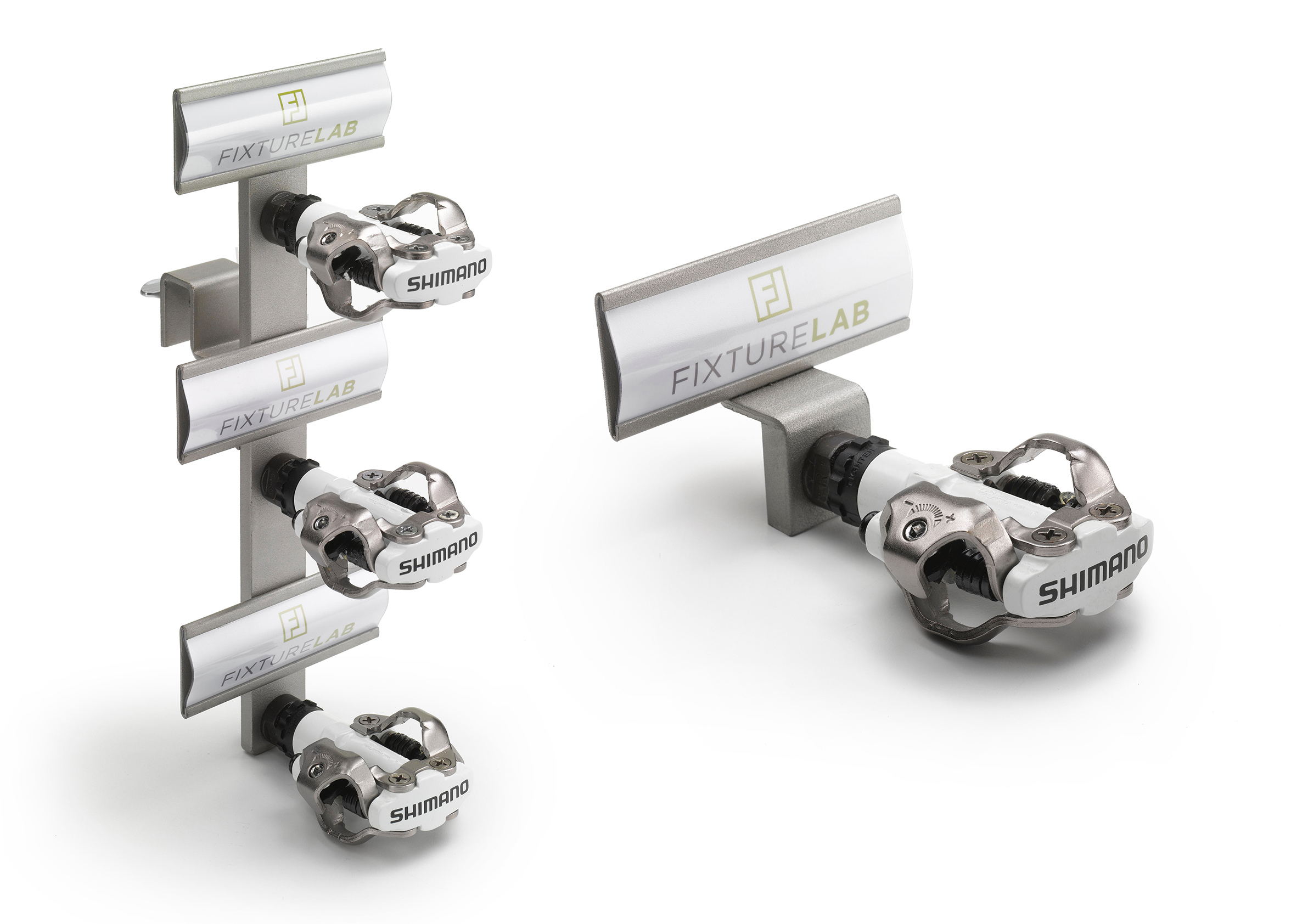
Hands down, our Single Dip and Triple Dip pedal displayers are our most popular fixtures for a number of great reasons.

The biggest reason: They sell more pedals!

  • Displaying the pedals outside the packaging give the customer a chance to interact with the product
  • Since the pedals are threaded into the fixture, not loose, they are more secure and safe from dropping/damage
  • Each displayer easily attaches to a crossbar (Fixture Lab or Opto) in seconds, which also means you can move them anywhere you have crossbars in the store
  • Sign holders give you the perfect way to display all of the info/specs for each pedal…and gives you the chance to brand your own display
  • Available in Fixture Lab silver or Opto’s Stardust Silver colors
  • They save space, organize your display and they make your pedals drop-dead sexy!

So go on, dig those pedals out of that big glass coffin display case and get rid of the coffee beans! Find out what all the hype is about and order some up!

Single Dip Pedal Displayer: $16
Triple Dip Pedal Displayer: $29

Happy Pedaling!

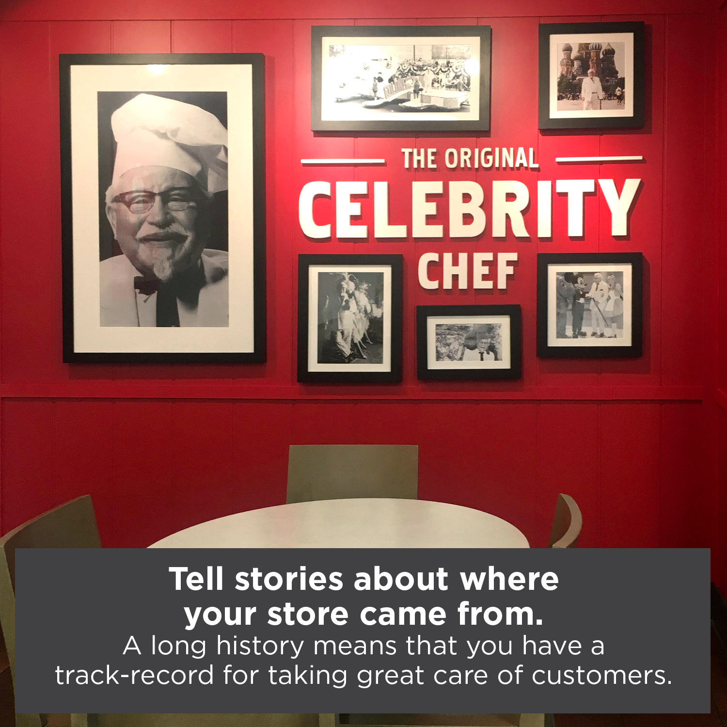
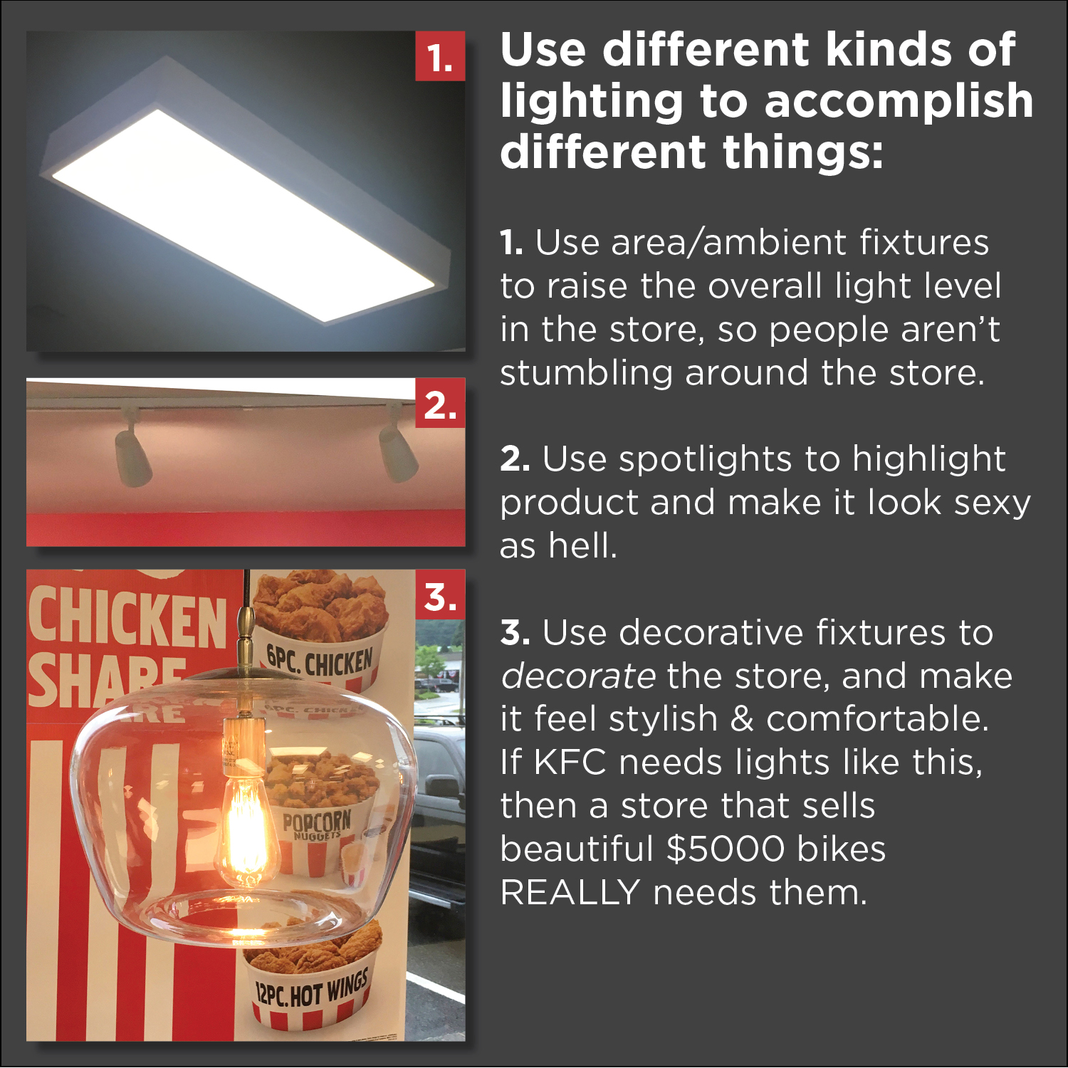
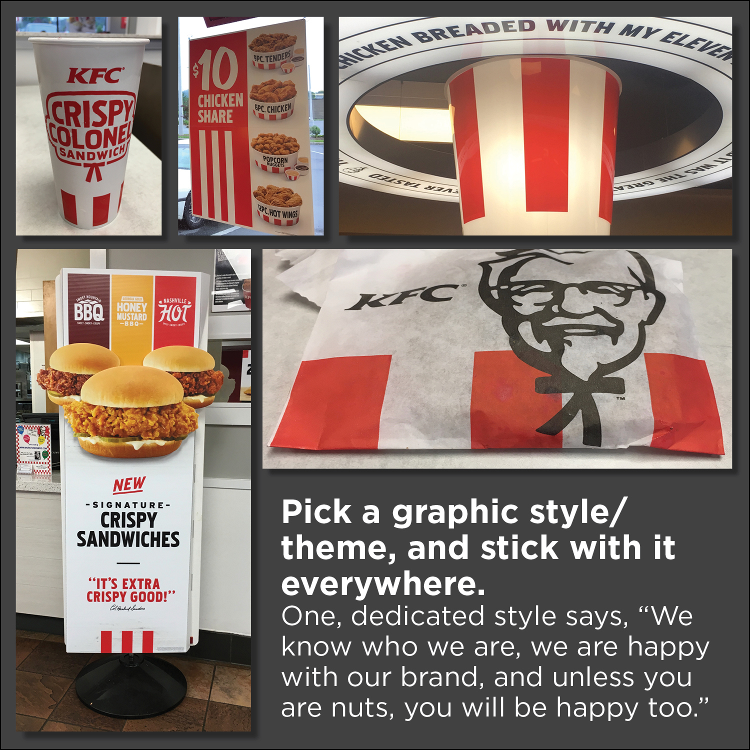
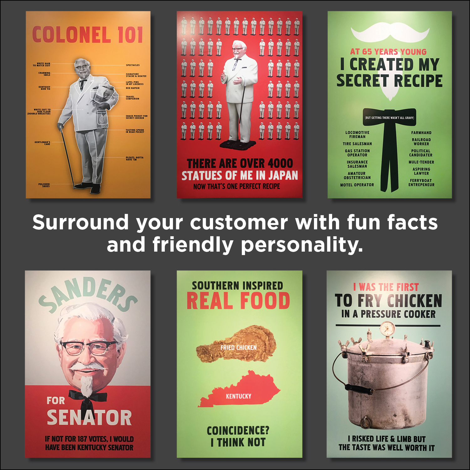
8 great things that bike shops can learn from a KFC, of all places.

What does a bike shop have to do with a KFC restaurant?

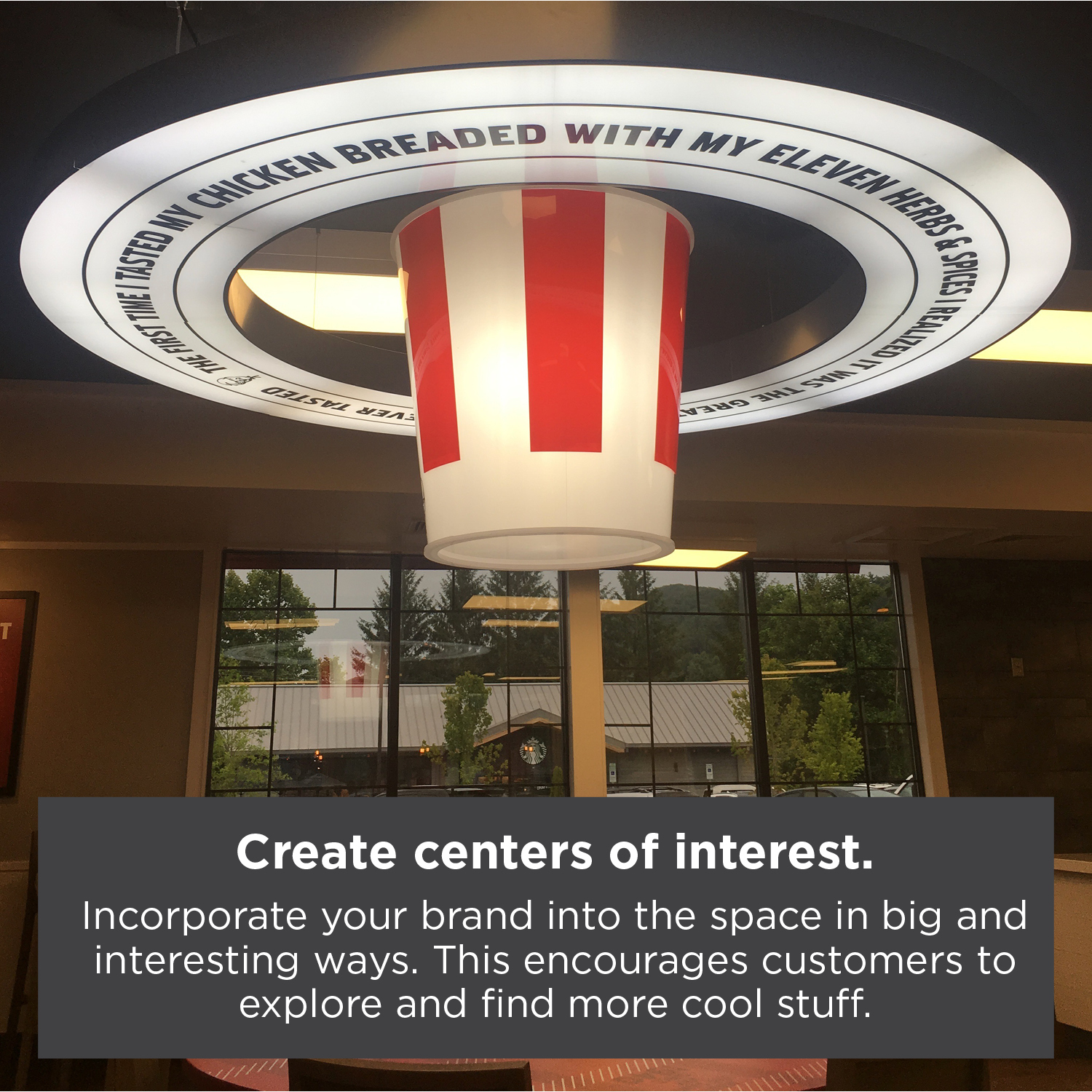
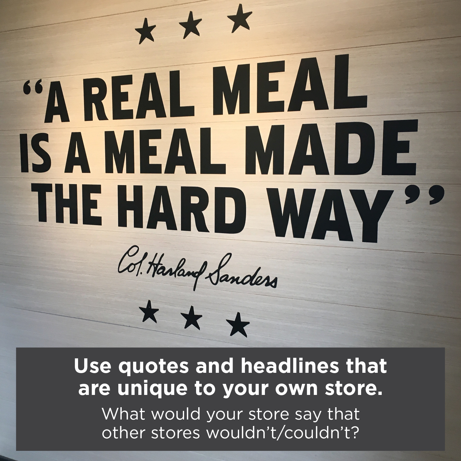
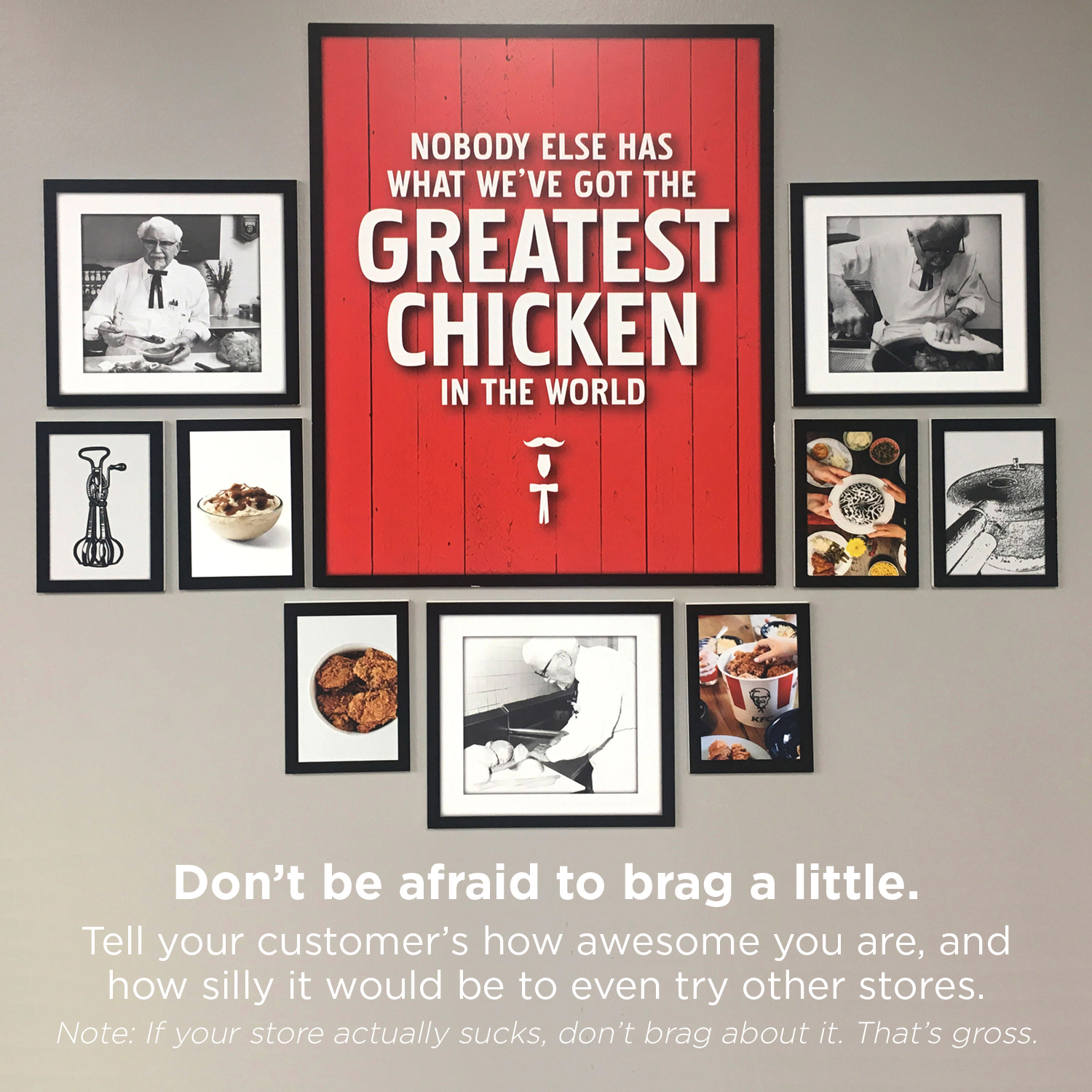
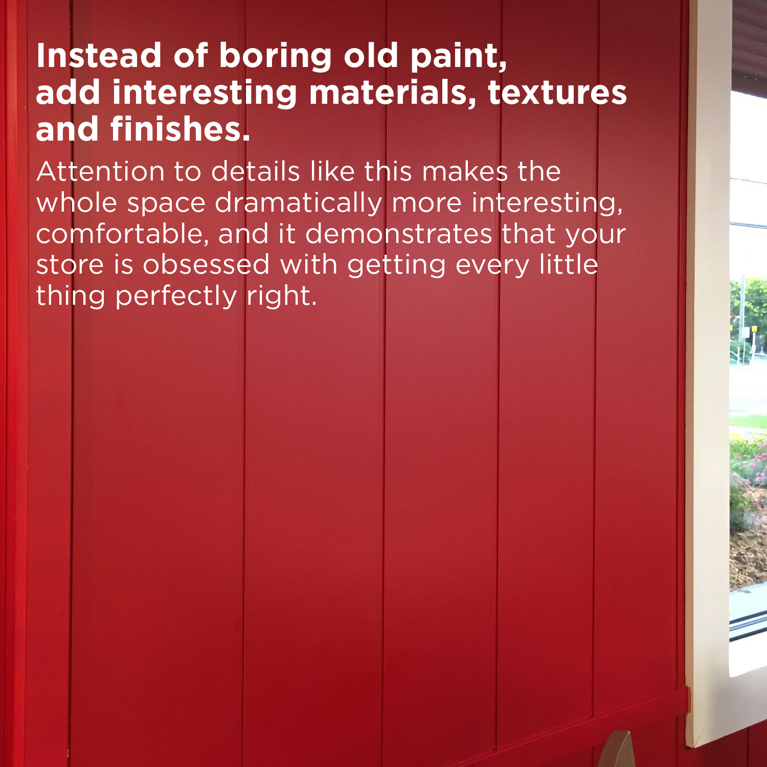
The other day I happened to find myself in a KFC restaurant. As I was looking around the space, it dawned on me that they had done a really nice job with a number of things that we always encourage bike shop stores to consider. So I thought, “Hey, why not share them?” As you look, ask yourself, “If the average KFC store can do these things right, what prevents me from doing them too?”

Have fun reading, and stay tuned because at the end, I’ll give you a link to download a PDF.

Tell stories about where your store came from.

Want to save and share these ideas?

As promised, here is a link to a PDF of these tips.

Download the PDF


Looking for a comprehensive, detailed resource on exactly how you can improve your bike shop?

Check out our previous blog post with a value-packed, information filled video presentation we did for Brooklyn Bicycle Company here.

Explore retail design inspiration and improve your own store’s offering

Exploring Retail Design Inspiration at Milk Market Denver

Have fun, and open your eyes to great retail design your customers are experiencing

When you are working in a store everyday, it’s easy to get swept away with the demands of the day and only focus on the bare necessities in terms of look and feel for your store. Retail is hard, and if we aren’t careful we can be lulled into overlooking opportunities (big and small) that could make a valuable difference for your customers. In an effort to kick-start your thought process, we challenge you to get out there, take off those blinders and explore all of the new stores and restaurants in your community….I know, a terrible challenge. You’re welcome.


Not only can it be incredibly inspiring, but it will also give you a really strong indication of what your customers are craving and gravitating towards. Don’t forget, your customers aren’t simply comparing your retail experience to the other bike shop in town. Next Saturday they might find themselves deciding if they are going to go shopping at Lululemon or go to a bike shop. They might even have to decide if they are going to go out for a nice lunch or stop by the bike shop. In today’s busy world, you complete against a wide array of experiences that might eat up our customer’s time and attention. Think of this as the best research project you’ve ever had to do, and get out there and see what your customers are seeing.

Retail design challenge extended. Retail design challenge accepted.

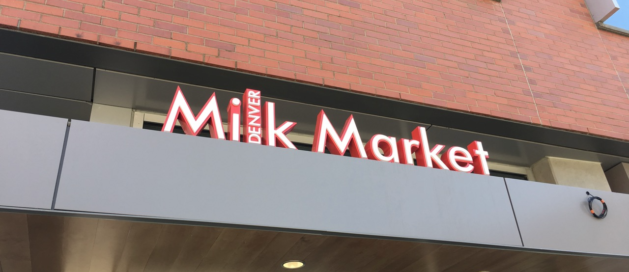
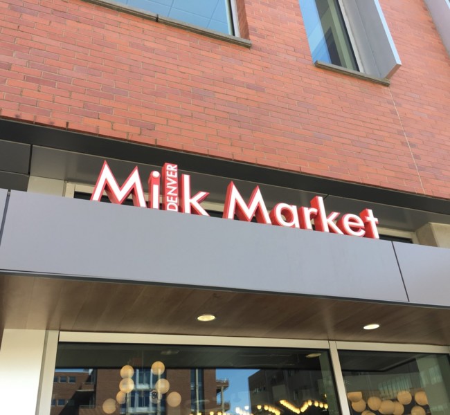
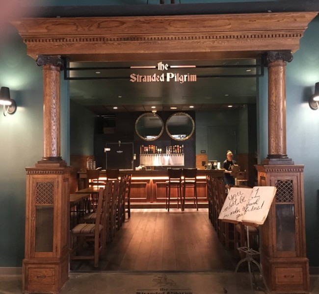
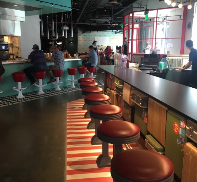
We took our own advice, and we headed up to the brand new Milk Market located on Dairy Block in Downtown Denver. It opened a few weeks ago and it is getting rave reviews.


“Denver Milk Market is an all-local, all-wonderful mix of take-away and dine-in restaurants and bars run by Colorado chef Frank Bonanno. Denver Milk Market, a 16-venue cornerstone of the historic Dairy Block, aims to draw in travelers, visitors, neighbors and fans to shop a little, drink a little, eat a little and celebrate a lot in the very heart of the Ballpark Neighborhood here in Denver. “ www.denvermilkmarket.com


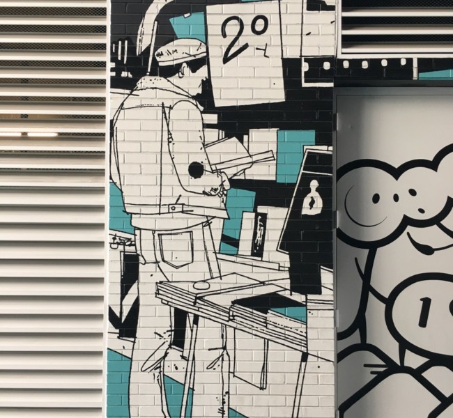
This place is oozing with inspiration. From their unique flooring choices, to their exceptional branding of each ‘concept’. And despite the way their marketing makes it look, you can enjoy the experience if you are over 29 years old. Let’s take a gander of some of the stuff we experienced…


Retail design, outside

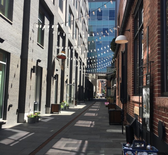
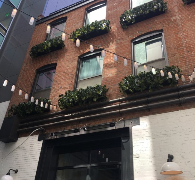
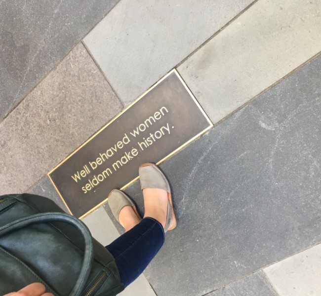
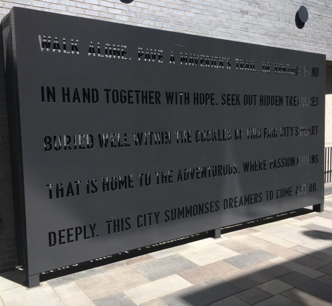
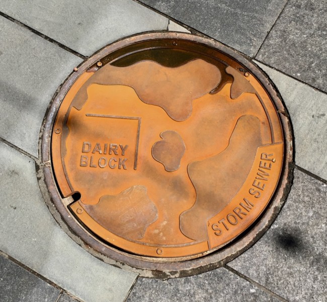
One of our favorite parts of Dairy Block (http://dairyblock.com/) and Milk Market is their use of the outdoor space for branding and ambiance. From the milk bottle string lights to the adorable quote plaques on the ground, it is a charm fest. Even their man hole covers are branded! We often see these small details hit the cutting room floor during a remodel and it breaks our heart. These features give a space soul. People want soul! What small detail can you add outdoors that would would make people smile? Do it!

Retail design, on the floor

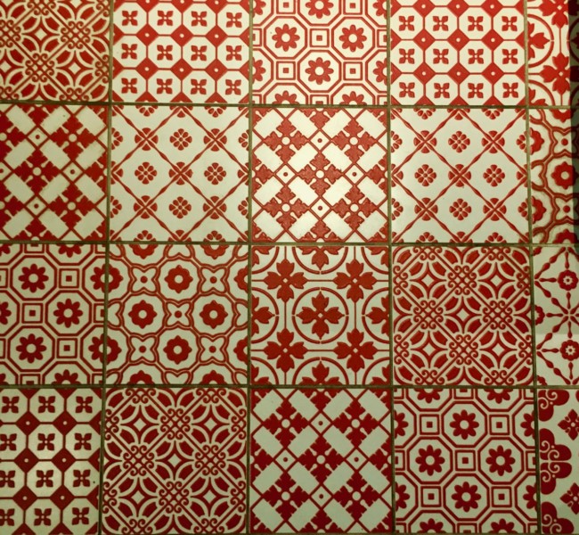
Each space at Milk Market is differentiated by a splashy floor tile that was custom designed by Frank Bonanno’s wife, Jacqueline Bonanno. Not only does it give the overall space some good personality, but it is also a terrific story to share about the build-out process. It would be silly of them not to share that story! Is there something unique in your store that has a story that needs to be told? Tell it! If not, create your own story!

Don’t be afraid to have fun

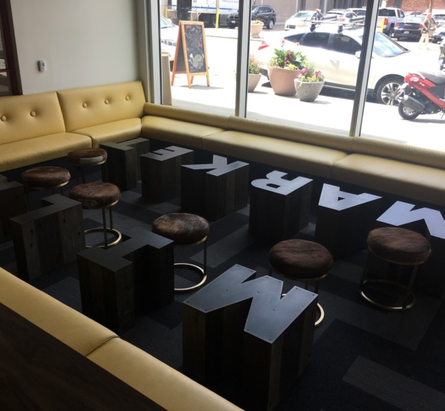
If there is one thing this space drives home, It’s: Don’t be afraid to have a little fun with your space. If you are incorporating a sitting area, why not make the tables out of letters? If you have tall ceilings, why not make an awesomely enormous sign? How about building some neat phrases into the path your customers walk? How about mixing colors and textures in bold ways? Take a risk! Run wild! Where is your shop lacking some fun? Need help?…give us a call A.S.A.P.

Make it flow

For some bonus tips on how to make your store flow with all these new inspired ideas you now have firing in your brain, be sure to check out the latest post we wrote, “Rethinking the Flow of a Store for More Sales and Happier Customers

Rethinking the flow of a store for more sales and happier customers

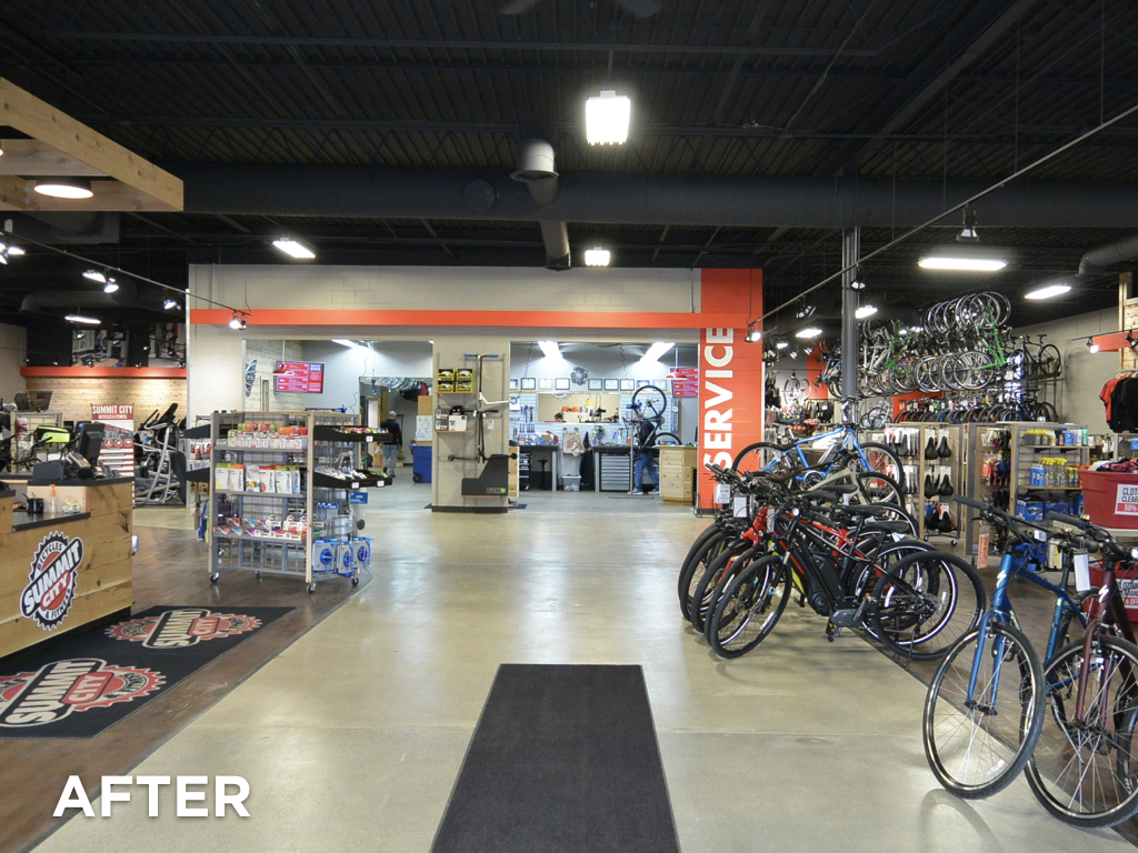
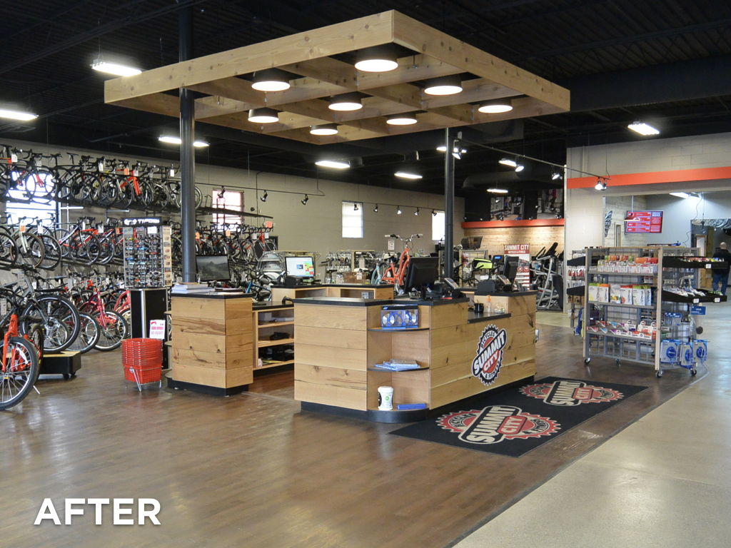
We recently finished up a really great store design with Summit City Bicycles out in Fort Wayne, IN. Bob and Sherry were already running a very successful shop with solid merchandising and superb customer service, but over the years as they grew and grew the space took on some less-than-optimal characteristics. We see this kind of thing all the time.

Here’s how stores evolve and lose their flow:

A store starts out small and scrappy, with just about whatever space they can afford to begin with. Of course they have success because they are offering great products, great service and a fun place to shop. Before they know it, they need to expand. The natural expansion would be to take over the space right next door and simply spread out. It feels so nice to be able to spread out a little that they barely even notice the awkwardly placed wall in the middle of the space, or the way that the back wall of the space has a conspicuous building material change, or the flooring that no longer matches. Sound familiar?


For a good shop, this process usually takes place a number of times over the years. It’s like boiling a frog. If the space were offered to them as is, and they didn’t experience the evolution of the space themselves, they would say, “Oh hell no. That store is broken up really strange. That will totally hold us back.”


The Summit Cycles team was doing a great job with what they had, but there were some definite ways that they had been boiled like a frog. To their credit, they knew that something was going to have to change…so they called us in to help out.

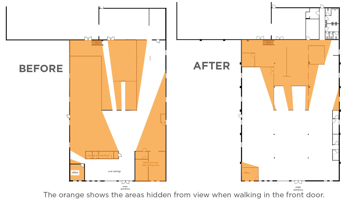
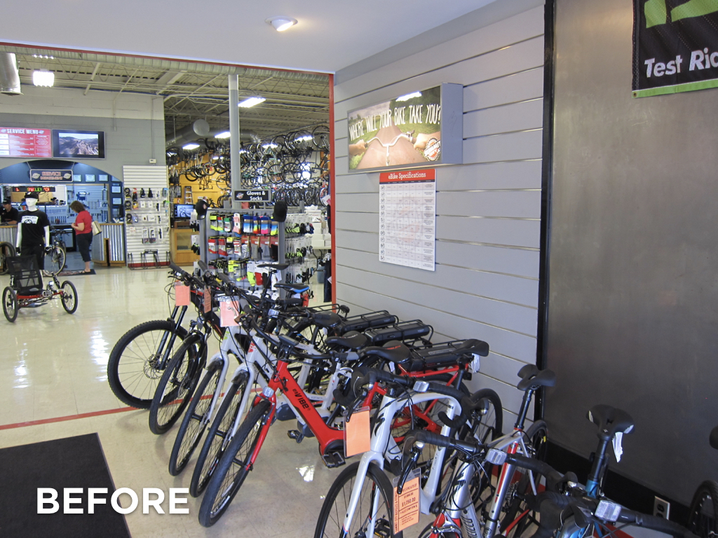
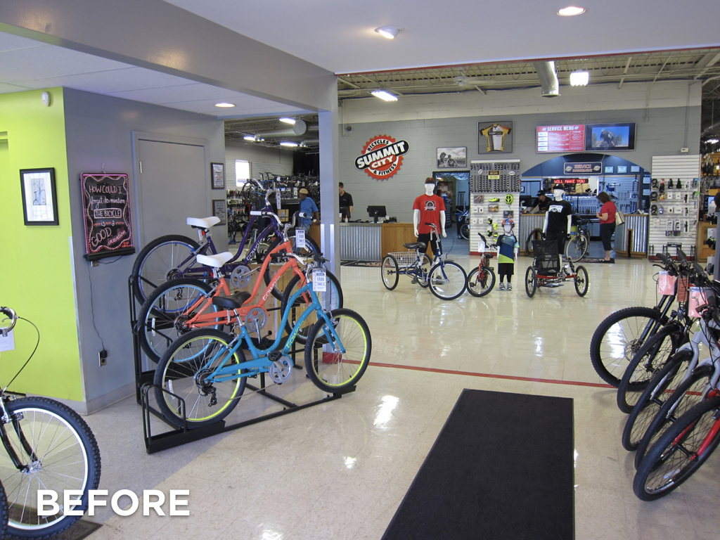
The way that the store had evolved, the customer would enter the store and find themselves facing the back side of some strangely placed electrical and storage rooms on the left, and the side of a bathroom on the right. To make things worse, the entry area had the lowest ceiling in the whole space. Technically, the shopper could see into the retail space, but their view was very constrained, unflattering, and they certainly couldn’t visually scan whole store to see where they might like to shop.


To address the problem we sat down with Bob and Sheri, the architect, and the contractor to see what moves were reasonable to make. We ended up suggesting a number of changes that included removing some walls, moving the cash wrap, opening up the service writing area, and relocating a number of categories around the store. What a difference it has made! The store feels SO much bigger and much more inviting. It feels Like the store has more product because it’s actually visible. As soon as one walks in the front door they can easily see everything and where they need to go. Plus, the employees have much better visibility around the store. Add all these factors together and you have a space that is going to sell more, and make customers happier!

Is your store suffering from gradual change that hurts your overall shopping experience?

Step outside your store. Now shake your head and say, “I am now a customer walking in this store for the first time.” As you walk in and around the store, ask yourself these questions. Be brutally honest with yourself.

  • What catches my eye first when I walk in the store? What is the most interesting feature of the store?
  • How much of the store can I actually see when I walk in?
  • Are there areas that don’t look inviting, or that I can’t see at all?
  • Does the organization of the store encourage me to spend time and walk around?
  • Are there walls in strange places? Do the materials/floors/features change dramatically as I walk around? Does it all feel like one store?
  • Are there areas where all the people are? Are the customers and employees in the store spread around the store, or is everyone typically in one small area?

If you’d like help “seeing” your store and the possibilities it offers, we know a great store design firm in Denver that you should talk to..wink wink.

Congratulations and thank you to the whole team at Summit City Bicycles! Your patience and hard work has totally payed off! The store looks fabulous!


Before view, right

Before, looking right as you walk in the door


Before straight view

Before view, looking straight ahead


Before view, looking left

Before view, looking to the left


After view, straight

After view, looking straight


After view, left

After view, looking left


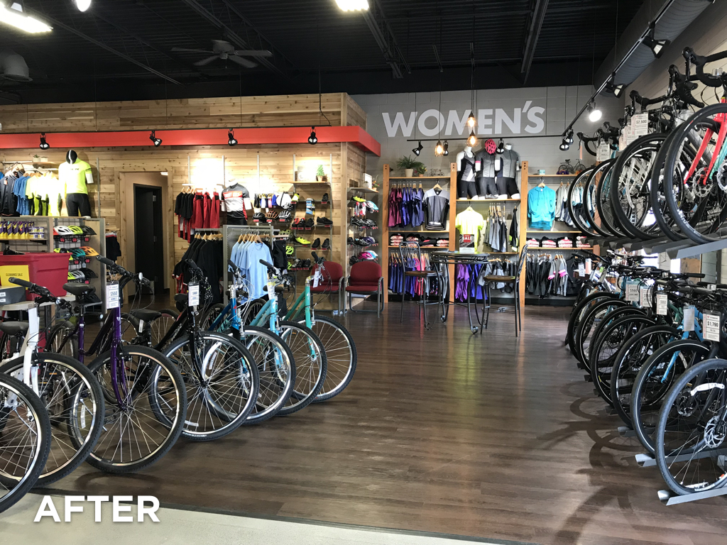
After view, right

After view, looking right


The right overhead light for a retail store’s dressing room.

We are always looking for great lighting solutions for all the stores we work on. Recently, we uncovered this really great ceiling light that works great for a dressing room. And the bonus, it’s only $69.95.


A few words about lighting a dressing room:

Your goal when lighting a dressing room is easy: Make the customer look like a million bucks. Certainly the size of the room, the colors, and the finishes have a lot to do with you hitting your goal. Great lighting however, is one of the very best investments in your plan. It’s easy too! It really makes you wonder why so many retailers, big and small, get the lighting part so wrong.

In a nutshell, you need two basic lights in the dressing room to make the customer look great.

  1. A nice soft overhead light
  2. Lights that illuminate the front of the subject in the room. We are going to do a whole separate post about these lights, so stay tuned.
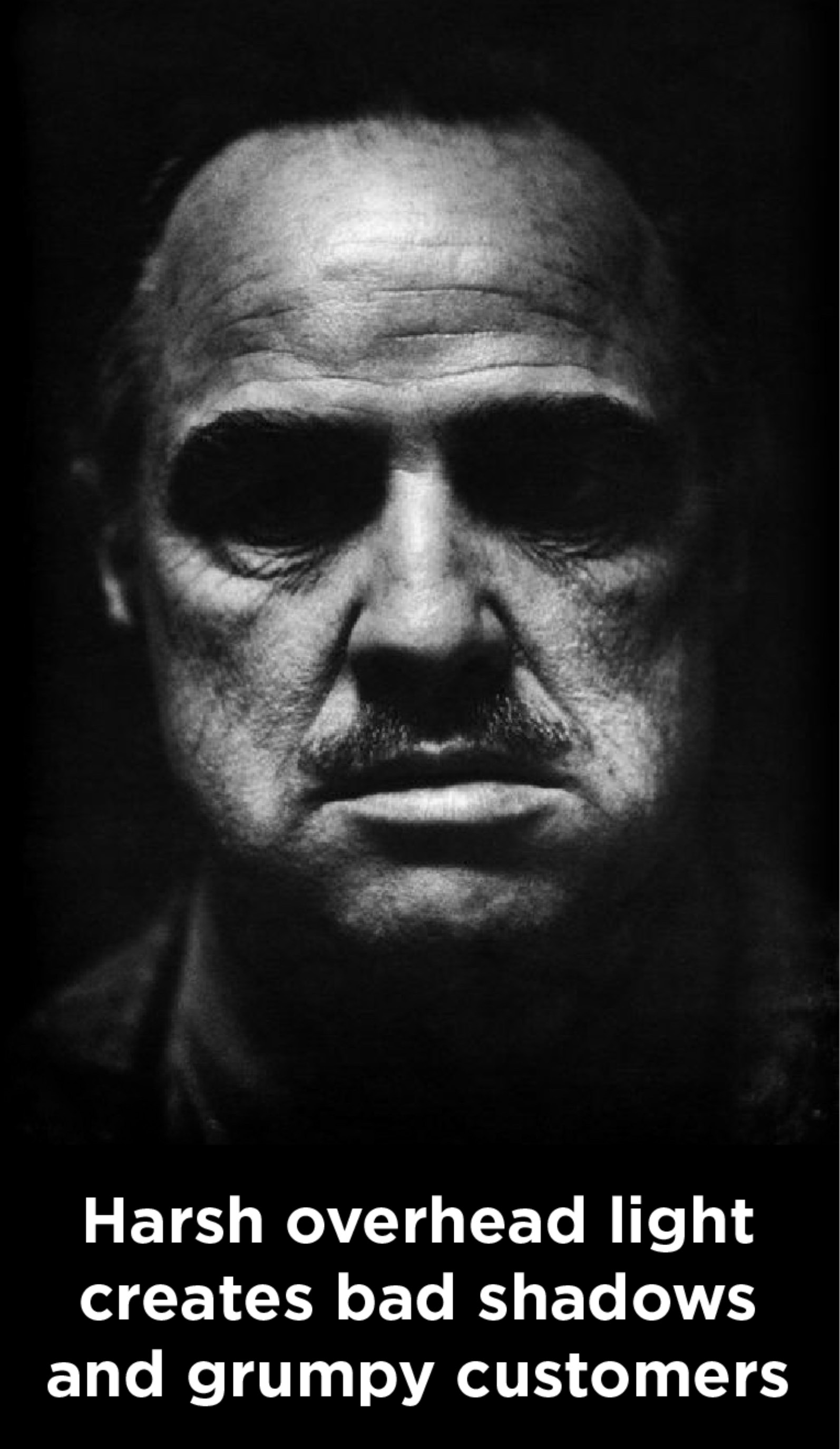
  3. Poor overhead light in a dressing room

Attributes of a great overhead light:

  1. The light should be diffused or indirect…not direct spot lights that cast dramatic shadows. Pretty much, the softer the light the better.
  2. The right color temperature is important. The most flattering light for skin tones and clothing is around 3000k.
  3. The style of the light should compliment the room.
  4. It sure doesn’t hurt if the light is inexpensive, am I right?!

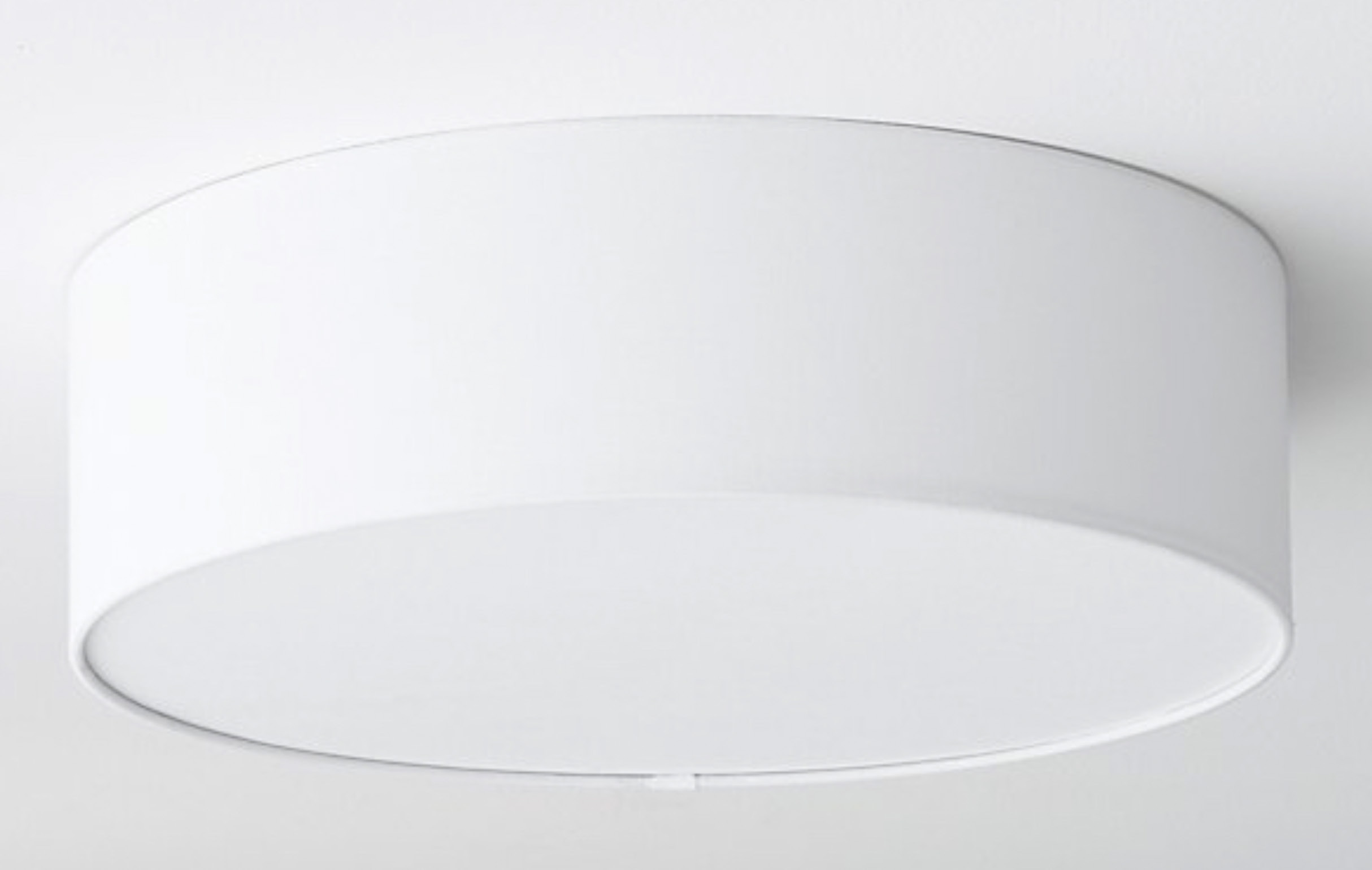
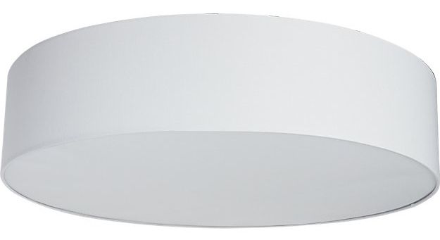
Drum Flush Mount Light from CB2Introducing the “Drum Flush Mount Light” from CB2: 

1. The simple and clean design allows it to fit into almost any design plan.
2. The overall size of the shade (19.75″Wx19.75″Dx6″H) is pretty big, which does a great job of spreading out the light. The diffuser on the light softens and makes the light pretty.
3. It uses two standard bulbs (up to 60W incandescent or equivalent LED or CFL), which makes dialing in the exact amount of light real easy, and swapping out lamps later simple.
4. Did we mention it is only $69.95?


What are you waiting for?


If your dressing room needs a little shot in the arm, hop on over to CB2 and order one up! Click here to see it!

Ceiling drum light by CB2CB2 also makes a “oversized drum flush mount light” which is a huge 34″ across. If you have a larger room, that could be just what the doctor ordered! Check it out


The first person to send us before and after photos will get a social media shout out….and perhaps a little surprise from us! Aren’t you dying to find out what that might be?!

Ready. Set. Go!

The Best Bike Shop Retail Design Blog on the Internet

Blogs are for dorks bannnerBlogs are for dorks, so who better to have one than us?! And now, without further ado,  welcome to our (dorky) blog! (Please toss your own confetti here) We have big plans for great content as we move ahead. In it you will find all sorts of retail design inspiration and information…and the occasional random post that has nothing to do with anything, other than being remarkably witty and charming.


We hope you enjoy your stay and please reach out and let us know what content you would like to see in the near future. It could be anything. Anything. You know we are always game! Thanks for the visit! Come back soon!


And make sure you check out our recent posts:

Brian’s ‘How To Design Your Bike Shop’ presentation for the Brooklyn Bicycle Co

National Bike Dealers Association presentation


Are you looking for design or layout assistance for your bike shop? Toss us a note or give us a call at 303-777-2014 today and let’s talk about how we can help.

Talking Bike Shop Business (and Design) Strategy in Napa, CA

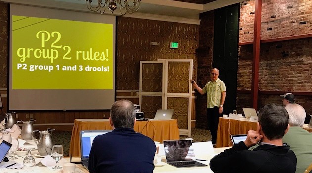
Brian's P2 presentation in NapaThe National Bike Dealers Association recently asked Brian to present to their Profitability Project Group #2 (there are three P2 groups). The Profitability Project (P2) aims to improve business for all the participating specialty bike retailers. Of course we took them up on the offer because the Profitability Project groups are made up of some of the best bicycle retailers in the country. The fact that the meeting was in Napa, CA didn’t hurt either!
 

Brian’s presentation was called, “Being the bike shop of the future is all about being a great retailer of today”. In it, Brian discussed the history of bike shops from the 1800’s to years in the future. He shared a whole bunch of things that today’s best retailers outside the bike world do today, and a zillion ways the bike shop of the future will change from today’s model.Slides from the P2 show


We are considering hosting an online webinar where Brian would deliver this presentation in its entirety. If you are interested in attending, click here and we will send you further details when it happens.


Get Involved in P2

If you are a bike dealer and you have never heard of a P2 group, it would be in your very best interest to look into it. Each group is made up of non-competing dealers who meet to learn, compare, network, examine and analyze specific data from their business to help and support each other in business operation and strategy. The retailers within these groups are all very well respected dealers around the country with awesome shops. So, it’s a tremendous honor to be asked to present at one of their meetings!

If you want to find out more about the NBDA or P2 groups, check out their site: nbda.com


P2 logo   NBDA logo


Check out Brian’s additional presentation on ‘How To Design Your Bike Shop’

Great store design projects and what they do for your bike shop

Brooklyn Bicycle Co logoBrooklyn Bicycle Co. has created a great library of articles and training for their dealers. So, when they approached Brian to share his Interbike presentation on “Great store design projects and what they do for your business” with their dealers, we jumped at the opportunity. I mean, who wouldn’t want to be a part of that! After you view Brian’s presentation 5-6 times, make sure you check out the other great articles in their library!

Thanks Brooklyn Bicycle Co., it was an absolute pleasure working with you!