fbpx

Add graphics AND decrease echo in your retail store!

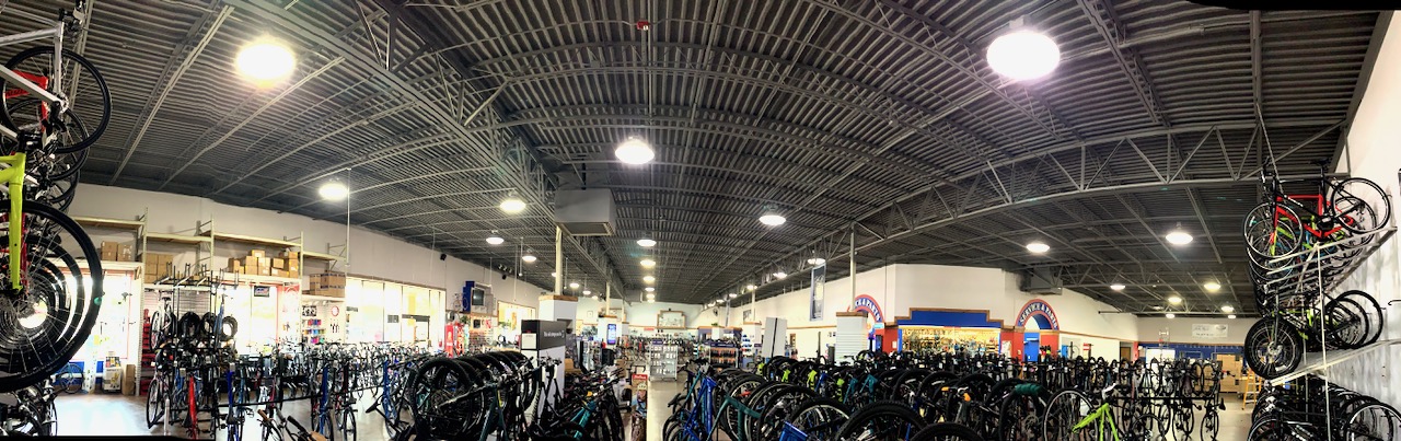
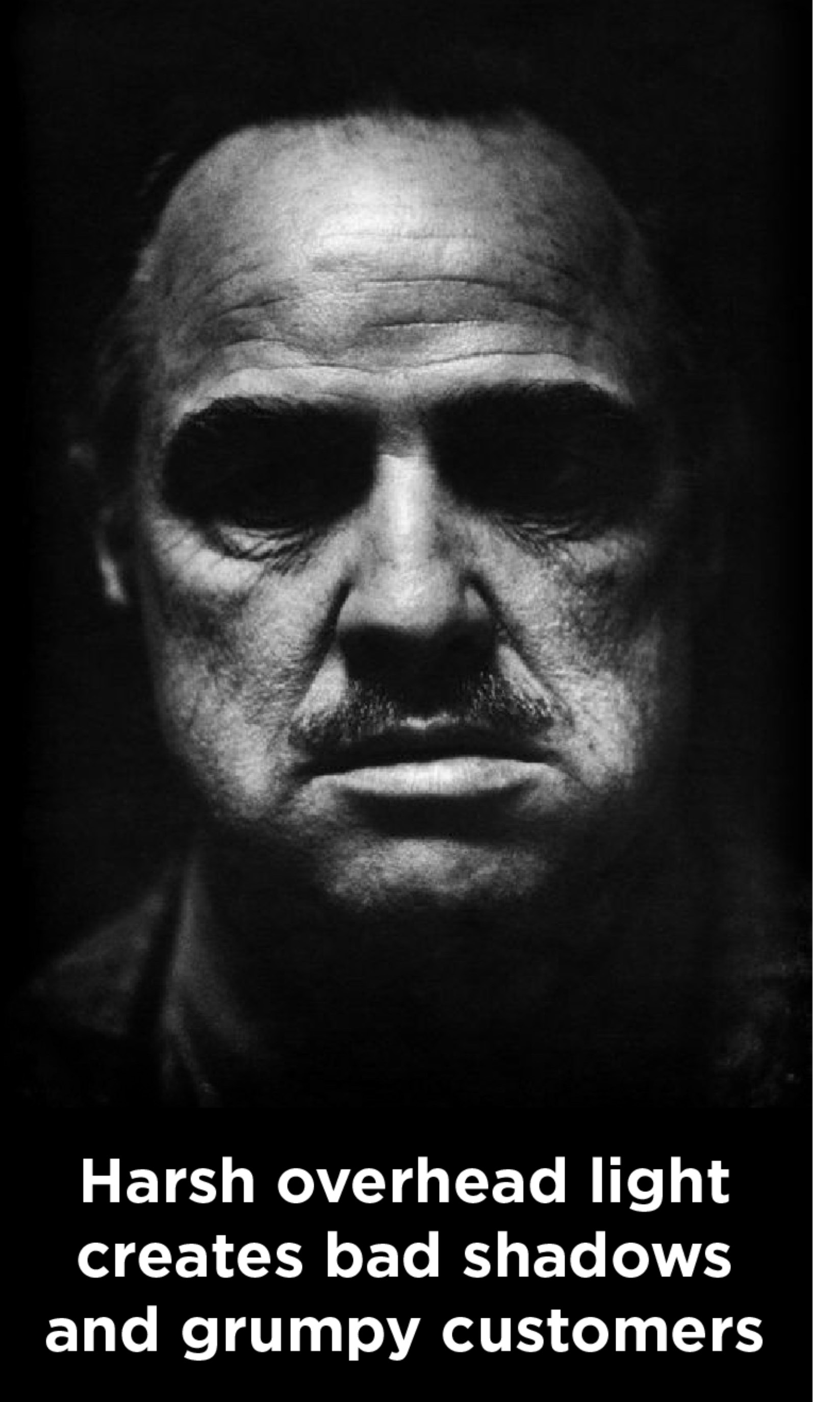
Pretty much everyone agrees that strong graphics contribute to a great sales atmosphere. And most people also agree that noisy retail environments can ruin the shopping experience.

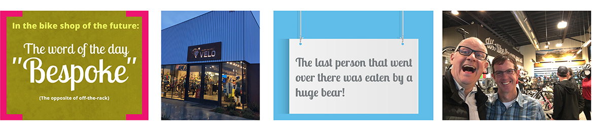
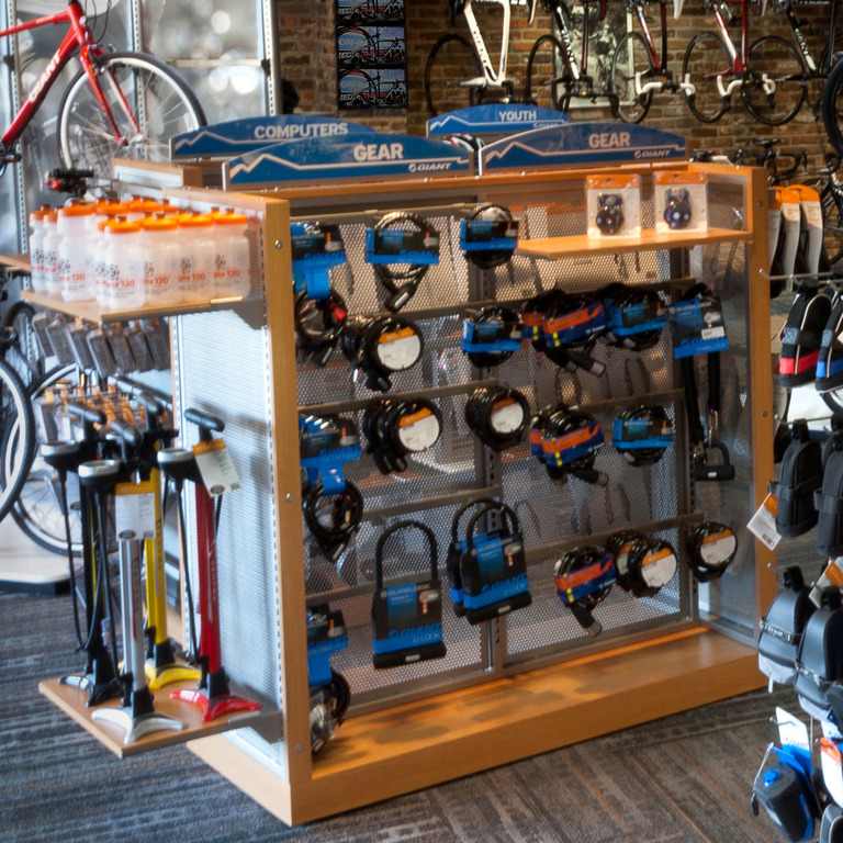
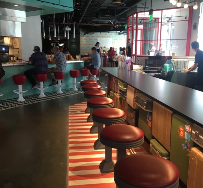
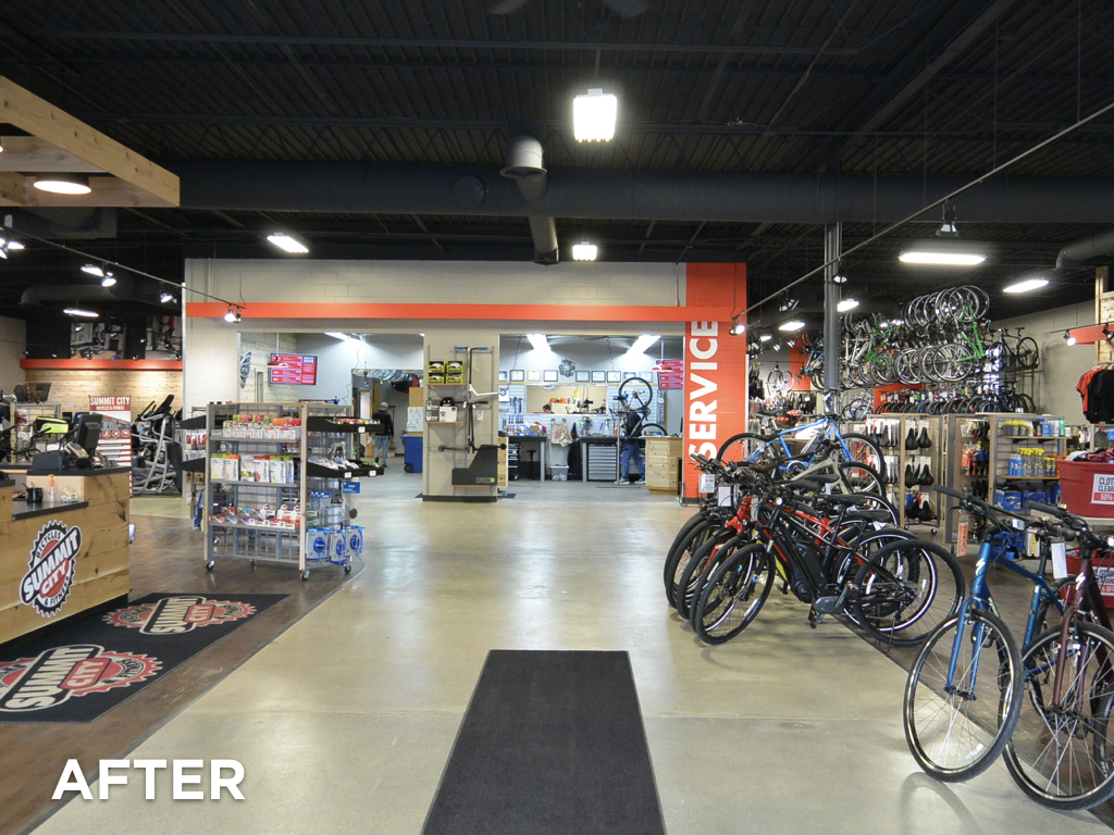
Effective retail stores invite customers in and keep them shopping. We’ve all visited stores with sound so deafening and annoying that we can’t wait to leave. Well, we have a super genius trick for you! Here’s how to add visual excitement to your store while subtracting acoustic distractions. The video below walks you through how we applied this technique to a bike shop.

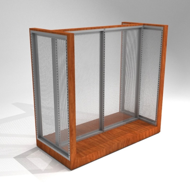
Start by using the right kind of graphics: Silicone Edge Graphics (SEG).

SEG fram on wall

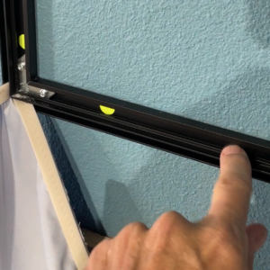
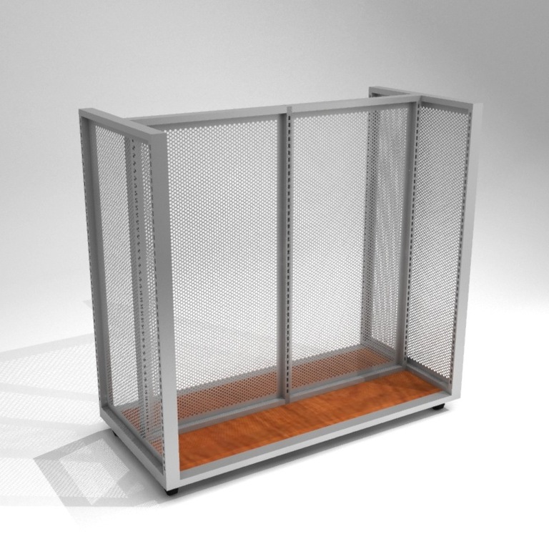
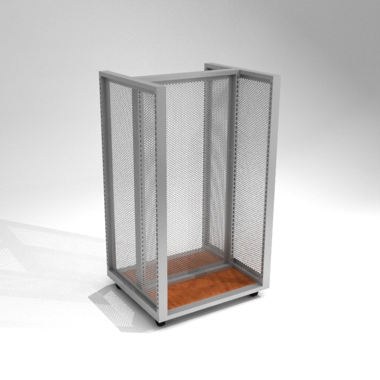
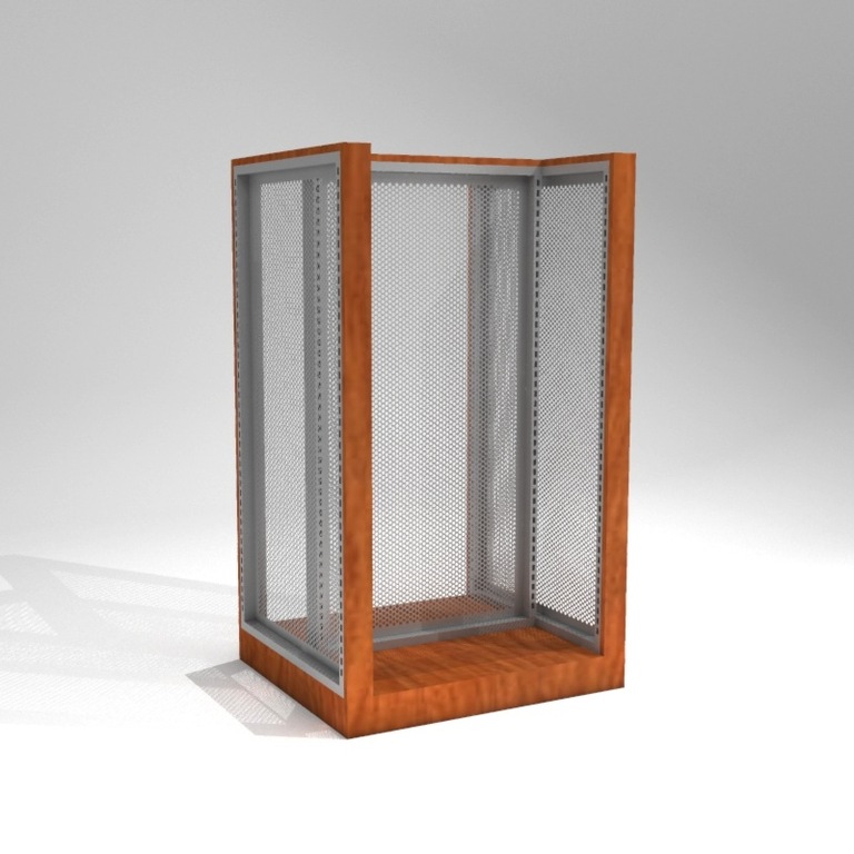
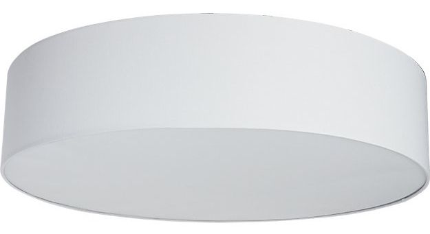
SEG frame mounted to the wall

SEGs have about a million advantages over old-fashioned rigid graphics or vinyl graphics. They are great looking, inexpensive, easy to ship, easy to change, and you can make them in just about any size. However, there’s another advantage hidden in the little gap between the fabric graphic and the wall. If you’re really smart (like us, of course), you can use that sliver of space to tackle the sound problem in your store!

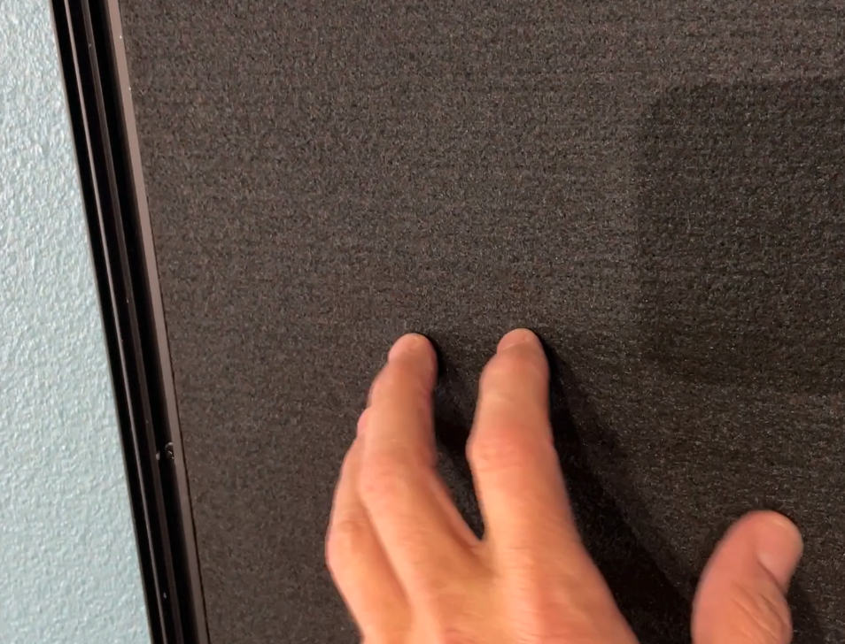
Install the sound-sucking material

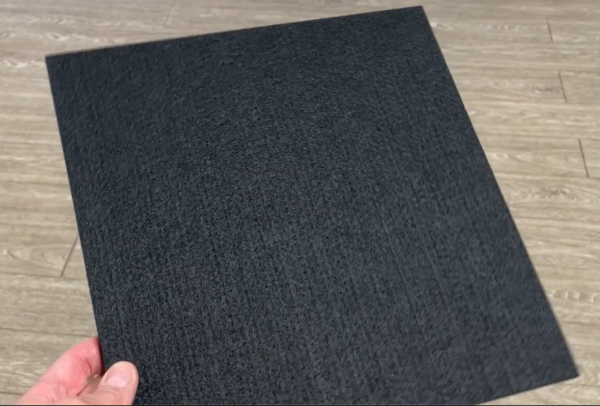
There are a number of products on the market that do a great job of absorbing sound. Sound-absorption materials are really popular these days because of their usefulness for eliminating echo in online meetings and podcasts. Every sound recording studio in the world uses some sort of sound baffle system, and we think more retail stores should too. The product shown here is a ½” thick, semi-rigid, felt-like material. The tiles come in 12×12” squares, so installing them is easier than losing your car keys.

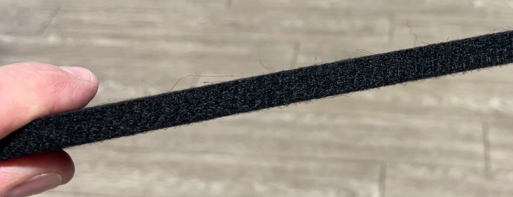
Once you have the SEG frame up on the wall, just fill it with as many sound tiles as possible. In the example above, we used silicone glue to stick the tiles to the wall and made sure they wouldn’t move by tacking them in place with a couple of tiny nails (from a handy nail gun). This process goes extremely fast. Remember that the sound tiles won’t be visible, so they don’t have to be flawlessly cut or perfectly positioned inside the frame. The more tiles you fit, the more echoes you’ll eliminate.


Install the graphic over the tiles

After the acoustic tiles are in place, you can simply install the fabric graphics as you normally would. Just like that, you’ve accomplished two major improvements at once: amplifying your visuals and dampening your sound. Right about the time you finish this project, your customers will be clamoring to buy stuff from the store – so be ready. They’ll probably say things like, “wow, that’s such a nice image. And darn it, I don’t know what it is, but I feel completely comfortable in your store. Here’s my credit card.”

If you are interested in tackling this project, let us know. Fixture Lab can help you with all the nitty-gritty details.


An easy and sexy way to brand a store.

Customized Steel Logo Sign

Laser-cut steel can be just the ticket to make your logo sing when you brand a store.

Main counter picture
The cash wrap counter at The Rivers Edge in Bozeman

16 gauge steel sheets with the store’s logo laser cut through to reveal the wood from the cabinet behind it. It’s a classy, durable, and as signs go…pretty darn inexpensive.

Mounted Custom Sign

If you’re curious about this type of thing for your own store, let us know! Contact us here or give us a call 303-777-2014.

Looking for more inexpensive ideas to brand your store? Check out this blog post: Fixture Lab reveals retail store design secrets that will give your store an unfair advantage! …a value-packed webinar with all the ways to “take a gun to knife fight” when it comes to store design. Super valuable stuff, you’ll definitely want to take notes.

Did you know you can make a fixture any color? And we mean ANY color.

You’ve probably seen the Eclipse Wheel Displayer in some of our photos or posts before, but this one has an exciting new twist that we figured you would want to know about.

Eclipse Wheel Display full picture

The Eclipse makes displaying a wheel very easy and the fixture is super simple and elegant. What you might not know is although the standard color is silver, we can make any fixture ANY color you want…like this little devil in black.  All you need to do is call us and we will walk you through the ins and outs of how to do it.  

Closeup of Eclipse bracket
Custom wall-mount for Eclipse wheel Display
One more juicy detail shown here: If you need, we can make you a custom, wall-mounted bar to hang your Eclipse on. Just give us a call if you want to know more.

Bike retailers. This is your chance to get free stuff from Fixture Lab!

If you are a bicycle retailer, you’re definitely familiar with the National Bicycle Dealers Association (NBDA). And you might also know that Fixture Lab has been a proud member for a few years now. If you haven’t checked out the long list of benefits that NBDA offers, you should check them out right now: https://nbda.com/membership-benefits

Fixture Lab and NBDA logos

We just wanted to bring our own great benefits to your attention, because, well, who doesn’t like discounts and free stuff! 

NBDA Preferred Partner discount:

Store fixture special: $100 off any fixture order over $1000, or $500 off any order over $5000!

Store design special: FREE in-depth, custom store remodel budget creation and consultation…a $500 value. Tap our decades of store design, brand development, and remodeling expertise with a detailed analysis of your situation. This step alone could save you thousands of dollars!

How do you get started? Just give us a call: (303) 777-2014

For extra credit: Want to learn some great stuff about bike shop store design? Check out the Fixture Lab webinar: https://nbda.com/bike-shop-of-the-future

Want the customer’s eyes on your product? Try removing the ceiling.

How painting the ceiling can help to upgrade the store and focus the shopper’s attention on the product below.

Over the years, we have recommended painting the ceiling to a lot of stores. Sometimes the ceiling in a store is messy, dirty or distracting because there are so many colors going on up there.

A lot of the time the ceiling is just painted white (or some other light color) and the net effect is unoffensive…but uninspired.

If the ceiling was painted a light color it’s usually because the store was afraid that a darker color would feel heavy, or subtract from the light in the space.

What we have found is almost exactly the opposite impact.

Richardson Bike Mart
Before: Richardson Bike Mart

Three things a darker ceiling does for your store:

  1. Gives your eye less to look at overhead, thus drawing your eye down below to the product on display
  2. Improves the contrast in the product’s reflective surfaces, making it prettier looking
  3. Creates visual definition between the ceiling and the space below which helps to define the shape and depth of the space

Case study: Richardson Bike Mart, Richardson Texas

Richardson Bike Mart is a big store. A real big store. Making the decision to paint 18,000 square feet of ceiling that’s 21 to 25 feet high was no small decision.

Our strategy for the whole store remodel has been to turn from the feel of an overwhelmingly large warehouse, to a more modern, more inspired, more approachable space.

Certainly painting the ceiling alone isn’t going to change everything, but it is a big and very impactful move. We are also relighting the space, creating much better storytelling opportunities throughout, and reducing clutter and visual distraction overall. All these things together are going to really make for a remarkable update to this venerable store!

Even half-done, the darker ceiling already gives the eye a much-needed rest.

“We have a 22-year-old building with 25 ft ceilings that haven’t been renovated since we moved in it. The goal was to get bikes off our tall ceilings and for the store to look more like modern-day retail stores and less of a warehouse look. I was listening to an NBDA Podcast with Brian Hawkins and invited him to Dallas to show him our challenges and he gave us a dynamic plan that we are starting now. Part of that plan was painting our white ceiling a dark grey color. I was reluctant to do it because of the price. It was north of $30,000+. Painting the ceiling just didn’t seem like a good return on our money. Long story short, I went to REI, lululemon, and others and they all had a dark or black ceiling. I was shocked that the darker color didn’t draw my eyes to the ceiling at all. It was like there was no ceiling.  All I saw was the product. I have no regrets we did it and it works!”

Woody Smith, Owner, Richardson Bike Mart
Richardson Bike Mart
The updated, modernized ceiling at Richardson Bike Mart

If you’re curious about learning simple, yet profoundly impactful tactics to improve your store’s design and in turn, your sales, you need to listen to the exact webinar by Brian Hawkins here…the webinar that inspired Woody Smith to modernize his humungous, outdated bike shop through the help and planning of Fixture Lab.

Looking for help with re-designing your store? Contact us here or give us a call 303-777-2014. We’d love to help create your dream store.

Fixture Lab reveals retail store design secrets that will give your store an unfair advantage!

If you are an NBDA member you need to know about this fun Webinar

How’s an independent retail store supposed to compete with the big guys these days? How can I make my own store as engaging as the national brands/stores? And how the heck can I make my store’s brand stand out without spending zillions of dollars? If you’re asking questions like these, this webinar is just what the doctor ordered for you! In this fun presentation Brian Hawkins (the leader of Fixture Lab), will take us through a treasure trove of retail store design tips and best practices that the leaders in retail use every day. It’ll be like getting the keys to unlock the store you’ve been dreaming about.

Watch it here!

https://www.youtube.com/watch?v=yj_HnilE2vU

Put your customers right in the middle of a great day of riding!

You’ve heard it a thousand times.

Show your customers experiences, not just products. This display that we built for Bicycle Sport Shop in Austin does a great job of taking the customer’s mind right to a great day of riding their mountain bikes with friends. It never fails to get a comment from people walking in the front door. It also gives the team at BSS a chance to display other types of merchandise right along side the bikes. If you need help coming up with ideas like this, give us a shout. This stuff is super fun.

The Most Customizable Retail Display, Ever

The Fixture Lab Gondola

If you don’t know about this completely customizable fixture, it’s about time you learn!

A common fixture in most retail stores, as you probably already know, is the Gondola. Gondolas are great for displaying a plethora of items in one cohesive, beautiful fixture. And when you have wall fixtures and gondolas that are the same system, your merchandising world becomes A WHOLE LOT BETTER because you can put just about any fixture that goes on the wall, on the gondola….and back again. That means that moving product around is EASY and you are about 999% more likely to update displays more frequently. When you move stuff around more frequently your customers are kept more engaged. When your customers are more engaged you SELL MORE! Not to mention, when you have a nicely fixtured store, it’s great looking. Who can argue with being great looking?!

We can build you just about any size, configuration, and finish, that blends seamlessly into your store’s style…so give us a call and let’s get started.

Increase Sales Today With This Wheel Display Hack For Your Bike Shop

If you are a bike shop, you have wheels to display. If you have wheels to display, then you are absolutely challenged with the problem of how to display them in a beautiful, easy to use, way. This is the exact problem that causes thousand dollar wheelsets to be displayed on 69¢ 2x4s at bike shops all over the place 😉 Showing wheels can be a pain in the A@#$!…until now.

You need to meet the ECLIPSE WHEEL DISPLAYER!

This super simple and elegant fixture literally hides behind the wheel, so that all the customer sees is the pretty wheel you are showing! And because it doesn’t rely on the QR or the Thru-axle to hold the wheel, your wheel display life is about 300% easier! Check it out.


Being The Retail Store of The Future

Tips on how you can make your bicycle retail store kick butt, instead of it kicking your butt!

Brian of Fixture Lab explains exactly how to do that in his recent webinar with the National Bike Dealer’s Association, “Being the bike shop of the future is all about being a great retailer of today”. If you missed his webinar and you’re a member of the NBDA, login to their site where you can listen to the recording of it here and follow the topic titled “NBDA Webinar Recordings”.

The biggest takeaways from this webinar were also published in a recent post in Outspokin’s blog here. Outspokin’ summarizes the main topics & takeaways that Brian covered in the webinar, such as:

  • The importance of continually keeping your store fresh/changing things up
  • Prioritizing customer experience
  • Bespoke (making people feel special with customized products)
  • Fostering a strong community
  • Technology integration
  • Telling a story
  • Standing out and being remarkable

Be sure to check out both the NBDA webinar for the rest of his extremely valuable tips, and head over to Outspokin’s blog post for a full summary of the webinar.

Let us know what you think in the comments, and feel free to call us with any questions about how we can help you design your store. We’re here for you!


The Best Grip Display In The World

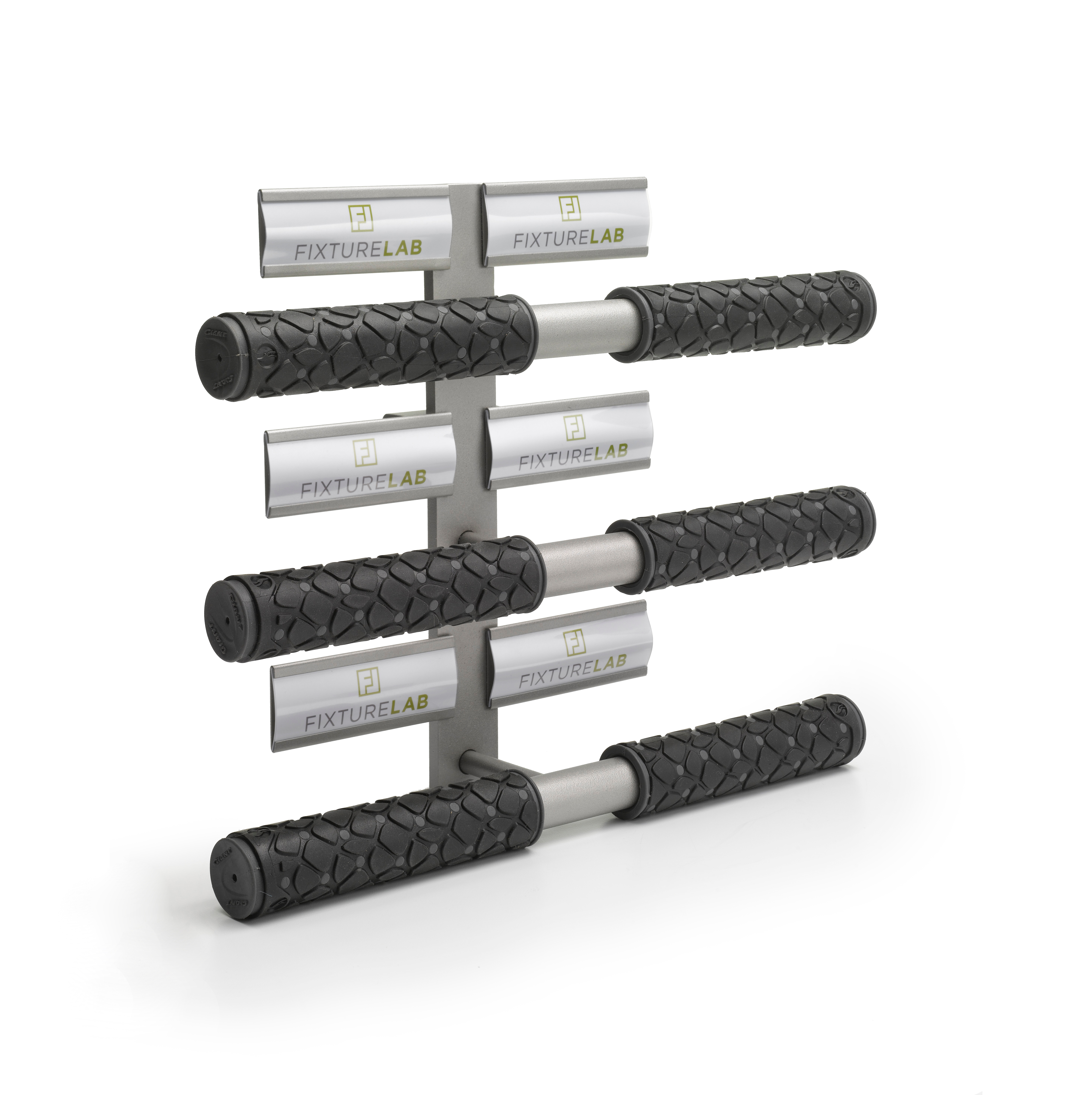
Are you the kind of person that likes to try/touch/feel something before you buy it? Same. Fixture Lab’s sweet Grip Displayer allows you to display up to 6 different grips out of their packaging for the full sensory experience. Check it out on our product page here.

People are initially attracted to how visually appealing something is…it’s science. People are even more attracted if you can also touch & experience it! Also science. This display is a great way to elevate your customer’s experience. Go ahead and place some grips on display for your customers to feel. Then watch what happens (more sales).

Secret tip: Sure this is great for displaying grips, but you can also wrap the bars of the fixture with bar tape in order to create a really nice tactile display.


Huge News: Fixture Lab Teams Up With NBDA

If you run a bike shop and you are breathing, we have huge news.
We’ve partnered up with the National Bicycle Dealers Association aka NBDA. As an NBDA Preferred Partner, Fixture Lab is super excited to help bring the NBDA members extra special discounts on our unique services, because we really like you. We want your business and store to be successful!
What this partnership means: we get to bring more value to you by helping you save money to create your dream store. Whether it includes just a few new pedal display fixtures or an entire remodel, we can absolutely make your dream store happen for you. Stand out from the fierce retail competition and let Fixture Lab help make your store sing.

What we’re offering you:

As a preferred partner, we’re discounting store fixtures and offering a FREE in-depth, custom store remodel budget creation/consultation…a $500 value.

The good news is: It’s crazy easy to take advantage of these sweet deals! All you need to do is be a member of the NBDA and hop on over to their website which you can find here! Happy Designing!

Explore retail design inspiration and improve your own store’s offering

Exploring Retail Design Inspiration at Milk Market Denver

Have fun, and open your eyes to great retail design your customers are experiencing

When you are working in a store everyday, it’s easy to get swept away with the demands of the day and only focus on the bare necessities in terms of look and feel for your store. Retail is hard, and if we aren’t careful we can be lulled into overlooking opportunities (big and small) that could make a valuable difference for your customers. In an effort to kick-start your thought process, we challenge you to get out there, take off those blinders and explore all of the new stores and restaurants in your community….I know, a terrible challenge. You’re welcome.


Not only can it be incredibly inspiring, but it will also give you a really strong indication of what your customers are craving and gravitating towards. Don’t forget, your customers aren’t simply comparing your retail experience to the other bike shop in town. Next Saturday they might find themselves deciding if they are going to go shopping at Lululemon or go to a bike shop. They might even have to decide if they are going to go out for a nice lunch or stop by the bike shop. In today’s busy world, you complete against a wide array of experiences that might eat up our customer’s time and attention. Think of this as the best research project you’ve ever had to do, and get out there and see what your customers are seeing.

Retail design challenge extended. Retail design challenge accepted.

We took our own advice, and we headed up to the brand new Milk Market located on Dairy Block in Downtown Denver. It opened a few weeks ago and it is getting rave reviews.


“Denver Milk Market is an all-local, all-wonderful mix of take-away and dine-in restaurants and bars run by Colorado chef Frank Bonanno. Denver Milk Market, a 16-venue cornerstone of the historic Dairy Block, aims to draw in travelers, visitors, neighbors and fans to shop a little, drink a little, eat a little and celebrate a lot in the very heart of the Ballpark Neighborhood here in Denver. “ www.denvermilkmarket.com


This place is oozing with inspiration. From their unique flooring choices, to their exceptional branding of each ‘concept’. And despite the way their marketing makes it look, you can enjoy the experience if you are over 29 years old. Let’s take a gander of some of the stuff we experienced…


Retail design, outside

One of our favorite parts of Dairy Block (http://dairyblock.com/) and Milk Market is their use of the outdoor space for branding and ambiance. From the milk bottle string lights to the adorable quote plaques on the ground, it is a charm fest. Even their man hole covers are branded! We often see these small details hit the cutting room floor during a remodel and it breaks our heart. These features give a space soul. People want soul! What small detail can you add outdoors that would would make people smile? Do it!

Retail design, on the floor

Each space at Milk Market is differentiated by a splashy floor tile that was custom designed by Frank Bonanno’s wife, Jacqueline Bonanno. Not only does it give the overall space some good personality, but it is also a terrific story to share about the build-out process. It would be silly of them not to share that story! Is there something unique in your store that has a story that needs to be told? Tell it! If not, create your own story!

Don’t be afraid to have fun

If there is one thing this space drives home, It’s: Don’t be afraid to have a little fun with your space. If you are incorporating a sitting area, why not make the tables out of letters? If you have tall ceilings, why not make an awesomely enormous sign? How about building some neat phrases into the path your customers walk? How about mixing colors and textures in bold ways? Take a risk! Run wild! Where is your shop lacking some fun? Need help?…give us a call A.S.A.P.

Make it flow

For some bonus tips on how to make your store flow with all these new inspired ideas you now have firing in your brain, be sure to check out the latest post we wrote, “Rethinking the Flow of a Store for More Sales and Happier Customers

Rethinking the flow of a store for more sales and happier customers

We recently finished up a really great store design with Summit City Bicycles out in Fort Wayne, IN. Bob and Sherry were already running a very successful shop with solid merchandising and superb customer service, but over the years as they grew and grew the space took on some less-than-optimal characteristics. We see this kind of thing all the time.

Here’s how stores evolve and lose their flow:

A store starts out small and scrappy, with just about whatever space they can afford to begin with. Of course they have success because they are offering great products, great service and a fun place to shop. Before they know it, they need to expand. The natural expansion would be to take over the space right next door and simply spread out. It feels so nice to be able to spread out a little that they barely even notice the awkwardly placed wall in the middle of the space, or the way that the back wall of the space has a conspicuous building material change, or the flooring that no longer matches. Sound familiar?


For a good shop, this process usually takes place a number of times over the years. It’s like boiling a frog. If the space were offered to them as is, and they didn’t experience the evolution of the space themselves, they would say, “Oh hell no. That store is broken up really strange. That will totally hold us back.”


The Summit Cycles team was doing a great job with what they had, but there were some definite ways that they had been boiled like a frog. To their credit, they knew that something was going to have to change…so they called us in to help out.

The way that the store had evolved, the customer would enter the store and find themselves facing the back side of some strangely placed electrical and storage rooms on the left, and the side of a bathroom on the right. To make things worse, the entry area had the lowest ceiling in the whole space. Technically, the shopper could see into the retail space, but their view was very constrained, unflattering, and they certainly couldn’t visually scan whole store to see where they might like to shop.


To address the problem we sat down with Bob and Sheri, the architect, and the contractor to see what moves were reasonable to make. We ended up suggesting a number of changes that included removing some walls, moving the cash wrap, opening up the service writing area, and relocating a number of categories around the store. What a difference it has made! The store feels SO much bigger and much more inviting. It feels Like the store has more product because it’s actually visible. As soon as one walks in the front door they can easily see everything and where they need to go. Plus, the employees have much better visibility around the store. Add all these factors together and you have a space that is going to sell more, and make customers happier!

Is your store suffering from gradual change that hurts your overall shopping experience?

Step outside your store. Now shake your head and say, “I am now a customer walking in this store for the first time.” As you walk in and around the store, ask yourself these questions. Be brutally honest with yourself.

  • What catches my eye first when I walk in the store? What is the most interesting feature of the store?
  • How much of the store can I actually see when I walk in?
  • Are there areas that don’t look inviting, or that I can’t see at all?
  • Does the organization of the store encourage me to spend time and walk around?
  • Are there walls in strange places? Do the materials/floors/features change dramatically as I walk around? Does it all feel like one store?
  • Are there areas where all the people are? Are the customers and employees in the store spread around the store, or is everyone typically in one small area?

If you’d like help “seeing” your store and the possibilities it offers, we know a great store design firm in Denver that you should talk to..wink wink.

Congratulations and thank you to the whole team at Summit City Bicycles! Your patience and hard work has totally payed off! The store looks fabulous!


Before view, right

Before, looking right as you walk in the door


Before straight view

Before view, looking straight ahead


Before view, looking left

Before view, looking to the left


After view, straight

After view, looking straight


After view, left

After view, looking left


After view, right

After view, looking right


The right overhead light for a retail store’s dressing room.

We are always looking for great lighting solutions for all the stores we work on. Recently, we uncovered this really great ceiling light that works great for a dressing room. And the bonus, it’s only $69.95.


A few words about lighting a dressing room:

Your goal when lighting a dressing room is easy: Make the customer look like a million bucks. Certainly the size of the room, the colors, and the finishes have a lot to do with you hitting your goal. Great lighting however, is one of the very best investments in your plan. It’s easy too! It really makes you wonder why so many retailers, big and small, get the lighting part so wrong.

In a nutshell, you need two basic lights in the dressing room to make the customer look great.

  1. A nice soft overhead light
  2. Lights that illuminate the front of the subject in the room. We are going to do a whole separate post about these lights, so stay tuned.
  3. Poor overhead light in a dressing room

Attributes of a great overhead light:

  1. The light should be diffused or indirect…not direct spot lights that cast dramatic shadows. Pretty much, the softer the light the better.
  2. The right color temperature is important. The most flattering light for skin tones and clothing is around 3000k.
  3. The style of the light should compliment the room.
  4. It sure doesn’t hurt if the light is inexpensive, am I right?!

Drum Flush Mount Light from CB2Introducing the “Drum Flush Mount Light” from CB2: 

1. The simple and clean design allows it to fit into almost any design plan.
2. The overall size of the shade (19.75″Wx19.75″Dx6″H) is pretty big, which does a great job of spreading out the light. The diffuser on the light softens and makes the light pretty.
3. It uses two standard bulbs (up to 60W incandescent or equivalent LED or CFL), which makes dialing in the exact amount of light real easy, and swapping out lamps later simple.
4. Did we mention it is only $69.95?


What are you waiting for?


If your dressing room needs a little shot in the arm, hop on over to CB2 and order one up! Click here to see it!

Ceiling drum light by CB2CB2 also makes a “oversized drum flush mount light” which is a huge 34″ across. If you have a larger room, that could be just what the doctor ordered! Check it out


The first person to send us before and after photos will get a social media shout out….and perhaps a little surprise from us! Aren’t you dying to find out what that might be?!

Ready. Set. Go!

The Best Bike Shop Retail Design Blog on the Internet

Blogs are for dorks bannnerBlogs are for dorks, so who better to have one than us?! And now, without further ado,  welcome to our (dorky) blog! (Please toss your own confetti here) We have big plans for great content as we move ahead. In it you will find all sorts of retail design inspiration and information…and the occasional random post that has nothing to do with anything, other than being remarkably witty and charming.


We hope you enjoy your stay and please reach out and let us know what content you would like to see in the near future. It could be anything. Anything. You know we are always game! Thanks for the visit! Come back soon!


And make sure you check out our recent posts:

Brian’s ‘How To Design Your Bike Shop’ presentation for the Brooklyn Bicycle Co

National Bike Dealers Association presentation


Are you looking for design or layout assistance for your bike shop? Toss us a note or give us a call at 303-777-2014 today and let’s talk about how we can help.

Talking Bike Shop Business (and Design) Strategy in Napa, CA

Brian's P2 presentation in Napa
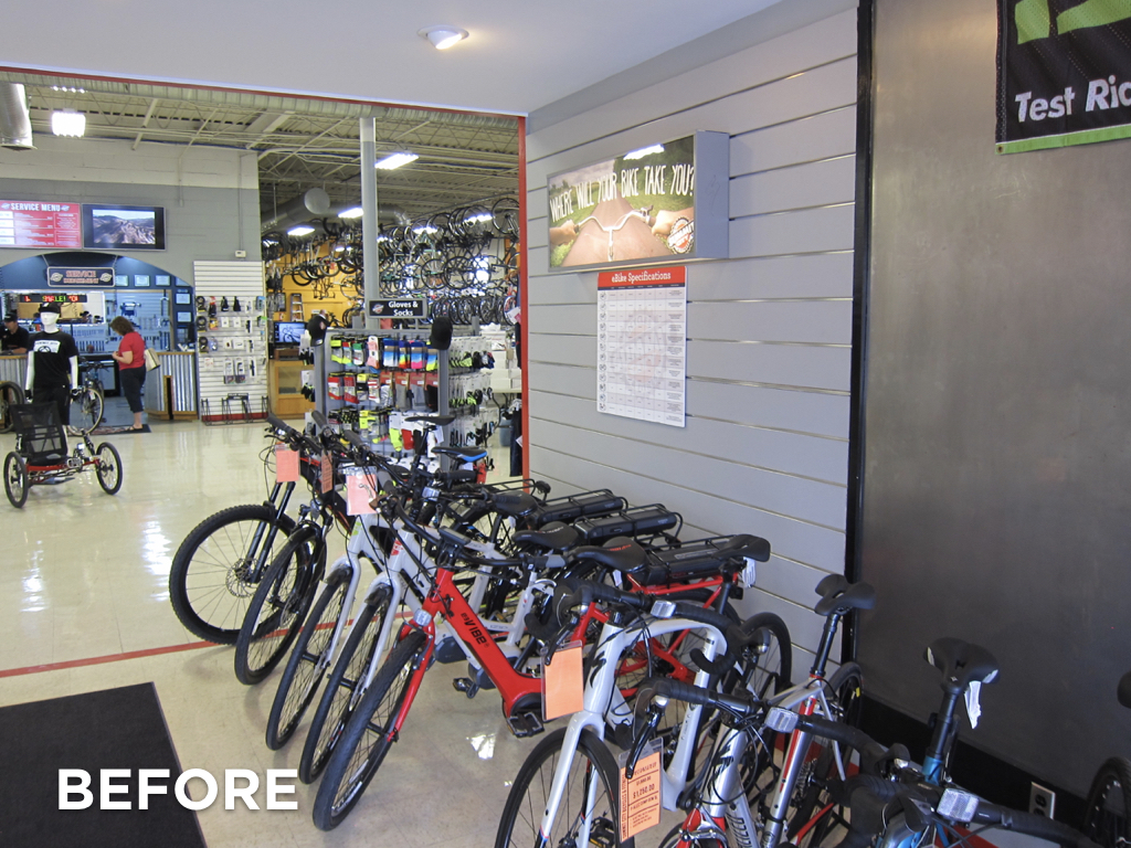
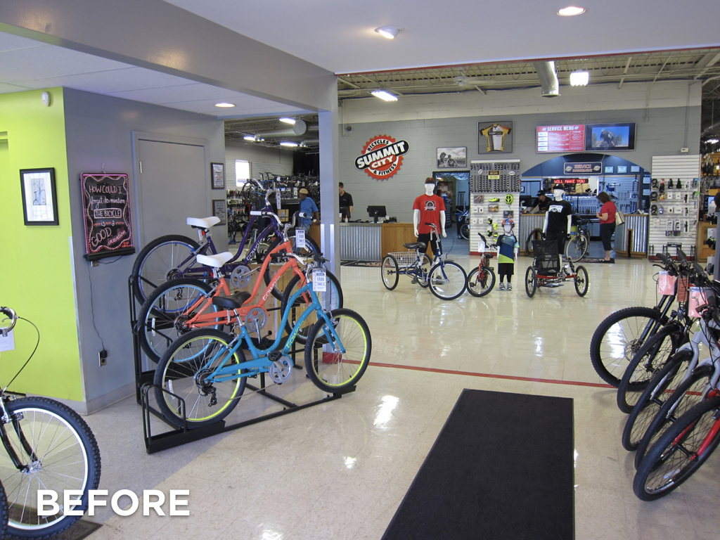
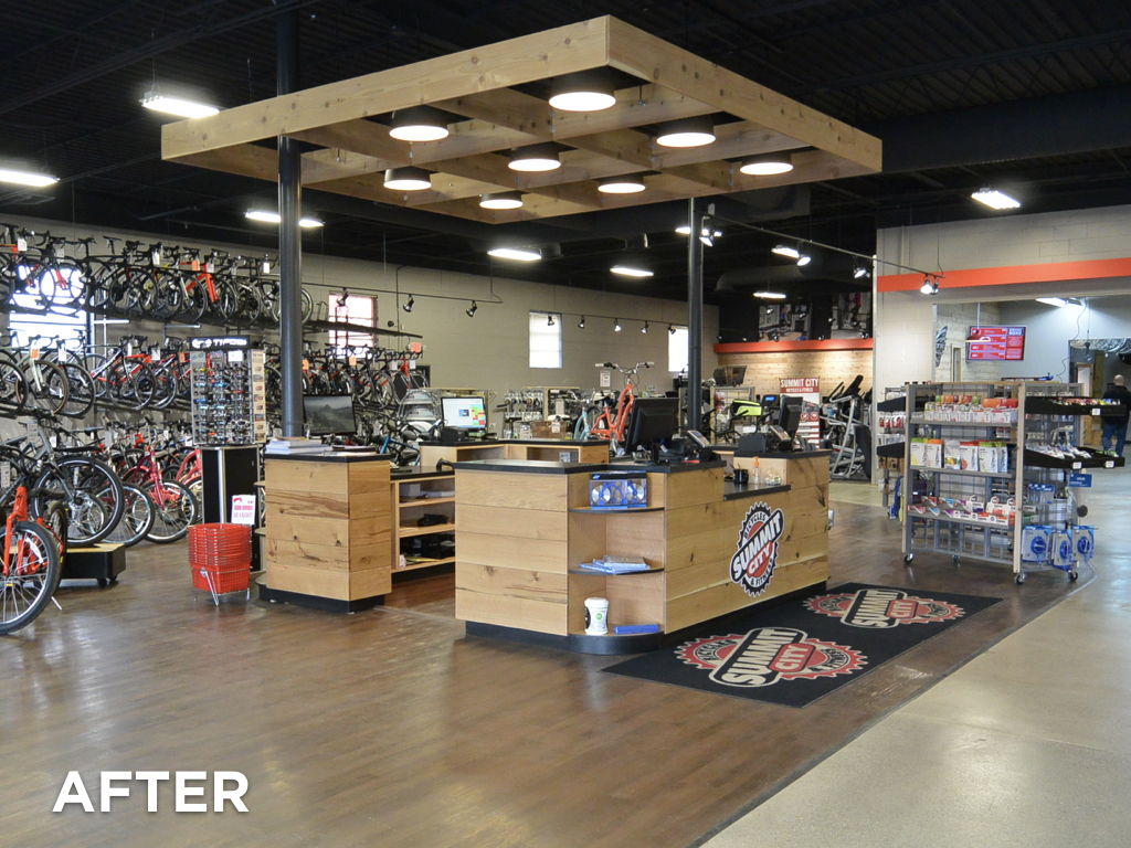
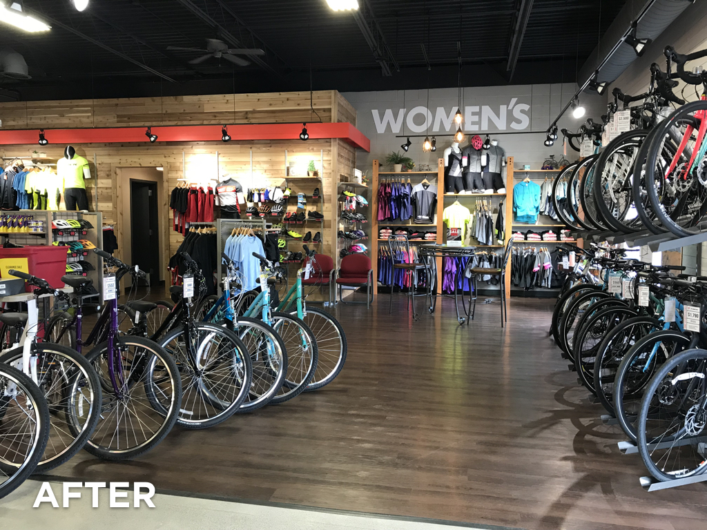
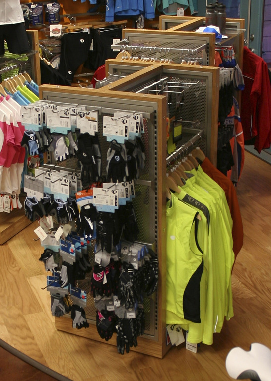
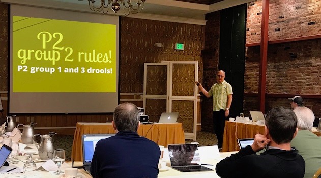
The National Bike Dealers Association recently asked Brian to present to their Profitability Project Group #2 (there are three P2 groups). The Profitability Project (P2) aims to improve business for all the participating specialty bike retailers. Of course we took them up on the offer because the Profitability Project groups are made up of some of the best bicycle retailers in the country. The fact that the meeting was in Napa, CA didn’t hurt either!


Brian’s presentation was called, “Being the bike shop of the future is all about being a great retailer of today”. In it, Brian discussed the history of bike shops from the 1800’s to years in the future. He shared a whole bunch of things that today’s best retailers outside the bike world do today, and a zillion ways the bike shop of the future will change from today’s model.Slides from the P2 show


We are considering hosting an online webinar where Brian would deliver this presentation in its entirety. If you are interested in attending, click here and we will send you further details when it happens.


Get Involved in P2

If you are a bike dealer and you have never heard of a P2 group, it would be in your very best interest to look into it. Each group is made up of non-competing dealers who meet to learn, compare, network, examine and analyze specific data from their business to help and support each other in business operation and strategy. The retailers within these groups are all very well respected dealers around the country with awesome shops. So, it’s a tremendous honor to be asked to present at one of their meetings!

If you want to find out more about the NBDA or P2 groups, check out their site: nbda.com


P2 logo   NBDA logo


Check out Brian’s additional presentation on ‘How To Design Your Bike Shop’

Great store design projects and what they do for your bike shop

Brooklyn Bicycle Co logoBrooklyn Bicycle Co. has created a great library of articles and training for their dealers. So, when they approached Brian to share his Interbike presentation on “Great store design projects and what they do for your business” with their dealers, we jumped at the opportunity. I mean, who wouldn’t want to be a part of that! After you view Brian’s presentation 5-6 times, make sure you check out the other great articles in their library!

Thanks Brooklyn Bicycle Co., it was an absolute pleasure working with you!