fbpx

Free Tour! What has Fixture Lab been up to in Denver, Colorado?

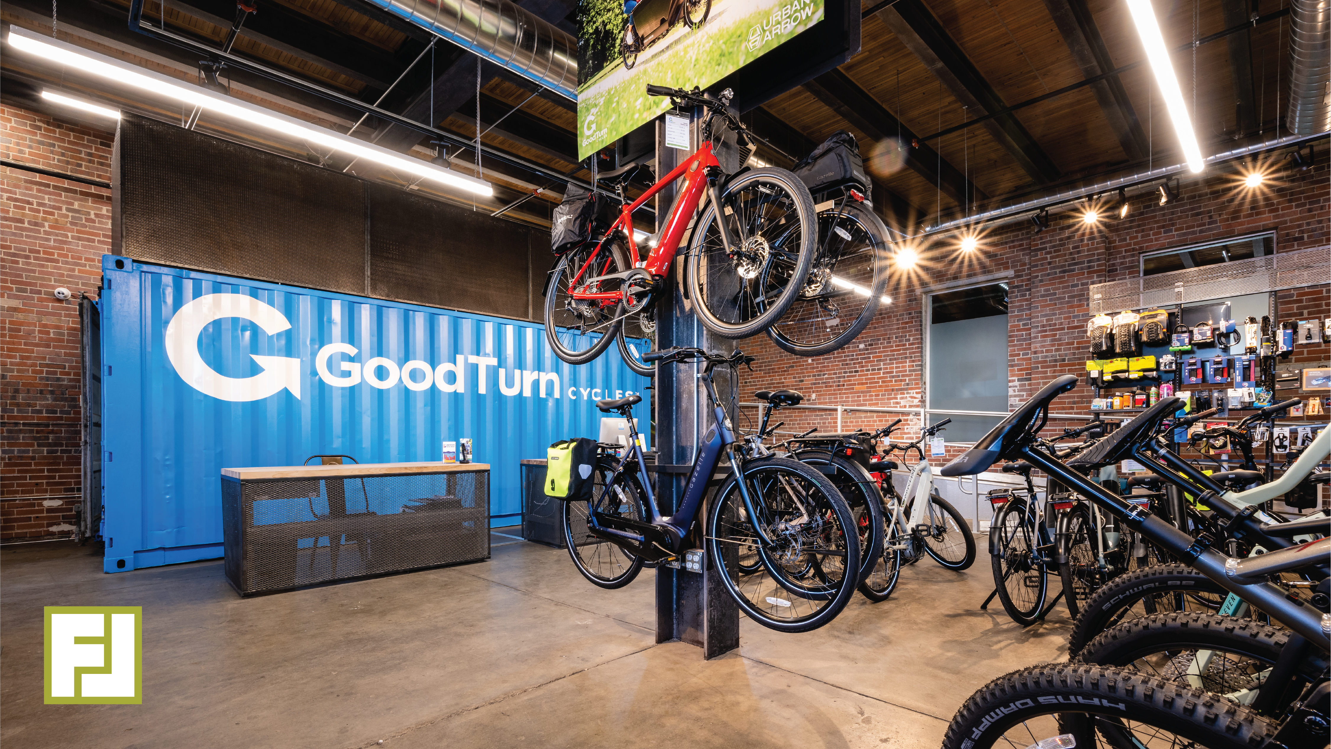
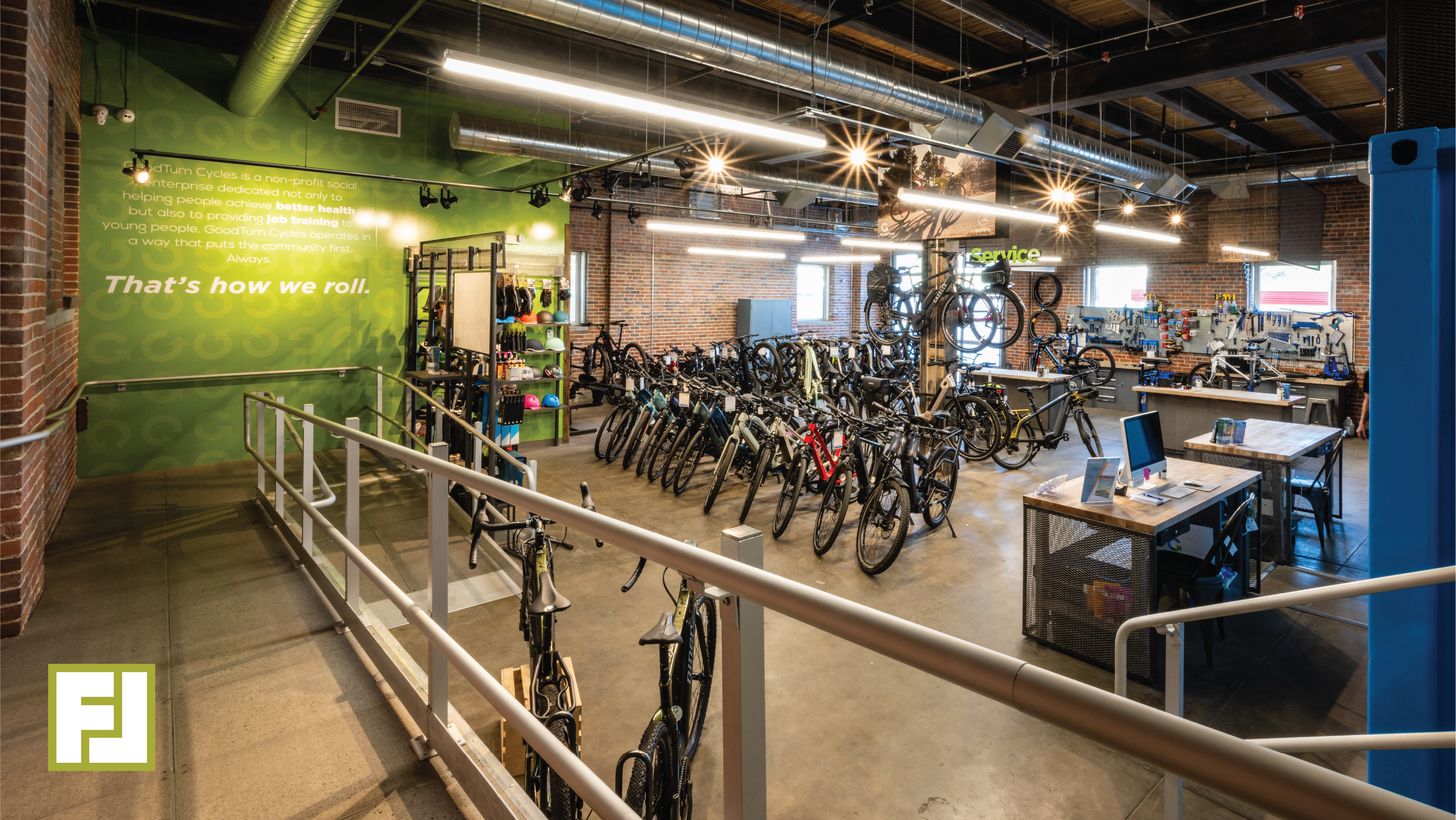
At Fixture Lab, we value versatility. We love being your go-to for a variety of needs, from lighting to heavy lifting. The downside, however, is that people sometimes ask us: “what is it that you do, exactly?” Since “anything” isn’t a satisfying answer, and “everything” would be an exaggeration, we thought of a creative way to show you what Fixture Lab does. Join us on a walk-through of Good Turn Cycles, a recently-completed bike shop in Denver, Colorado. You’ll learn about our process, expertise, and how Fixture Lab can help you create an amazing store!


Here is just a sneak peek at what you will find once you press play below:


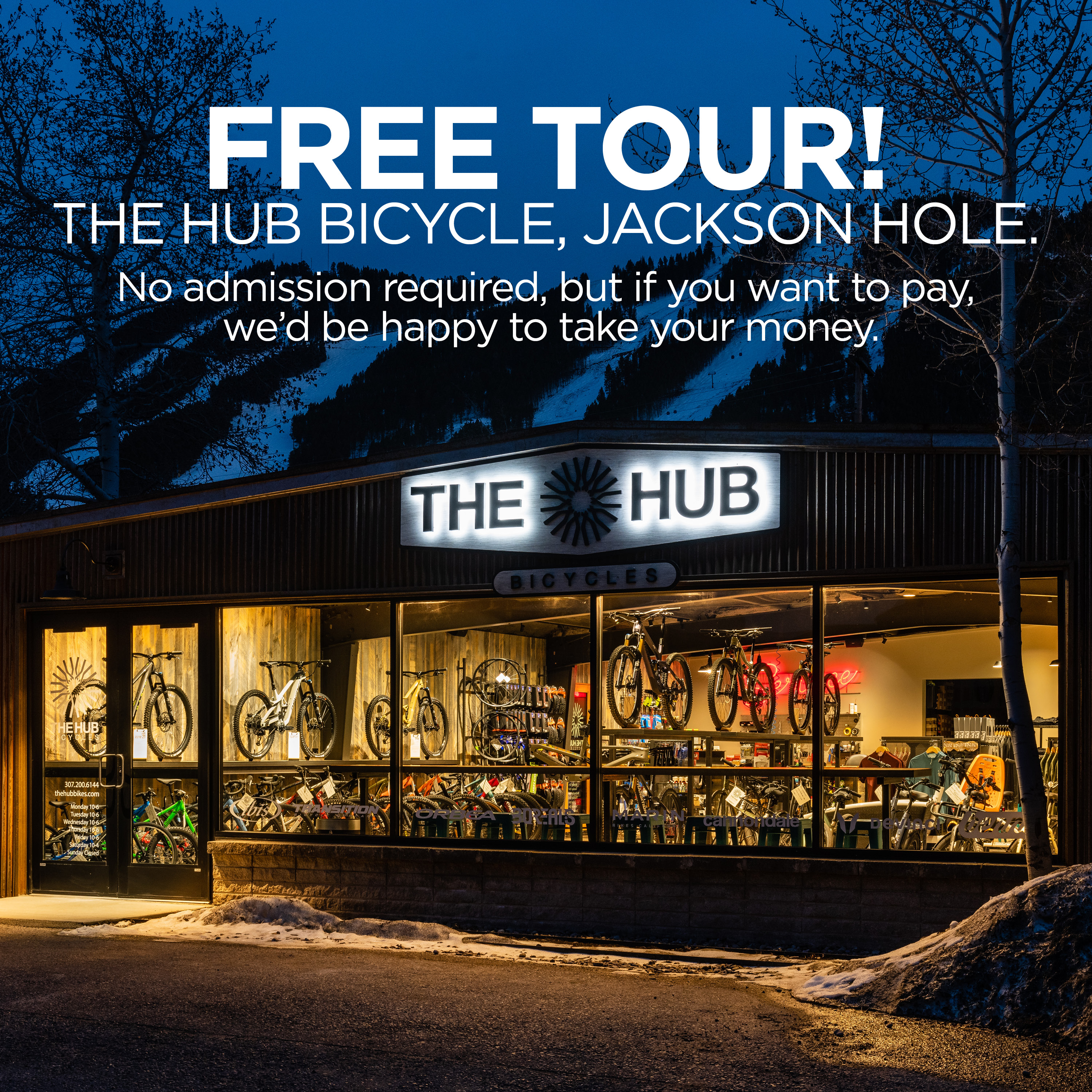
Side note: in case you missed it, our first walk-through video was of The Hub, a bike shop in Jackson, Wyoming. Go check it out once you’re done here!


As you’re watching and chomping on some popcorn, take special note of how Fixture Lab can help with:
  • Space planning. Turning your space into a thriving retail store is where we shine!
  • Lighting. Everything about it. Where, which lights, and why.
  • Fabrication. We know the people who can get any job done.
  • Fixtures (duh!). It’s in the name. We provide versatile, effective display solutions.
  • Installation. We’re happy to put in the legwork.
  • Moving shipping containers with forklifts
  • Hanging big, weird metal structures

You tell us! We’d love to help make your vision a reality.


When you’re done, reach out to Good Turn to let them know how their store inspired you to remodel yours. Hungry for more? Check out the walk-through of The Hub we mentioned earlier.

THE HUB 

Take this virtual tour, and see what Fixture Lab does!

The Hub Bicycles

At Fixture Lab, we get this question all the time: “We are remodeling our store and we could use some help, but I don’t really know what you guys actually do in the process. What do you do?” So, as we were looking at our photos of The Hub, we got to thinking that this would be an ideal opportunity to show off the new store AND help everyone understand the things we typically do in the store design/remodeling process.

Check out the video. Inside you’ll see nicely handled examples of these common things we address:

  • Creating great storytelling opportunities in your store
  • Great store flow design
  • Specifying and using standard and custom Fixture Lab fixtures
  • Service, cash wrap and bar counter design and fabrication
  • Choosing paint and other finishes, including tasty wood wall textures
  • Custom bike displays
  • Adding local flavor to the space
  • Custom graphics and signage (interior and exterior) including fun items like neon signs
  • New concept for a “cash wrap” transaction counter
  • Designing and utilizing sexy, effective lighting

You will love this tour, so pop some popcorn and your beverage of choice, and have fun!

When you’re done, reach out to The Hub and tell them what a good job they did!


Fixture Lab reveals retail store design secrets that will give your store an unfair advantage!

If you are an NBDA member you need to know about this fun Webinar

How’s an independent retail store supposed to compete with the big guys these days? How can I make my own store as engaging as the national brands/stores? And how the heck can I make my store’s brand stand out without spending zillions of dollars? If you’re asking questions like these, this webinar is just what the doctor ordered for you! In this fun presentation Brian Hawkins (the leader of Fixture Lab), will take us through a treasure trove of retail store design tips and best practices that the leaders in retail use every day. It’ll be like getting the keys to unlock the store you’ve been dreaming about.

Watch it here!

https://www.youtube.com/watch?v=yj_HnilE2vU

Don’t just make space for service department, design it.


We know your pain! The retail bike biz is a tough one, and sometimes areas like the service department can evolve into a less-than-optimal monster. Fear not. We can help.
Whether your service area needs to be re-thought, made sexier or you’re just trying to upgrade your store’s service game, you should check out NBDA’s latest Outspokin newsletter, “Make It Sexy: Tips for Sprucing Up Service” written by our own Brian Hawkins.

In the article, Brian spills the beans about designing sexy & functional service departments – offering so much value. You can even use his tips and take action on them like, today! Hint: it’s not just about fancy displays and reclaimed wood walls.
“…national statistics show that bike service is one of the highest performing areas of the bike shop these days, so there’s no question that your service department is worthy of a good hard look.”
He’ll walk you through step-by-step the specific ways to understand if your service department is operating smoothly or not and what to do about it. By the end of the article, you’ll understand the four solutions to problems that come up when changing your service department. Then, he’ll lay out all the mistakes to avoid. Again – so much value. You can take this information through the lifespan of the business and pass it along to your team.
We can’t wait for you to soak up all the wisdom that Brian offers and learn about how it impacts your store. Check out the article now!

Blazing Saddles opens first retail bike shop in Sonoma!

We are very excited to announce our latest! Blazing Saddles called us when they decided to open a retail store alongside their new bike rental location in Sonoma, California.

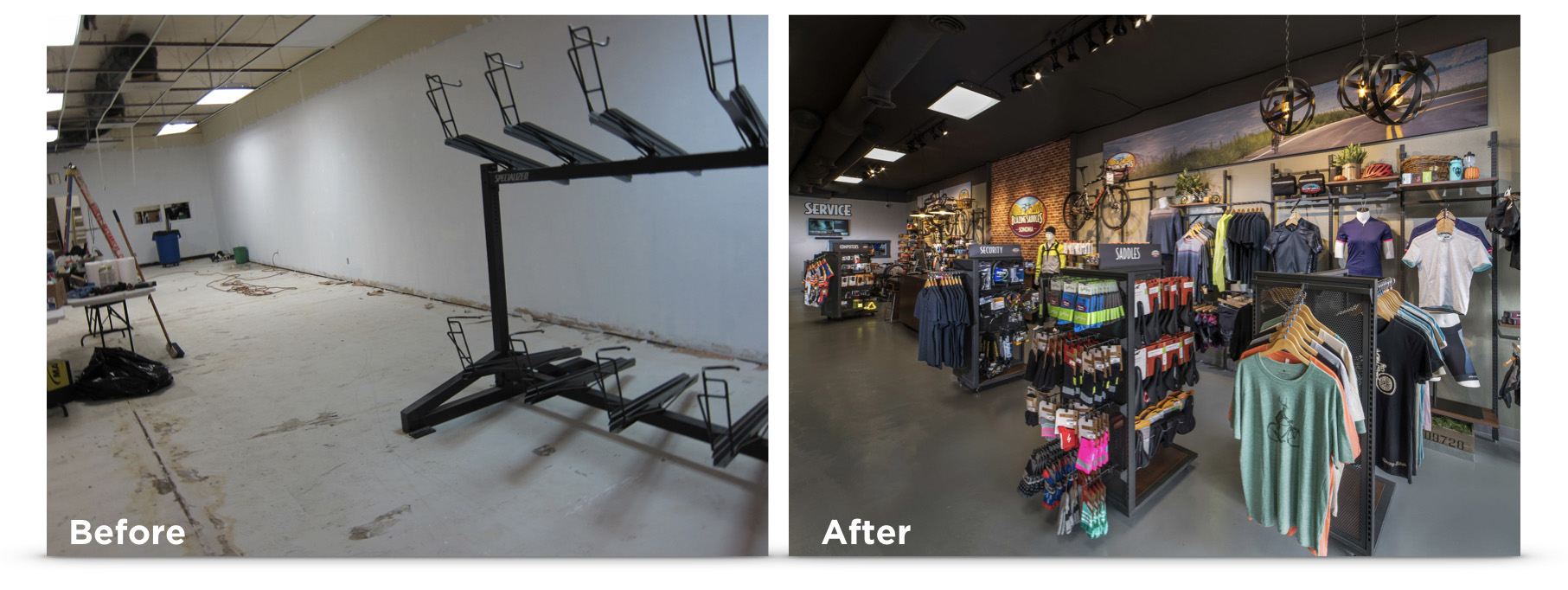
Before and after photo of Blazing Saddles, SonomaGetting a chance to help a veteran bike rental organization with a new retail store.

You might know Blazing Saddles already, because they run an amazing business in San Francisco renting bikes to about a billion people a day. When you are around San Fran, you can’t miss the droves of happy people on Blazing Saddles bikes. Their operation is seriously impressive, so when they called and said that they wanted help designing and implementing the retail & rental store in Sonoma, we were like, “Oh hell yea!”

We were able to pretty much help with every aspect of the new store…floor plan, fixtures, graphics, signage, merchandising, etc. We even installed one of those Sonos sound systems that you might have read about in our previous blog post. By the way, see those fixtures? The Blazing Saddles team wanted a look of their own, so we produced all the fixtures in their own dark grey paint color. They look really great!

We could not have had a better time working with the awesome team at Blazing Saddles! If you are in the area, make sure you stop by and say “Hi”

Flip through these pics!

Go check it out!

Blazing Saddles
20093 Broadway, Sonoma, CA 95476
https://www.blazingsaddles.com

Rethinking the flow of a store for more sales and happier customers

We recently finished up a really great store design with Summit City Bicycles out in Fort Wayne, IN. Bob and Sherry were already running a very successful shop with solid merchandising and superb customer service, but over the years as they grew and grew the space took on some less-than-optimal characteristics. We see this kind of thing all the time.

Here’s how stores evolve and lose their flow:

A store starts out small and scrappy, with just about whatever space they can afford to begin with. Of course they have success because they are offering great products, great service and a fun place to shop. Before they know it, they need to expand. The natural expansion would be to take over the space right next door and simply spread out. It feels so nice to be able to spread out a little that they barely even notice the awkwardly placed wall in the middle of the space, or the way that the back wall of the space has a conspicuous building material change, or the flooring that no longer matches. Sound familiar?

 

For a good shop, this process usually takes place a number of times over the years. It’s like boiling a frog. If the space were offered to them as is, and they didn’t experience the evolution of the space themselves, they would say, “Oh hell no. That store is broken up really strange. That will totally hold us back.”


The Summit Cycles team was doing a great job with what they had, but there were some definite ways that they had been boiled like a frog. To their credit, they knew that something was going to have to change…so they called us in to help out.

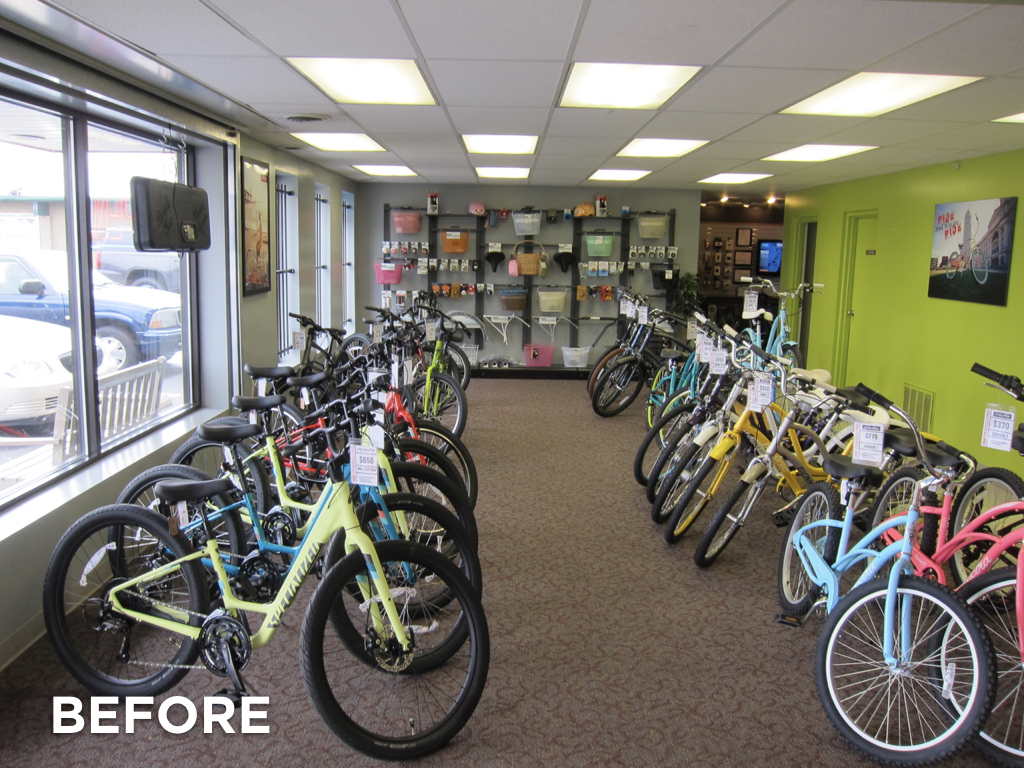
The way that the store had evolved, the customer would enter the store and find themselves facing the back side of some strangely placed electrical and storage rooms on the left, and the side of a bathroom on the right. To make things worse, the entry area had the lowest ceiling in the whole space. Technically, the shopper could see into the retail space, but their view was very constrained, unflattering, and they certainly couldn’t visually scan whole store to see where they might like to shop.
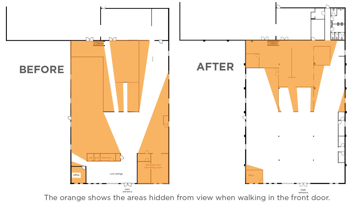
 

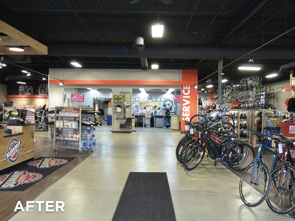
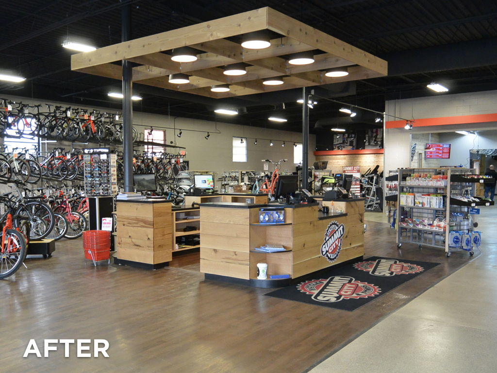
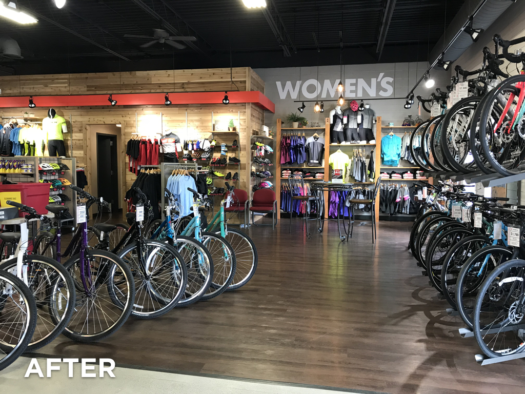
To address the problem we sat down with Bob and Sheri, the architect, and the contractor to see what moves were reasonable to make. We ended up suggesting a number of changes that included removing some walls, moving the cash wrap, opening up the service writing area, and relocating a number of categories around the store. What a difference it has made! The store feels SO much bigger and much more inviting. It feels Like the store has more product because it’s actually visible. As soon as one walks in the front door they can easily see everything and where they need to go. Plus, the employees have much better visibility around the store. Add all these factors together and you have a space that is going to sell more, and make customers happier!

Is your store suffering from gradual change that hurts your overall shopping experience?

Step outside your store. Now shake your head and say, “I am now a customer walking in this store for the first time.” As you walk in and around the store, ask yourself these questions. Be brutally honest with yourself.

  • What catches my eye first when I walk in the store? What is the most interesting feature of the store?
  • How much of the store can I actually see when I walk in?
  • Are there areas that don’t look inviting, or that I can’t see at all?
  • Does the organization of the store encourage me to spend time and walk around?
  • Are there walls in strange places? Do the materials/floors/features change dramatically as I walk around? Does it all feel like one store?
  • Are there areas where all the people are? Are the customers and employees in the store spread around the store, or is everyone typically in one small area?

If you’d like help “seeing” your store and the possibilities it offers, we know a great store design firm in Denver that you should talk to..wink wink.

Congratulations and thank you to the whole team at Summit City Bicycles! Your patience and hard work has totally payed off! The store looks fabulous!
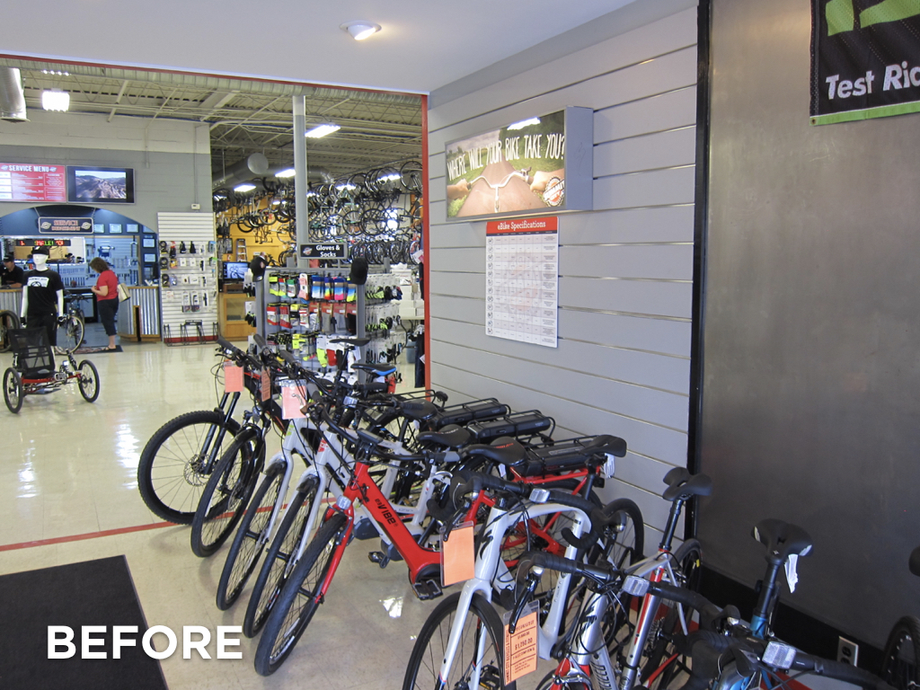
 

Before view, right

Before, looking right as you walk in the door
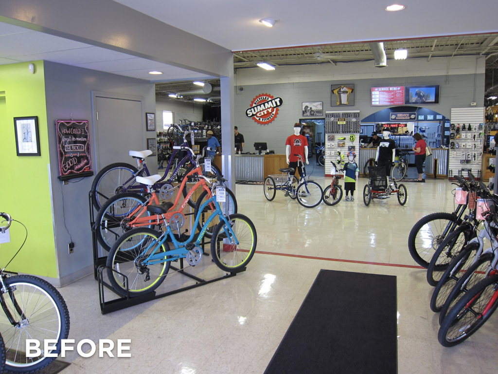
 

Before straight view

Before view, looking straight ahead


Before view, looking left

Before view, looking to the left


After view, straight

After view, looking straight


After view, left

After view, looking left


After view, right

After view, looking right